Expanding Access and Driving Revenue Through Inclusive Design
Redesigning the Spanish-language Medicare enrollment experience to improve accessibility, reduce unqualified leads, and help users confidently determine eligibility before entering the enrollment funnel.
CHALLENGE
82% of users entering the Spanish enrollment flow were not eligible for Medicare Parts A/B, creating confusion for users and inefficiencies for the business.
WHAT I DID
Conducted UX research and usability testing to identify barriers to understanding, then redesigned the enrollment experience around decision clarity, eligibility awareness, and accessibility.
RESULT
Expanded access to Medicare enrollment for 8,000+ Spanish-speaking users and reduced ineligible leads by 30% through clearer eligibility guidance and decision-making support.
.png)
FROM TRANSLATION TO TRUE ACCESSIBILITY
The original experience was a direct translation of the English enrollment flow. While the content was available in Spanish, the experience failed to address the unique questions, concerns, and decision-making needs of Spanish-speaking users.
Data revealed that 82% of users completing the form did not have Medicare Parts A/B, yet were still progressing through the funnel. This resulted in frustrated users, wasted sales resources, and missed enrollment opportunities.
The challenge wasn't simply translating content, it was helping users understand whether they qualified before entering the process.
.png)
DESIGNING FOR CLARITY IN
HIGH-STAKES DECISIONS
Usability testing revealed that users struggled to understand Medicare terminology and eligibility requirements.
Many participants were unsure whether they qualified and lacked confidence in the decisions they were making throughout the enrollment process.
This revealed a critical insight:
Users weren't failing the experience, the experience was failing to inform users.
Rather than focusing solely on conversion, the redesign prioritized decision clarity and confidence.
SYNTHESIZING INSIGHTS INTO ACTION
To better understand the problem, I conducted usability testing and collaborated with stakeholders across product and sales teams.
Through affinity mapping and research synthesis, several patterns emerged:
-
Users misunderstood Medicare requirements.
-
Eligibility information appeared too late.
-
Lack of guidance created uncertainty.
-
Sales teams spent time on unqualified leads.
These findings informed a design strategy focused on transparency, accessibility, and informed decision-making.
.png)
.png)
Connecting UX decisions to operational impact
Usability testing revealed that users struggled to understand Medicare terminology and eligibility requirements.
Many participants were unsure whether they qualified and lacked confidence in the decisions they were making throughout the enrollment process.
This revealed a critical insight:
Users weren't failing the experience, the experience was failing to inform users.
Rather than focusing solely on conversion, the redesign prioritized decision clarity and confidence.
Experience & interaction design
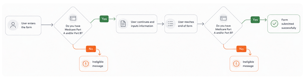
I introduced early eligibility checks, confirmation checkpoints, and visual cues that guided users through the enrollment process.
Through A/B testing, I evaluated multiple confirmation experiences. Users overlooked a text-only message and found warning-style alerts confusing. The final solution used a Medicare card visual and plain, language messaging, improving recognition, trust, and decision clarity.
By validating eligibility before submission, the experience reduced uncertainty for users and improved lead quality for the business.
.png)
The outcome
This project demonstrated how inclusive design can function as both a growth lever and an efficiency driver, directly impacting revenue, operations, and user trust.


WHAT’S NEXT STARTS HERE.
Get in touch at csoozee25@gmail.com