CYNTHIA GONZALEZ
MENU
Designing a Recovery Platform That Reduces Friction in Critical Moments
Transforming a fragmented nonprofit website into an accessible, trust-centered support platform that helps individuals find resources, attend events, and connect with help when they need it most.
CHALLENGE
The existing website lacked clear organization, making it difficult for users to quickly locate resources, understand available services, and take meaningful action. The challenge was to redesign the experience to reduce cognitive load, improve accessibility, and create clear pathways toward help.
WHAT I DID
Conducted usability research, evaluated information architecture, redesigned navigation systems, simplified content hierarchy, and created a more supportive experience focused on helping users quickly find resources, register for events, and connect with assistance.
RESULT
-
+34% visit duration
-
+10% site views
-
-5% bounce rate
.png)
Understanding Users in High-Emotion Situations
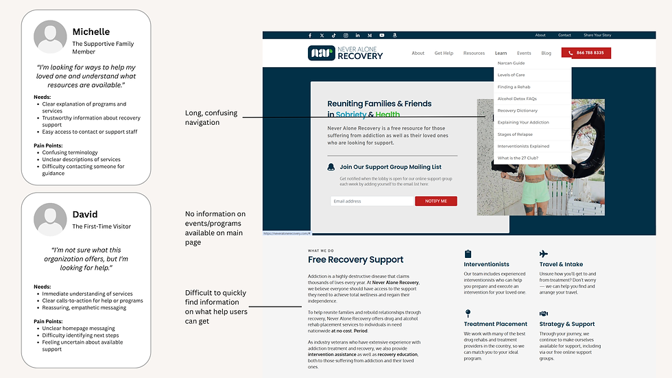
Unlike traditional websites, many visitors arriving at Never Alone Recovery were already navigating difficult circumstances. Some users were searching for support for themselves. Others were helping family members or loved ones. Research revealed that confusion within the experience often amplified feelings of uncertainty and overwhelm.
Many participants struggled to determine:
-
Where to begin
-
What resources were available
-
How to register for events
-
How to contact the organization directly
-
The experience needed to do more than provide information. It needed to create confidence.
.png)
Identifying Friction Points
-
Resource discovery: users struggled to locate support programs and recovery resources.
-
Event registration: important registration opportunities were often overlooked.
-
Navigation complexity: content was distributed across multiple sections without a clear hierarchy.
-
Contact Visibility: critical contact pathways were difficult to find when users needed immediate support.
Reimagining the Information Architecture
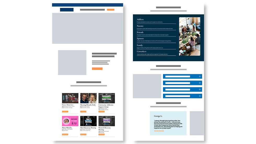
Rather than introducing new features, I focused on simplifying the experience. The redesign centered around helping users answer three questions as quickly as possible:
-
"I need help" - how do I get support?
-
"I want to attend" - what programs and events are available
-
"I want to learn more" - what resources exist for me and my family?
.png)
.png)
.png)
Designing for Emotional Clarity
The goal wasn't simply to improve usability. The goal was to reduce anxiety and uncertainty.
To accomplish this, I redesigned the experience around:
-
Clear navigation systems
-
Scannable content layouts
-
Simplified information hierarchy
-
Consistent calls-to-action
-
Supportive, approachable messaging
Every design decision focused on helping users move forward with confidence.
Creating Clear Paths to Action
One of the primary goals was helping users quickly identify what action to take next.
The redesigned experience introduced clearer pathways for:
-
Event registration
-
Program discovery
-
Resource exploration
-
Volunteer opportunities
-
Contacting the organization
By reducing decision-making complexity, users were able to engage with greater confidence and less friction.
.png)
Building Trust Through Community
Recovery is deeply personal, and trust plays a critical role in whether users engage with support services.
The redesigned experience emphasized:
-
Community involvement
-
Upcoming events
-
Real support opportunities
-
Transparent organizational information
This helped reinforce credibility while creating a more welcoming and approachable experience. The redesigned platform transformed Never Alone Recovery from a fragmented informational website into a guided support experience. By simplifying navigation, clarifying pathways, and prioritizing human connection, the redesign helped more users access resources, engage with programs, and reach out for support.


WHAT’S NEXT STARTS HERE.
Get in touch at csoozee25@gmail.com