A clean interface is not proof that information has been simplified. The real work happens before the interface: deciding what the evidence means, which choices matter, and what a person needs to see first.
I’m using one connected example—the Medicare research I led and the Plan Finder concept that grew from it—to show that work in detail. The research was delivered to GoHealth leadership. The Plan Finder was an exploratory concept and did not ship during my time there.
“Clarity is not less information. It is the right information, in the right order, for the decision someone is making.”
01
I started with the raw evidence, not a screen
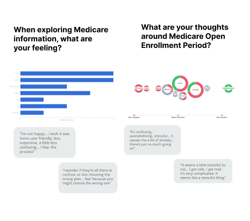
I spoke with and surveyed 40 Medicare-eligible and near-eligible adults. The result was not one neat problem statement. It was a mix of survey counts, interview quotes, emotional reactions, complaints about advertising, questions about timing, and uncertainty about what happened after a form was submitted.
I kept the quantitative and qualitative evidence together. The counts showed how often a pattern appeared; the interviews explained why it mattered. For example, 34 of 40 people described Medicare as confusing, but their language showed that the deeper issue was fear of making an expensive, irreversible choice—not simply a shortage of information.
- 01
Collect without forcing a conclusion
I captured what people said, what they understood, how they made decisions, and how current Medicare marketing made them feel.
- 02
Separate frequency from meaning
Survey counts established the size of a pattern. Interview language explained the anxiety, trust, and decision risk underneath it.
- 03
Rewrite the problem
The brief changed from “give people more Medicare information” to “help people feel confident that they can compare options without making a costly mistake.”
02
I compressed 40 conversations into a decision model
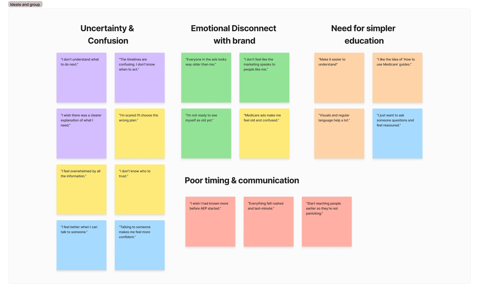
I moved every meaningful quote into an affinity map and clustered until the same underlying needs kept repeating. Four stable groups emerged: uncertainty and confusion, emotional disconnect from the brand, a need for simpler education, and poor timing and communication.
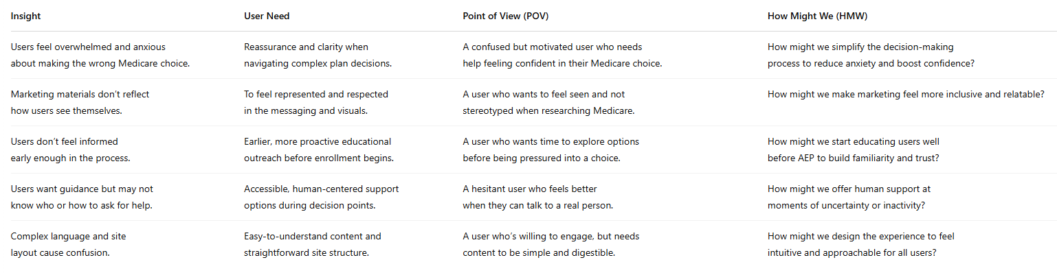
Then I translated each cluster through the same chain: observation → insight → user need → point of view → How Might We question. That prevented the synthesis from ending as a wall of sticky notes. Every theme had to point toward a decision the product or marketing team could make.
The simplification was not removing evidence. It was giving every piece of evidence a job.
- 01
Cluster observations
I grouped quotes by repeated behavior and emotion rather than by the interview question that produced them.
- 02
Name the underlying need
“Medicare is confusing” became needs for reassurance, plain-language education, control, and a visible path to human help.
- 03
Turn needs into prompts
Each theme became a How Might We question that could generate and evaluate product ideas.
- 04
Prioritize the decisions
The strongest direction was not another content page. It was a guided way to learn, compare, and ask for help without surrendering control.
03
I turned the model into a simpler product
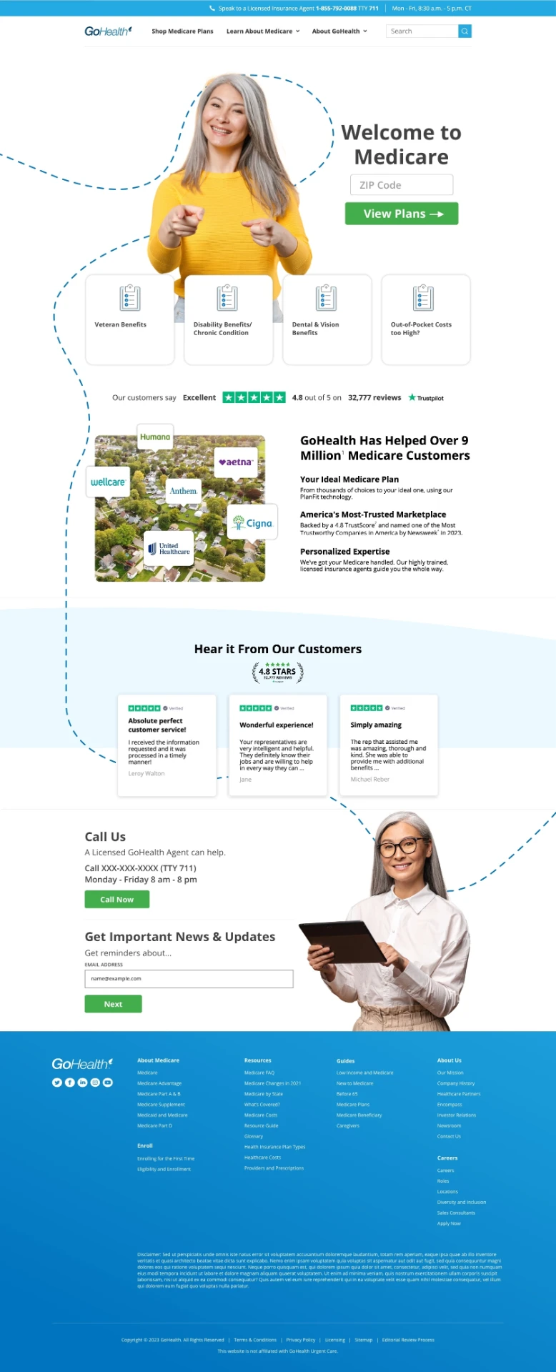
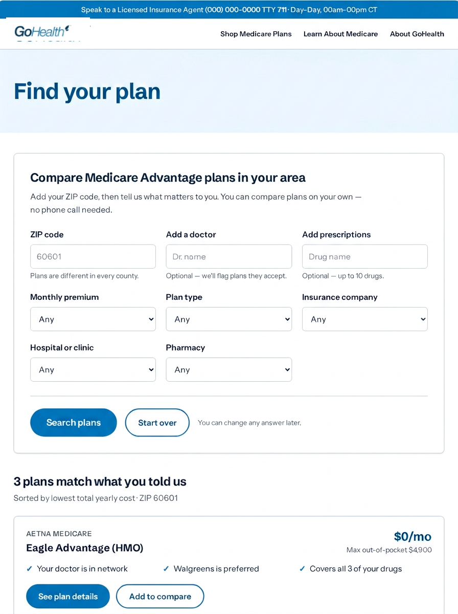
The research showed that people wanted to look before they talked to an agent, but the existing journey asked for contact information before showing a single plan. I designed a new path that begins with one necessary input—a ZIP code—and delays personal information until someone has a reason to speak with an agent.
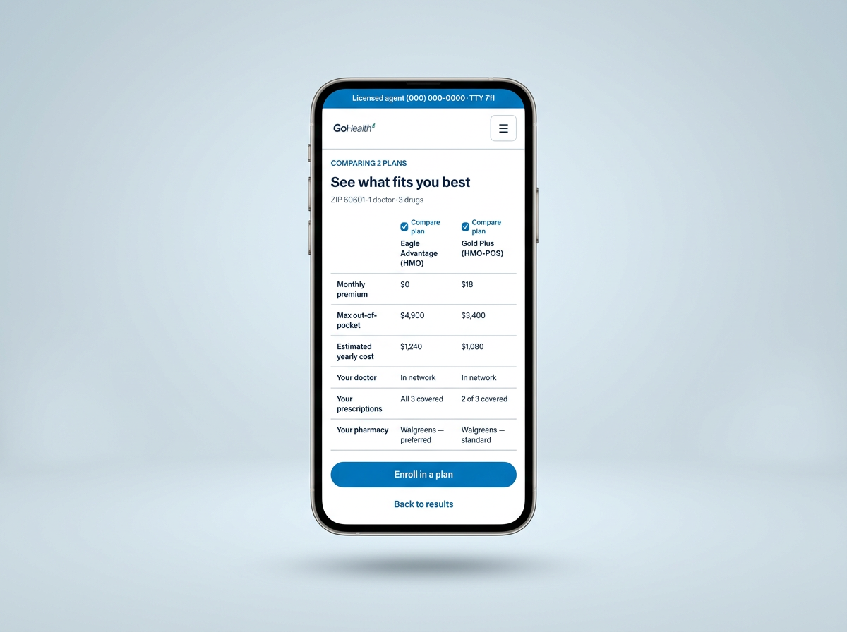
Inside the comparison tool, I did not expose every plan field at once. I organized the experience around the three questions people repeatedly used in interviews: Can I keep my doctor? Are my prescriptions covered? What will this cost me across the year? Carrier, plan type, pharmacy, and hospital remain available, while detailed copays and coverage expand in place when someone needs them.
- 01
One low-risk starting point
ZIP code first, because plans are county-specific. No name, email, or phone number before the person sees value.
- 02
Filters in human language
Doctors, prescriptions, yearly cost, carrier, hospital, pharmacy, and plan type map to the constraints people actually described.
- 03
Results answer the question first
“Your doctor is in network” and “covers all three prescriptions” lead; plan specifications support those answers.
- 04
Details appear without losing context
Copays, benefits, drug tiers, and out-of-pocket limits expand inline so two plans can remain open and comparable.
- 05
Human help remains visible
The self-service path supports agents rather than replacing them. People can call when they have a shortlist and a specific question.
The takeaway
Clarity should make the next step feel possible
When complex information is working, people do not notice the hierarchy. They notice that they understand their options, trust what they are seeing, and know what to do next. That is the outcome I design toward—and the reason I keep the underlying complexity intact while making the path through it feel simple.