Framing
A concept I pitched, not a product I shipped
This is an exploratory concept. I want to be direct about that up front: it was not built or released while I was at GoHealth. I designed it because I kept seeing the same gap in the work I was actually shipping, and I wanted to show what closing it could look like.
I'm including it because the problem it addresses is real and the direction held up. After my time there, the market — and GoHealth itself — moved toward exactly this kind of self-service plan comparison, which reinforced that the problem was worth solving.
The problem
Every road led to a phone call
I spent my time at GoHealth designing the front of the funnel: Medicare lead forms in English and Spanish, blog entry points, eligibility messaging. Those forms did their job — they collected enough information to hand someone to a licensed agent.
But that was the only ending available. Someone could read three articles, understand the difference between HMO and PPO, know exactly which doctor and which prescriptions mattered to them, and still have no way to see a single plan. The next step was always "talk to an agent."
That's a mismatch with how people shop now. Plenty of people 65 and up want to look first and talk second — and the ones who do call arrive cold, with no shortlist and no vocabulary for what they want, which makes the call longer for everyone.
- No self-serve pathComparison only existed inside an agent conversation.
- Trust gapAsking for a phone number before showing any plan lowered trust — it felt like a sales gate, especially for people new to Medicare.
- Real constraints ignoredDoctors, prescriptions, and pharmacy are what actually decide a plan — none were inputs.
The approach
Show plans first, make the call better second
The premise wasn't to replace agents. It was to let people arrive at the call already informed — and to let the people who never would have called at all get somewhere useful on their own.
So the tool had to answer the three questions people actually ask, in their own words: Can I keep my doctor? Are my prescriptions covered? What will this really cost me for the year?
Comparing plans shouldn't require a phone call. The call should be for the part a person can't do alone.
Who it's for
Two people I designed for
These personas came directly out of the Medicare research study I ran with 40 people — Katherine, who re-shops every year and dreads it, and Rosie, who had just turned 65 and researched online before calling.
They earned their place by settling arguments. Every filter in the tool exists because one of them needed it, and anything neither of them needed stayed out.

Retired · Dallas, TX
Katherine Banks, 70
“You're managing the cost. You have to figure out who's covered.”
About
Enrolled five years ago and re-shops every year. Prefers talking to a person, finds technology tiring, and money is tight.
Needs
- Keep her doctors and prescriptions covered
- Low out-of-pocket costs
- A comparison view she can trust
Design response: Doctor and prescription filters sit high, and total yearly cost shows next to premium.

Newly eligible · Atlanta, GA
Rosie Pierce, 65
“It was good to know we could change plans if this one's not working for us.”
About
Turned 65 this year and researched online before calling. Confident but still anxious about picking the wrong plan.
Needs
- Compare options side by side
- Coverage for unexpected costs
- An expert available when she has a question
Design response: Side-by-side compare, plus an agent CTA that stays available without blocking progress.
Information architecture
A second destination for the content funnel
GoHealth already had strong top-of-funnel content — the problem was that all of it emptied into the same lead form. So the tool sits one level below home as its own branch, linked from articles and from the form itself, rather than living inside the shop flow where it would read as a step in a sales sequence.
Find your plan (new)
New branch- Comparison tool
- Filtered results
- Plan detail
- Compare tray (2–3 plans)
- Talk to an agent
Shop Medicare Plans
- Medicare Advantage
- Part D
- Supplement
- Lead form
Learn About Medicare
- Basics
- Enrollment periods
- Costs
- Blog articles
About GoHealth
- Our mission
- Newsroom
- Contact
The tool is one level deep from home and reachable from every blog article and lead form, so the existing content funnel gets a second destination besides "call an agent."
Flow
The path, plus the states that usually get skipped
The happy path is six steps and stays on one page — filters, results, compare, next step. What mattered more to me was the unhappy paths: an empty result set, a drug that isn't in the formulary, a county with one plan. Those are where a 68-year-old decides the tool is broken and picks up the phone frustrated, so I designed them alongside the main flow instead of after it.
- 01
Arrives
From a blog article, search, or the homepage nav.
Curious, cautious
- 02
Enters ZIP
One required field, with help text explaining why county matters.
Low commitment
- 03
Adds what matters
Doctor, prescriptions, pharmacy, premium, plan type — all optional.
In control
- 04
Sees matches
Plans ranked by total yearly cost, each explaining why it matched.
Relieved
- 05
Compares 2–3
Side-by-side on cost, network, and drug coverage.
Focused
- 06
Chooses a next step
Enroll, save the shortlist, or call an agent with a plan in mind.
Confident
States I designed for
- No plans match — Loosen the strictest filter automatically and say which one, instead of an empty page.
- Drug not found — Offer close matches and a generic equivalent rather than a dead end.
- Doctor not found — Show the plan set anyway, flagged as unverified, with an agent nudge.
- One plan only — Explain why the county is limited and what removing a filter would add.
Where it starts
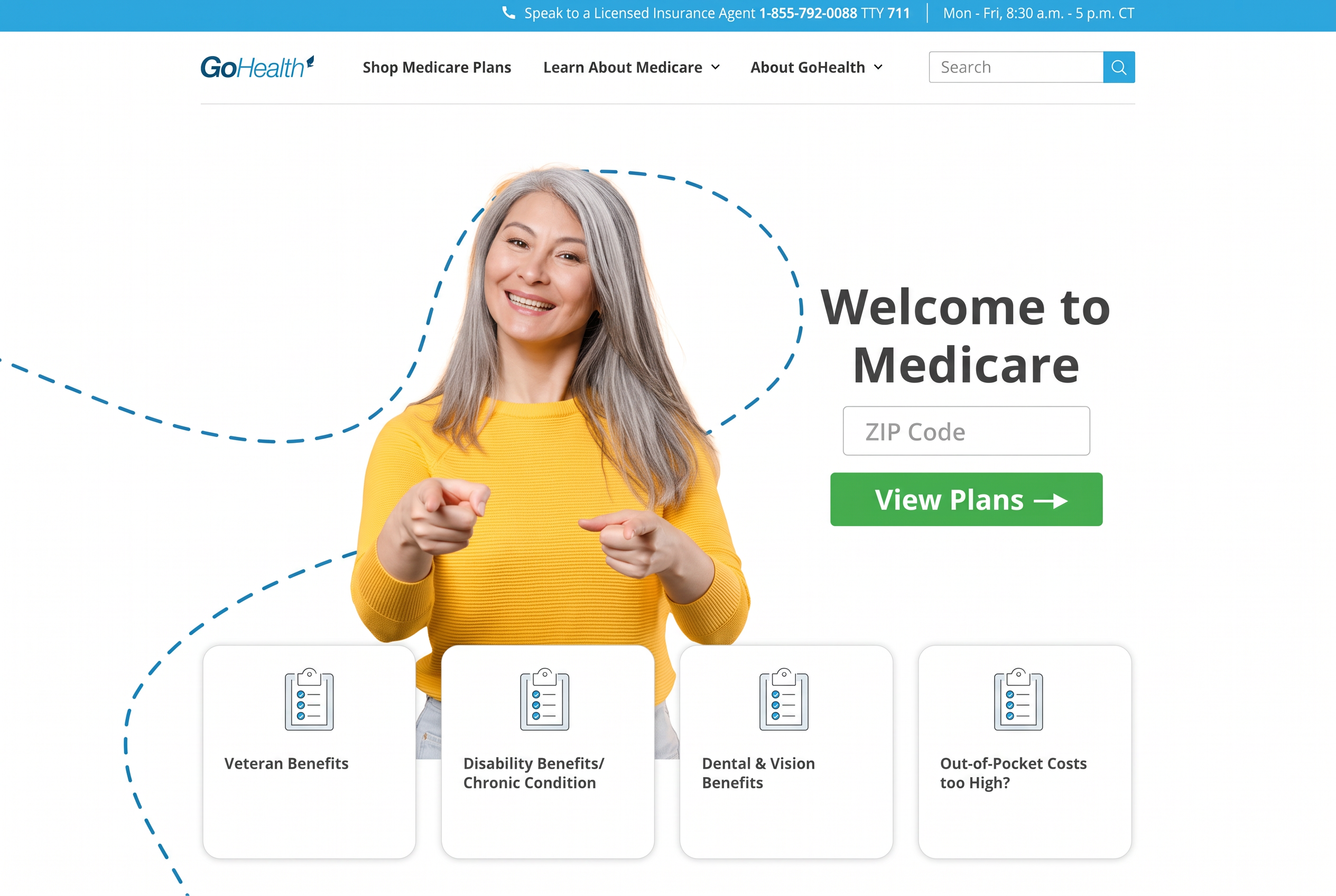
The proposed homepage: ZIP code, nothing else
This was the proposed entry point. The homepage asks for one thing — a ZIP code — and the View Plans button takes the person straight into the comparison tool.
No name, no email, no phone number at this stage. Asking for contact details before someone has seen a single plan is the friction that sends people away: most are still researching, and a form that reads as a sales gate makes them close the tab or brace for a call they didn't ask for. A ZIP code is the one input the tool genuinely needs, because plans are priced county by county.
Contact information still has a place — just later, once someone has a shortlist and an actual reason to talk to a licensed agent. Then it's an ask they say yes to instead of a toll they pay upfront.
The 'Find your plan' entry point was also a small trust signal. In the research, 30 of 40 participants said they felt anxiety about choosing the wrong plan, and several said they wanted to see options before giving contact info. Letting people look first — especially people new to Medicare — would have made them more confident and more likely to trust the next step.
Structure
Low-fidelity mockup
The hero drops to a single line, "Find your plan," with nothing under it, because the tool itself is the explanation.
Below that: one comparison block holding every input, then a stacked list of filtered plans, then a help block. One column, one decision at a time, no side rails competing for attention.

Find your plan
Comparison tool
ZIP code
Add a doctor
Add prescriptions
Monthly premium
Plan type
Company
Hospital / clinic
Pharmacy
Filtered results
Need more help? Speak to a licensed agent
Design
The branded concept
The designed version uses GoHealth's blue, its type hierarchy, and its existing header and footer patterns so it feels native to the site rather than bolted on.
ZIP code comes first, since plans are county-specific. Doctors and prescriptions are optional but sit high, because they're the filters that actually change someone's decision. Premium, carrier, hospital or clinic, pharmacy, and plan type follow as plain-labeled dropdowns. One prominent Search plans button, plus a Start over that removes the fear of getting it wrong.
Results lead with what the person asked for — "Your doctor is in network," "Covers all 3 of your prescriptions" — not with a spec table. Premium and max out-of-pocket sit together, because a $0 premium plan isn't automatically the cheaper one.
The first plan is shown with See plan details opened, so you can see what the expanded state holds: primary care and specialist copays, hospital and urgent care costs, drug tiers, dental, vision and hearing, fitness, and the yearly cost estimate. It expands in place rather than opening a pop-up — people 65 and up lose their spot when a modal covers the page, and expanding inline lets someone keep two plans open and read down the page.
Find your plan
Compare Medicare Advantage plans in your area
Add your ZIP code, then tell us what matters to you. You can compare plans on your own — no phone call needed.
Plans are different in every county.
Optional — up to 10 drugs.
You can change any answer later.
3 plans match what you told us
Sorted by lowest total yearly cost · ZIP 60601
Aetna Medicare
Eagle Advantage (HMO)
$0/mo
Max out-of-pocket $4,900
- Your doctor is in network
- Walgreens is preferred
- Covers all 3 of your prescriptions
Compare planEagle Advantage (HMO) — full plan details
Everything opens on the page, so you never lose your place.
What you pay to see a doctor
- Primary care doctorDr. Maria Patel is in network
- $0 copay
- SpecialistReferral required with this HMO
- $35 copay
- Urgent care
- $40 copay
- Emergency roomWaived if you're admitted
- $120 copay
- Hospital stay
- $325 a day, days 1–5
Prescriptions
- Tier 1 — generics
- $0 at Walgreens
- Tier 2 — preferred brand
- $10
- Tier 3 — non-preferred
- $47
- Your 3 prescriptionsMetformin, Lisinopril, Atorvastatin
- All covered
Extra benefits included
- DentalCleanings, fillings, crowns
- $1,500 a year
- Vision
- Eye exam $0 · $200 for glasses
- Hearing
- Exam $0 · aids from $99
- Fitness
- Gym membership included
- Over-the-counter
- $50 every 3 months
Your costs for the year
- Monthly premium
- $0
- Yearly deductible
- $0 medical · $0 drug
- Max out-of-pocketThe most you'd pay in a year
- $4,900
- Estimated yearly costBased on the doctors and drugs you added
- $1,180
Questions? Call (000) 000-0000 · TTY 711
Humana
Gold Plus (HMO-POS)
$18/mo
Max out-of-pocket $3,400
- Your doctor is in network
- Dental and vision included
- Covers 2 of your 3 prescriptions
Compare planUnitedHealthcare
Choice Plus (PPO)
$42/mo
Max out-of-pocket $5,200
- See any doctor, in or out of network
- CVS is preferred
- Covers all 3 of your prescriptions
Compare plan
Need more help choosing?
A licensed insurance agent can walk through these plans with you and answer questions about coverage, doctors, and prescriptions.
TTY 711
Research behind it
Built on the Medicare study, not on a hunch
Every filter, every persona, and the "Need more help?" prompt come out of the Medicare user research study I ran with 40 people. That study is a separate case study — it shipped as research; these recommendations didn't.
The strongest findings pointed the same way: people wanted to look before they talked, they judged plans on their own doctor and their own prescriptions, and they disengaged the moment a page asked for more than they were ready to give.
Read the Medicare research study ↗Mobile
Most of this audience starts on a phone
The phone screens weren't a resize of the desktop file. Three inputs stay visible — ZIP, doctor, prescriptions — and the remaining five filters collapse behind a single "More filters" control, so the first screen never looks like a form to survive.
On results, the filter summary stays pinned at the top as a tappable line ("ZIP 60601 · 1 doctor · 3 drugs") so changing an answer is one tap instead of a back-and-forth. Cards lead with premium and out-of-pocket, and every tap target clears 48px with real spacing between them.
Find your plan
ZIP code
Add a doctor
Add prescriptions
Find your plan
ZIP 60601 · 1 doctor · 3 drugs
Tap to change your answers
3 plans match
Aetna Medicare
Eagle Advantage (HMO)
$0/mo
Max out-of-pocket $4,900
- Your doctor is in network
- Walgreens is preferred
Humana
Gold Plus (HMO-POS)
$18/mo
Max out-of-pocket $3,400
- Your doctor is in network
- Dental and vision included
Need more help?
Compare
Compare what matters most
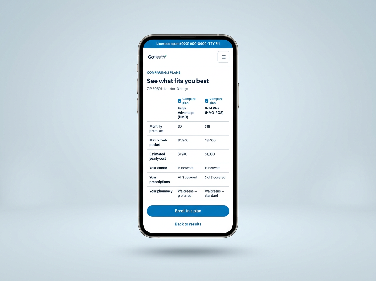
Every plan card carries a Compare plan box. After someone selects two plans, the checked boxes carry into the comparison view so it's obvious what's being compared and easy to swap one out.
I designed the comparison for both desktop and mobile. Desktop uses a familiar side-by-side table; mobile keeps the same two plans in fixed columns with shorter labels so people can compare without losing context.
The rows aren't a spec dump. They're the questions people asked in research, in that order: premium, max out-of-pocket, estimated yearly cost, doctor, prescriptions, pharmacy, extras, plan type. Katherine's version of "which one is cheaper" is the yearly cost row, not the premium row.
Step 3 of 3
Comparing the 2 plans you picked
Each plan you checked with Compare plan shows up here. ZIP 60601 · 1 doctor · 3 drugs
Aetna Medicare
Eagle Advantage (HMO)
Humana
Gold Plus (HMO-POS)
| What you told us matters | Eagle Advantage (HMO) | Gold Plus (HMO-POS) |
|---|---|---|
| Monthly premium | $0 | $18 |
| Max out-of-pocket | $4,900 | $3,400 |
| Estimated yearly cost | $1,240 | $1,080 |
| Your doctor | In network | In network |
| Your prescriptions | All 3 covered | 2 of 3 covered |
| Your pharmacy | Walgreens — preferred | Walgreens — standard |
| Dental and vision | Dental only | Dental and vision |
| Plan type | HMO | HMO-POS |
☰Comparing 2 plans
See what fits you best
ZIP 60601 · 1 doctor · 3 drugs
Support
A "Need more help?" prompt when someone stalls
In research, people who got stuck didn't ask for help — they left. So I designed a prompt that appears when someone has been on the page a while without interacting: a small panel offering a licensed agent, with the phone number, TTY line, and a plain "No thanks, I'll keep looking" that dismisses it.
It's deliberately not a full-screen takeover and it never appears mid-typing. It's help offered at the moment of hesitation, not a sales gate — the same idea I proposed for the Medicare lead forms after the research study.
Need more help?
Comparing plans can take a minute. A licensed agent can answer your questions — no obligation to enroll.
Call (000) 000-0000TTY 711
Accessibility
Designed for 65+
This audience is the reason the interface is calm rather than clever. Every choice below was a constraint I set before drawing anything.
- Type size16px minimum body, 18px labels and results — no fine print anywhere in the flow.
- ContrastText and controls meet WCAG AA against white and against the blue fields.
- Targets48px minimum inputs, 56px primary buttons, generous spacing so mis-taps are unlikely.
- Real labelsVisible labels above every field instead of placeholder-only inputs that vanish on typing.
- Keyboard and screen readerNative selects and inputs, visible focus rings, and a live region announcing the result count.
- Plain language"Add a doctor," not "provider network lookup." Help text under fields that need it.
Where it landed
Why it never shipped
This didn't get built while I was at GoHealth. The team was already focused on the lead funnel I was shipping, and a plan-comparison tool needs carrier data, accurate pricing, and compliance review — a much heavier lift than a lead form.
It still shaped how I argued for self-serve paths. It's the example I use when a team assumes the only conversion path is to capture a phone number first, and the industry's move toward comparison tools since then suggests the instinct was right.
What I'd take forward
The weakest part of this concept is that I validated it against patterns I'd seen rather than against people. With what I know now, I'd build it as a coded prototype and run moderated sessions with eight to ten Medicare-eligible adults on their own devices — watching where they stall on plan-type language, whether the doctor and prescription inputs read as optional, and whether they still feel the need to call after seeing results. I'd also design the hard states I skipped: no plans match, only one plan matches, and a prescription that isn't found.