The premise
Most cafe loyalty is a spreadsheet with a logo
Punch cards and point balances are functional and forgettable. I wanted to find out what happens when the reward system is the reason you open the app.
The work
Mochi bits, streaks, and levels
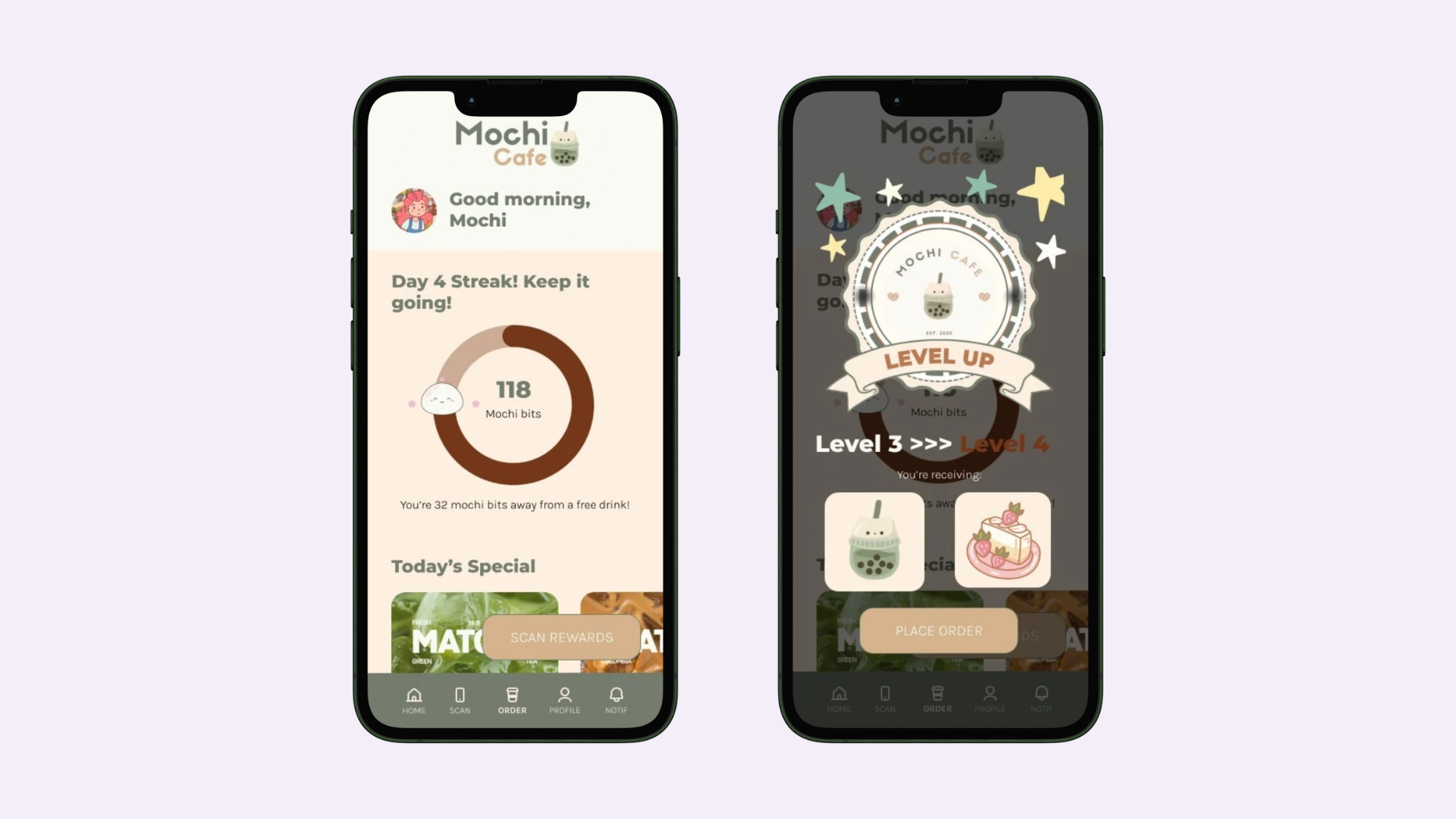
The home screen leads with a streak ring and a personal greeting, so progress is the first thing you see. Points became "mochi bits" — a named currency with a character attached, which makes the balance feel like something rather than a number.
Ordering stays boring on purpose: size, quantity, add to cart, pickup time. Playfulness belongs in the reward layer, not the transaction.
- StreaksDaily progress ring with a visible next milestone.
- RewardsTiered unlocks at 25% and 50% toward a free drink.
- LevelsCelebration moment with exclusive sticker rewards.
Brand
A full style guide, because loyalty is brand
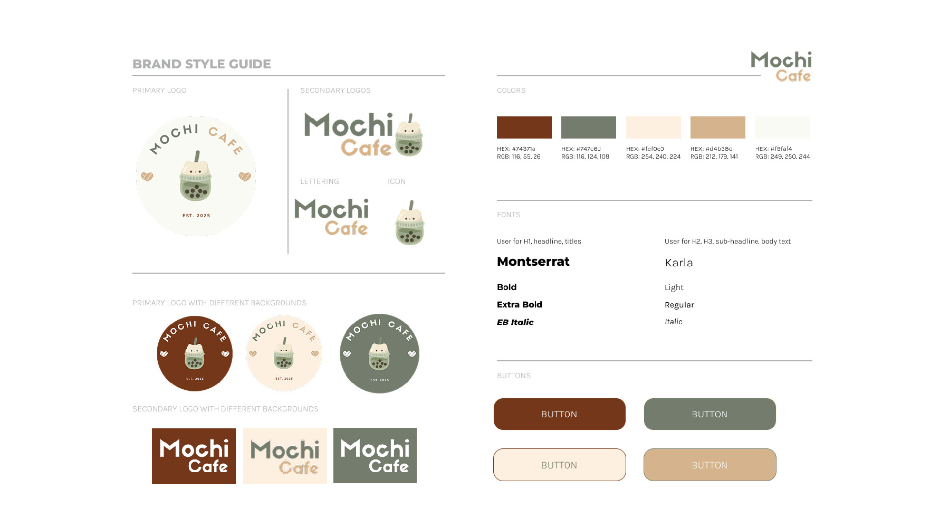
I built a complete identity — primary and secondary logos, background variants, a warm five-color palette, Montserrat and Karla type pairing, and button states — so the app feels like one place instead of a set of screens.
Outcome
A reward loop worth returning to
The result is a full concept — brand guide, ordering flow, checkout, reward scanning, redemption, and level-up states — designed as a system rather than a portfolio mockup.
View the Figma prototype ↗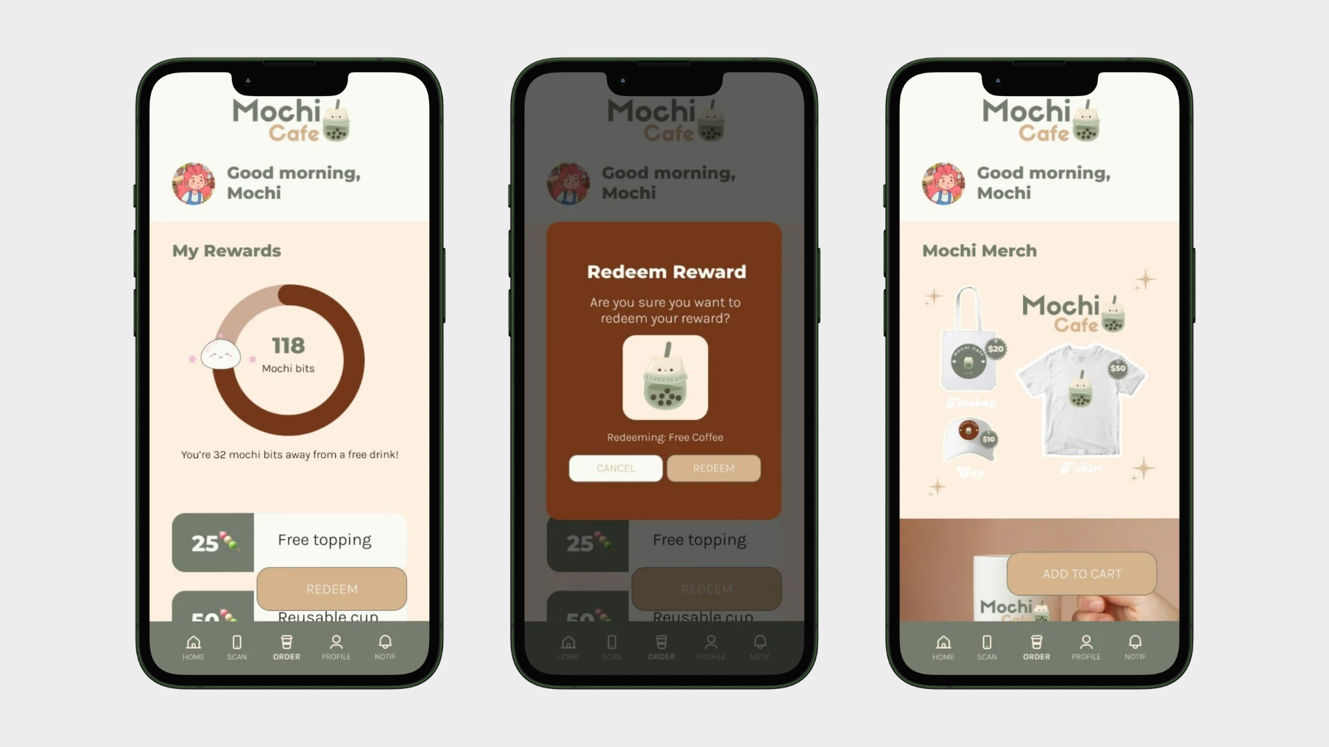
What I'd take forward
Every playful element had to survive one question: does this make someone come back tomorrow? To answer that properly I'd need real behavior, so next time I'd build the streak and reward loop as a working prototype and run it with a small group over two weeks. I'd also design the empty and broken-streak states first.