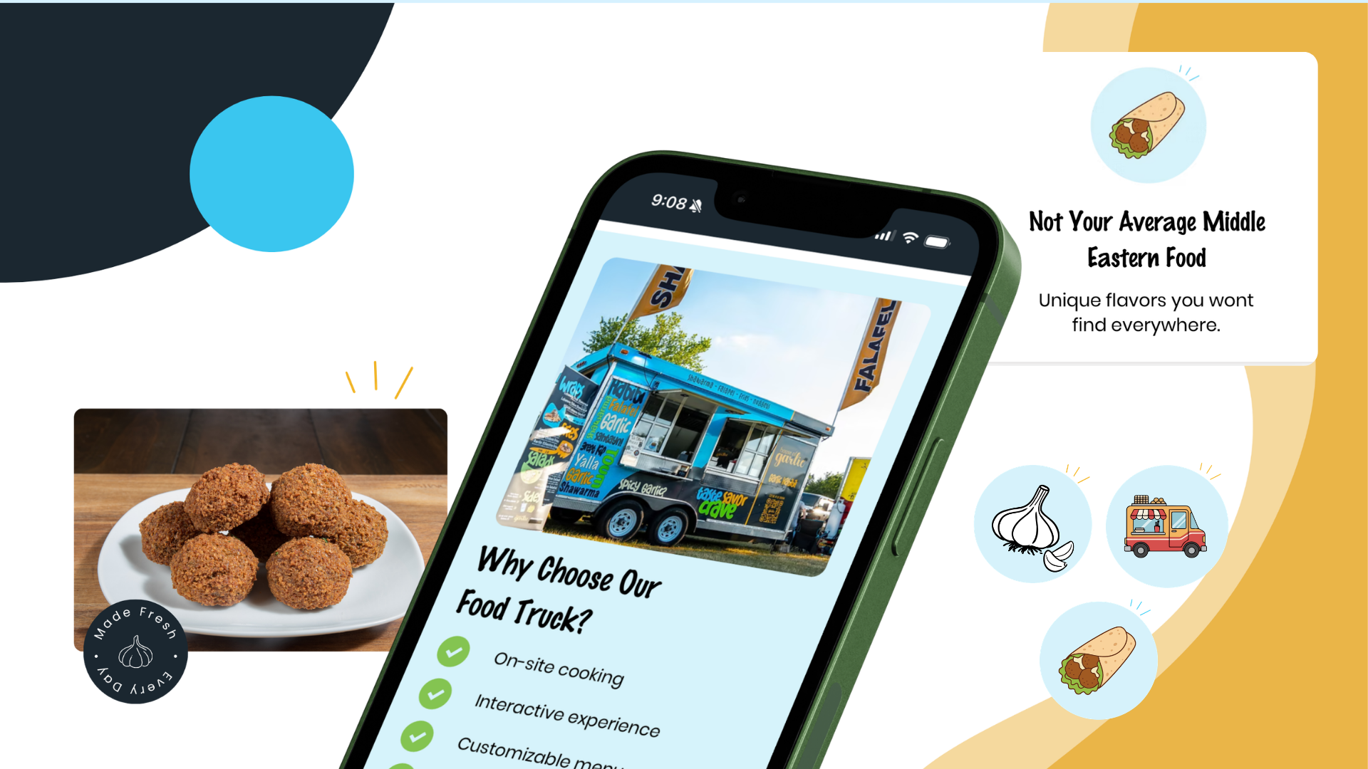
What I did
Redesigned the site around how people actually order
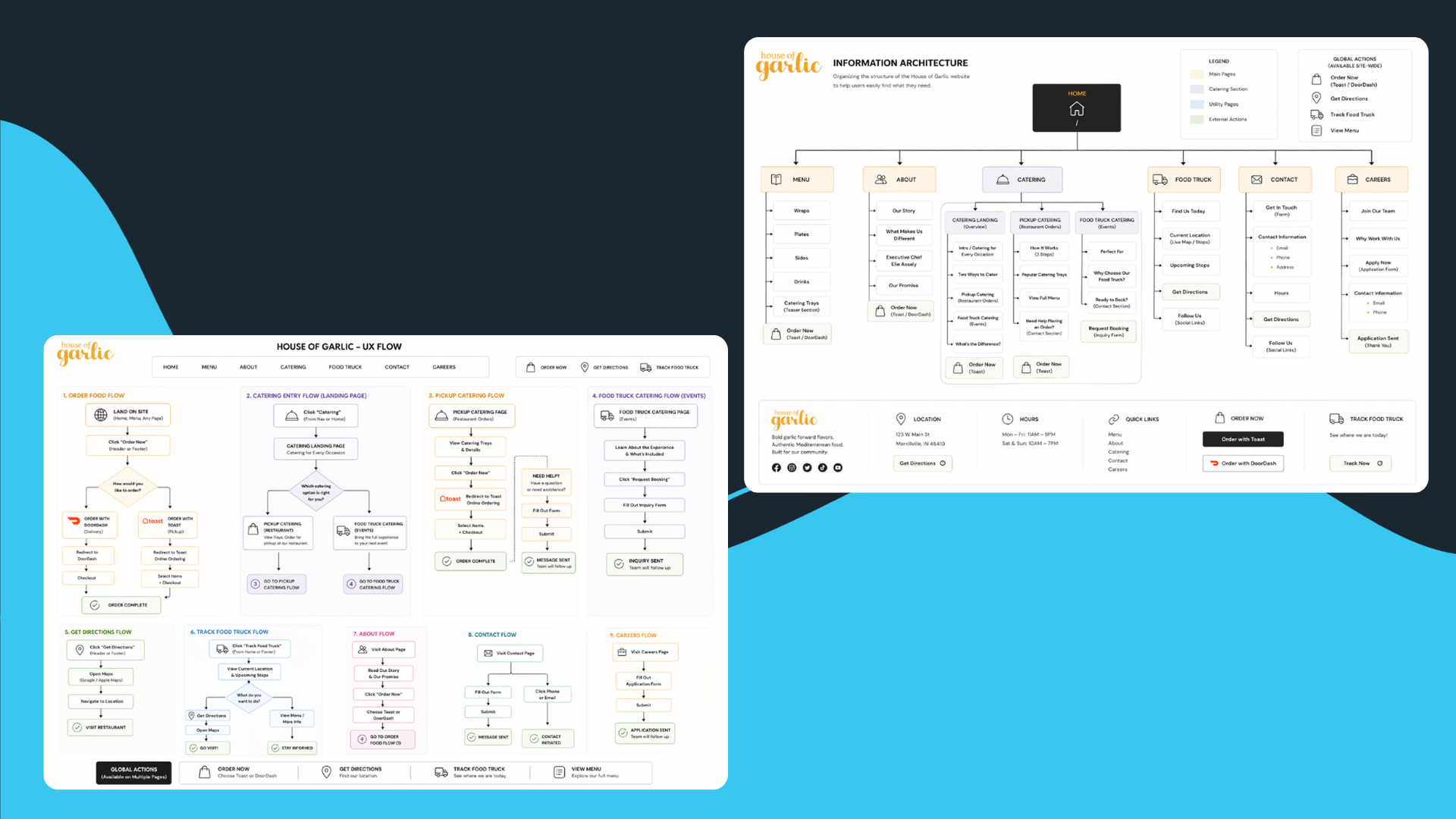
I mapped the whole site into three parallel journeys — order now, browse the menu, book catering — and gave each one an unmistakable entry point. The information architecture and flows came first so nothing had to share a slot.
- NavigationRebuilt around ordering, menu, and catering.
- OrderingToast and DoorDash integrated as paths, not escape hatches.
- CateringTwo clear tracks: pickup trays and food-truck catering.
Menu
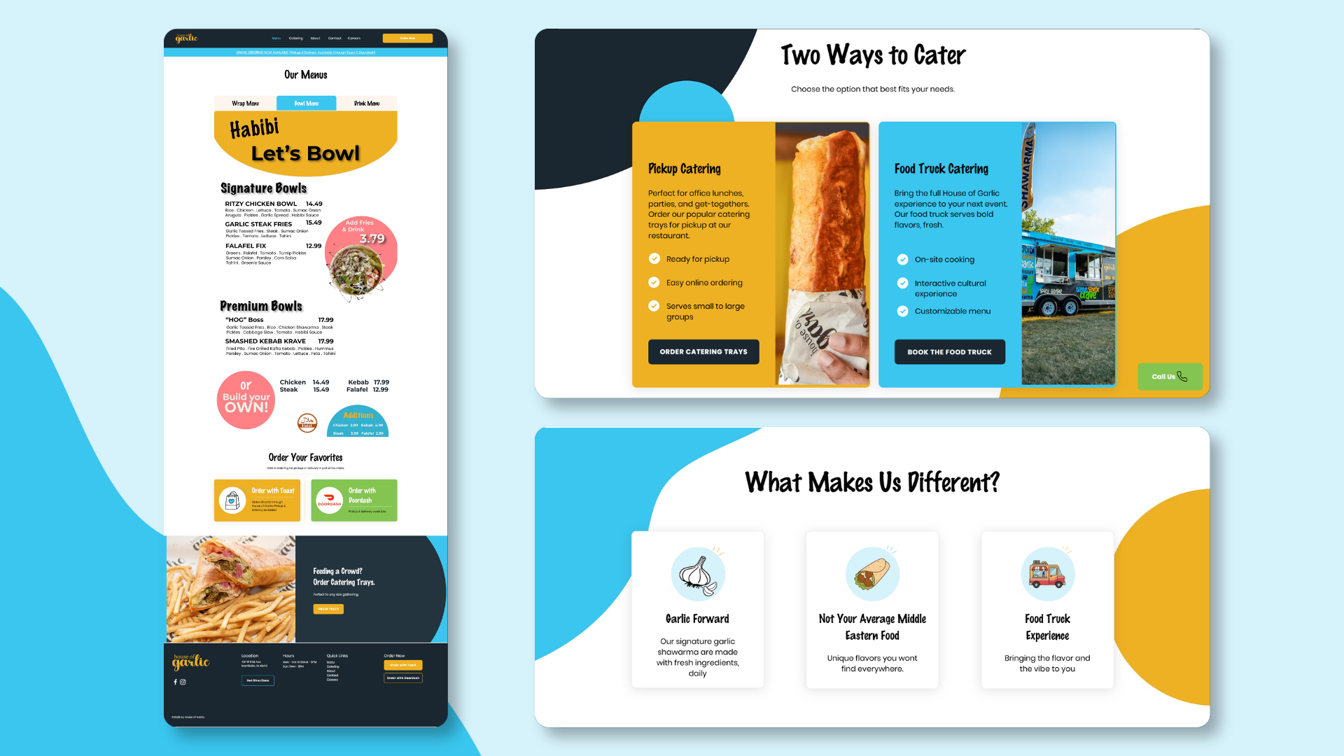
Category-first browsing with the food up front
The menu was restructured into scannable categories with photography of the actual food and prices in plain view, so browsing feels like looking at a counter instead of reading a document.
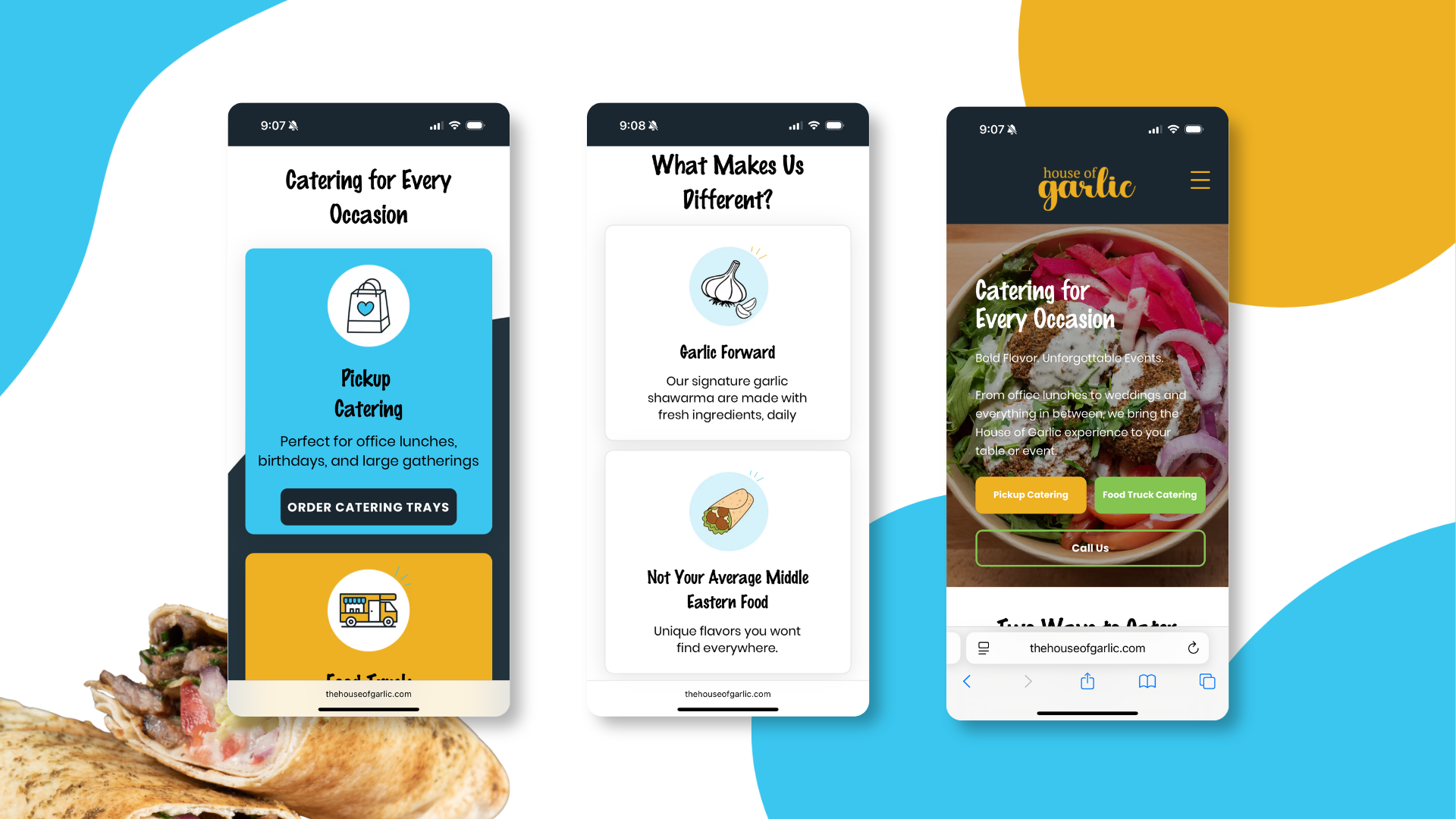
Mobile
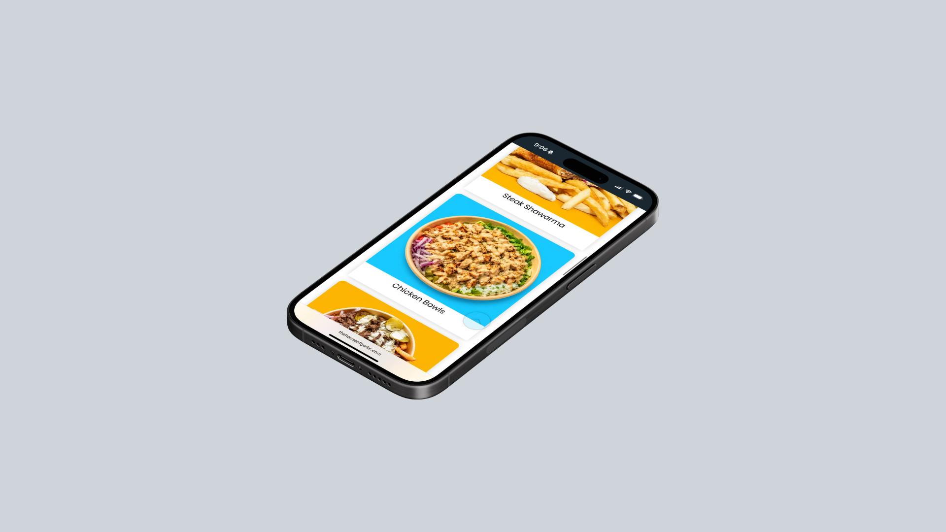
Designed for a phone in a parking lot
Nearly all ordering happens on a phone, so the mobile layout led the design rather than following it. Catering, ordering, and calling are all reachable without scrolling into the fold.
Brand
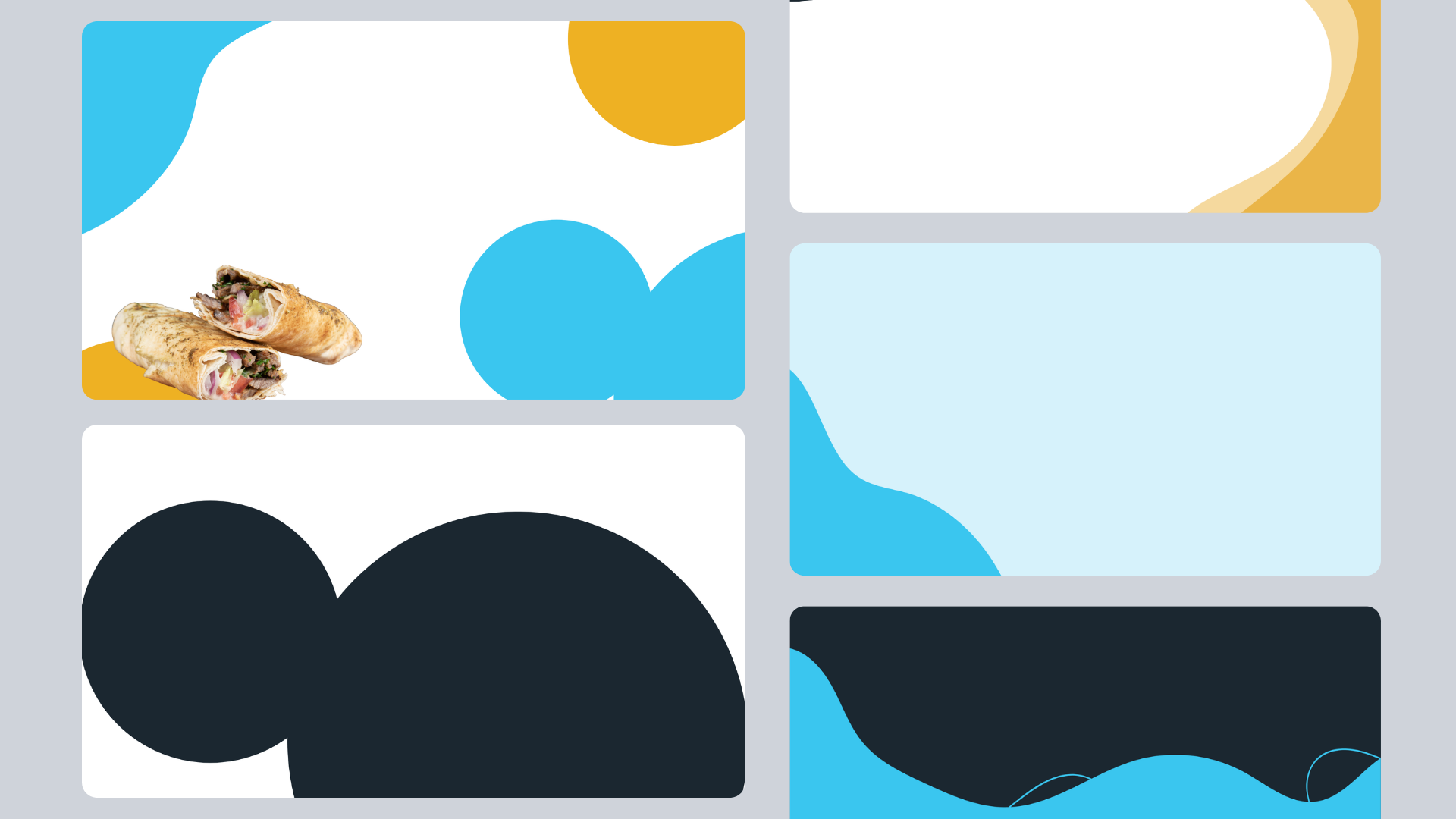
A visual system that carries the food truck energy
I extended the brand into a set of reusable shapes, color blocks, and card treatments so new pages and promotions stay on-brand without redesigning anything.
Design system
Every asset, from the icons to the ordering patterns, comes from one system
I created the full visual toolkit and maintained it across the website: the icon family, illustrations, color roles, typography, button hierarchy, food cards, navigation, calls to action, and reusable page sections. The goal was to make a growing restaurant, food truck, and catering business feel like one recognizable brand at every touchpoint.
The library reflects the real complexity of the business. Ordering needs immediate actions, menu browsing needs repeatable food cards, catering needs longer explanation, and the food truck needs location and contact patterns. Shared foundations keep those journeys connected while each pattern does a different job.
- Brand foundations#172833, #F4B51F, #3BBCE1, #7AC943, and #FFFFFF; expressive display lettering paired with clear interface type.
- Logo rulesThe hand-lettered House of Garlic wordmark stays legible across the dark navigation, photography, and promotional color fields.
- Assets I createdIcons, illustrations, brand shapes, category graphics, and campaign elements designed to stay recognizable at web, menu, and social sizes.
- Commerce patternsPrimary order actions, menu-category cards, featured-item cards, pickup and delivery choices, and direct links into Toast and DoorDash.
- Service patternsSeparate modules for pickup catering, food-truck catering, changing truck locations, phone contact, and event booking.
- MaintenanceReusable sections and documented roles let new menu items, promotions, and service pages stay consistent without recreating the brand each time.
Fresh flavor with
a handmade point of view.
A flexible identity built for menus, ordering, catering, and the food-truck experience.
BRAND RHYTHM
01 / FOUNDATIONS
TYPE + VOICE
Big appetite.
Zero pretense.
02 / COMPONENTS / WEBSITE SOURCE OF TRUTH
MENU CATERING ABOUT CONTACT CAREERS
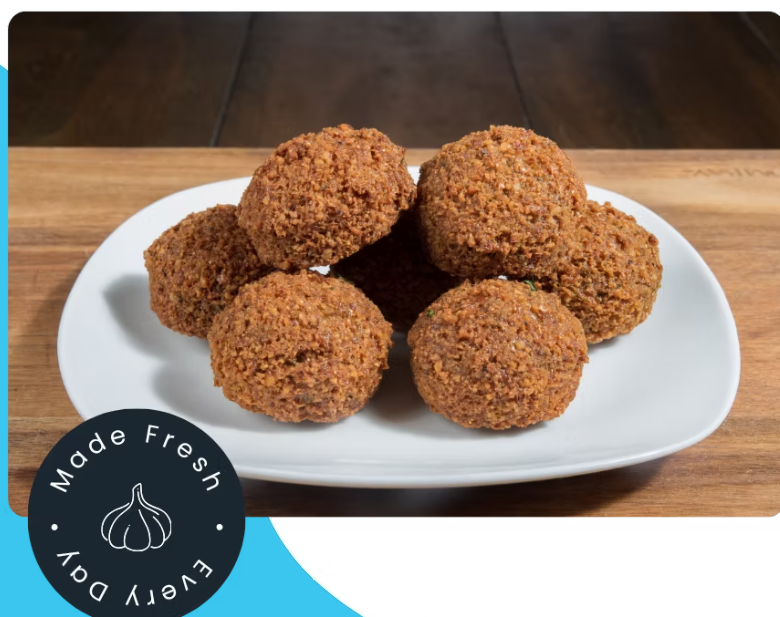 IMAGE + STAMP PATTERN
03 / ICON LIBRARY / CREATED BY ME.
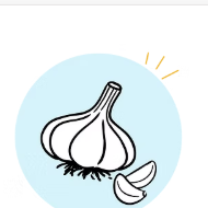
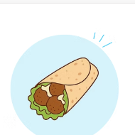
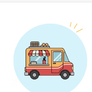
ILLUSTRATION RULES
- 01BOLD OUTLINEKeeps every asset recognizable.
- 02FLAT COLORUses the core palette only.
- 03PLAYFUL SCALEMakes utility feel memorable.
04 / PATTERNS / CATERING
Gather around
the good stuff.
Office lunches, birthdays, and large gatherings.
ORDER CATERING TRAYS
Bring the kitchen
to the party.
The full House of Garlic experience on location.
BOOK THE FOOD TRUCK05 / DO
✓ Let custom artwork carry the personality.
✓ Use #172833 for structure and readable type.
✓ Keep ordering actions direct and prominent.
DON'T
× Replace illustrations with generic icons.
× Add decorative colors outside the palette.
× Separate food photography from the brand marks.
Result
One experience for pickup, delivery, and catering
The result is a streamlined ordering experience that better supports pickup, delivery, and catering customers, and the food truck finally has a bookable home instead of a phone number in a caption.
Visit the live site ↗What I'd take forward
Given the same project now, I'd conduct research with real customers before locking the navigation, and build the ordering flow as a coded prototype so the owner could click through it before development started. I'd also plan for the truck's schedule to change weekly and build it so it updates itself, rather than linking out to Facebook for the current location.