The problem
A site that informed people without ever convincing them
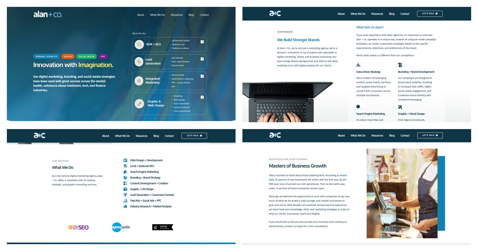
Alan + Co. had a working website. Navigation was fine, services were listed, the contact page existed. But leads weren't coming from it, and nobody internally could say why.
Looking at the pages, the pattern was hard to miss. Every section used the same layout, the same weight of type, and the same wall of paragraph text, so nothing led the eye anywhere. Services were grouped into broad buckets — "Integrated Marketing," "Graphic & Web Design" — that described categories instead of outcomes. Case studies existed but were buried, unlabeled, and thin on results. There was no visual hierarchy and no clear path from "this looks fine" to "I should contact them."
- No hierarchySame section pattern repeated down the page — headline, two paragraphs, stock photo.
- Vague positioningService lists that could belong to any agency in the country.
- Hidden proofCase studies with no measurable outcomes and no obvious entry point.
- No clear next stepContact was a nav item, not a moment the page built toward.
Research
I tested the site we had against what people expect from any agency
I ran two studies side by side. An unmoderated usability test in Maze with 11 participants doing real tasks on the live site, and a UX preference survey with 8 participants about what they look for in an agency website generally. One told me what people could do; the other told me what they wanted.
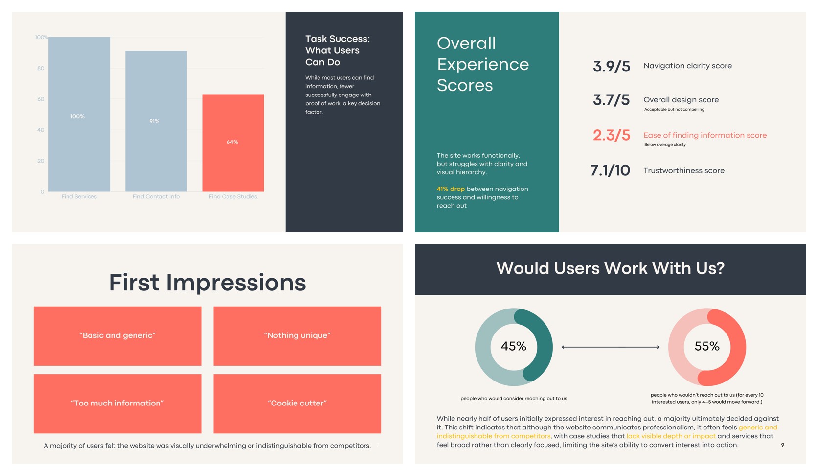
Task success was high — 100% found services, 91% found contact information. But only 64% found the case studies, the one thing that proves an agency can do the work. And the perception scores dropped hard where the decision actually happens.
"Basic and generic." "Nothing unique." "Cookie cutter." "Too much information."
- 19participants across usability testing and a UX preference study
- 3.9 / 5Navigation clarity — the site was usable.
- 3.7 / 5Overall design — acceptable, not compelling.
- 2.3 / 5Ease of finding information — the lowest score in the study and the reason for the rebuild.
- 7.1 / 10Trustworthiness — enough to browse, not enough to contact.
The insight
Usability wasn't the problem. Persuasion was.
45% of participants said they'd consider reaching out. After actually reading the site, 55% decided against it. That reversal was the whole finding: people weren't getting lost, they were getting unconvinced.
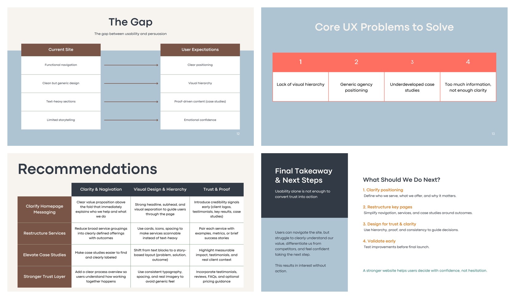
I framed it as a gap between what the site delivered and what people came looking for, and reduced it to four problems the redesign had to solve. That gave the team something to build against instead of a list of opinions about the homepage.
- 55%of users said they would not reach out after browsing the old site
- HierarchyFunctional navigation, but no visual order telling people what mattered.
- PositioningClean but generic — indistinguishable from competitors.
- ProofText-heavy sections where people expected results and real client context.
- ClarityToo much information, not enough of a story.
Brand
Alan + Co. became Running Point Media
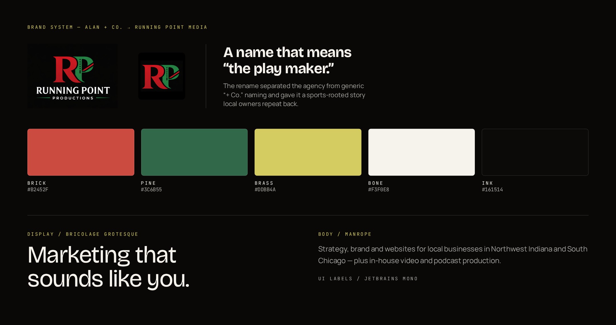
"Generic" started with the name. "+ Co." is what every small agency is called, and the research showed people couldn't tell the company apart from its competitors before they'd read a single line. The rename to Running Point Media borrowed a sports phrase the owners already used — the person who runs the point sets up the play — which gave the brand a story local business owners repeat back.
I built the identity around it: the RP mark, a deep ink base with brick red as the primary and brass as the accent, pine green carried over from the logo, and a Bricolage Grotesque and Manrope pairing that gives headlines real weight against quiet body copy. Every token got defined once so the site couldn't drift back toward beige.
Design
Restructured around outcomes, then built as real code
I mapped the new architecture before designing anything: a homepage that states who the agency serves above the fold, services broken into four named practices with outcomes attached, and case studies pulled up into their own labeled section with measurable results. Mockups and user flows covered the paths that mattered — homepage to service to case study to discovery call — including where someone lands from a Google search on a phone.
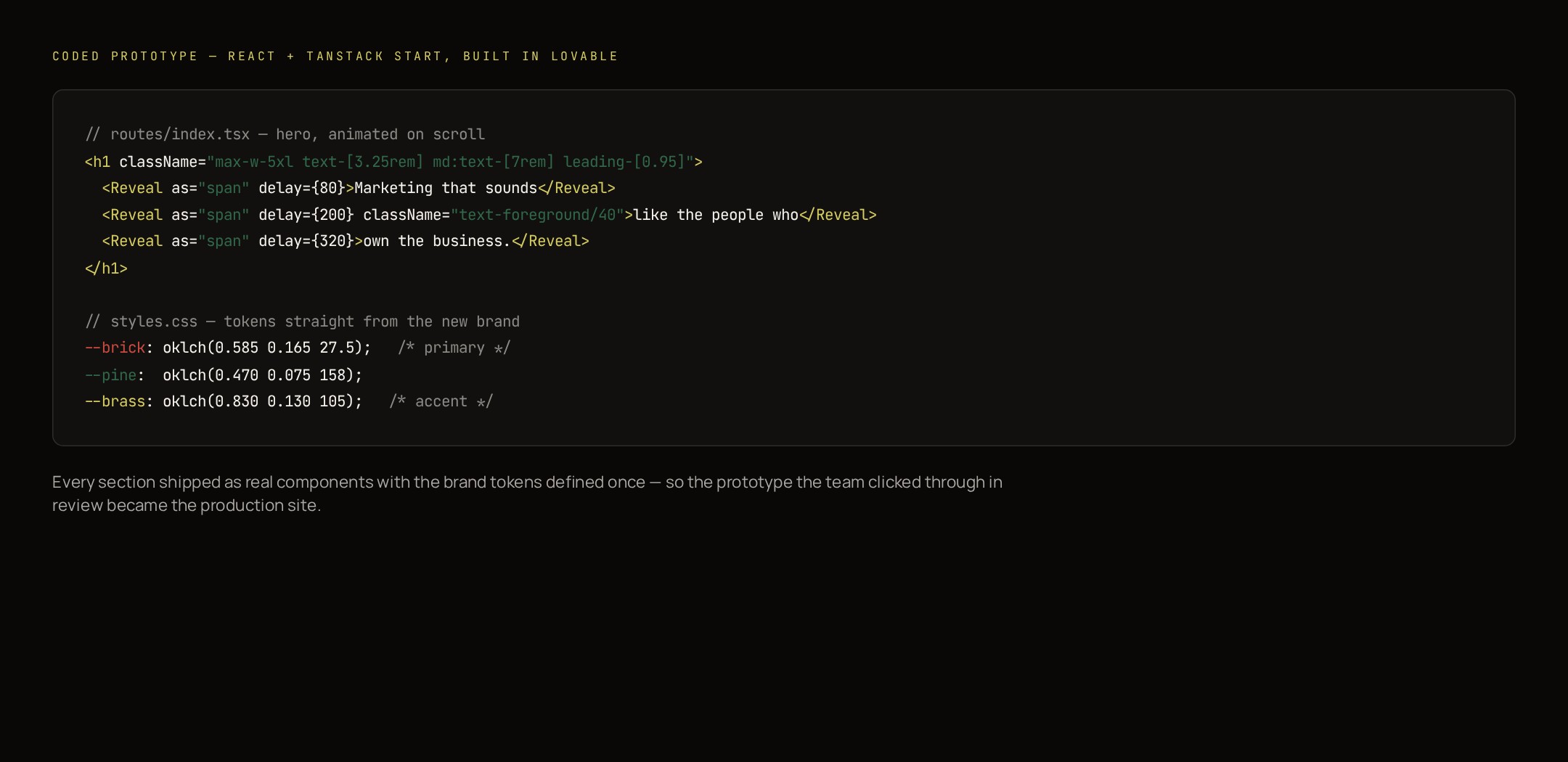
Instead of handing off static screens, I built the site as a coded prototype in Lovable — React with TanStack Start, brand tokens defined in one stylesheet, scroll-reveal animation and a real contact flow. The team clicked through the actual thing at review speed, which meant feedback was about hierarchy and copy rather than what a rectangle in Figma might feel like. That prototype became the production site.
Design system
An extensive library built to scale the brand without losing control
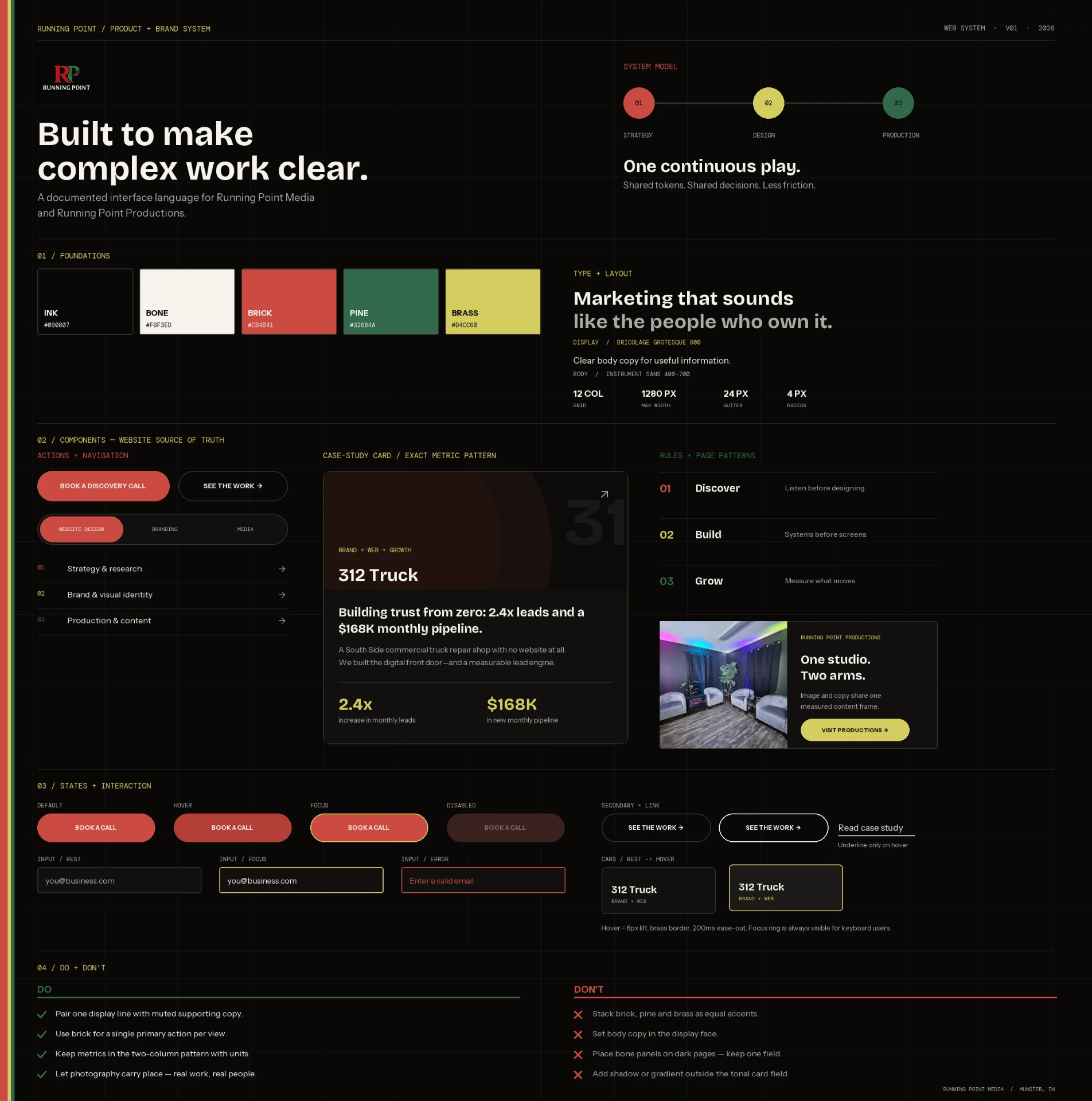
The rebrand could not live in a presentation and then dissolve page by page. I built and maintain an extensive design library that connects foundations, interface components, interaction states, content patterns, and page-level templates.
The system accounts for the complexity behind a growing agency site: responsive behavior, long and short content, form validation, service variations, and interactive tools. A new service, case study, or campaign can be assembled from documented decisions instead of redesigned from scratch.
- FoundationsBrick, pine, brass, bone, and ink roles; Bricolage Grotesque, Manrope, and monospaced interface labels; spacing and motion rules form the shared base.
- ActionsThe brick-red discovery CTA, quiet text link, field styles, and their interaction states are specified rather than inferred.
- ComponentsNavigation, the numbered service index, inquiry fields, case-study structures, and editorial labels share consistent anatomy.
- PatternsContact, discovery, comparison, recommendation, and results patterns cover complete tasks—not just isolated components.
- GovernanceNaming, usage guidance, accessibility notes, responsive rules, and examples make the library maintainable after launch.
- Built to extendThe live site, Service Matchmaker, Growth Readiness Scorecard, and future case studies all inherit the same system.
Interactive tools
Two tools that turn browsing into a conversation
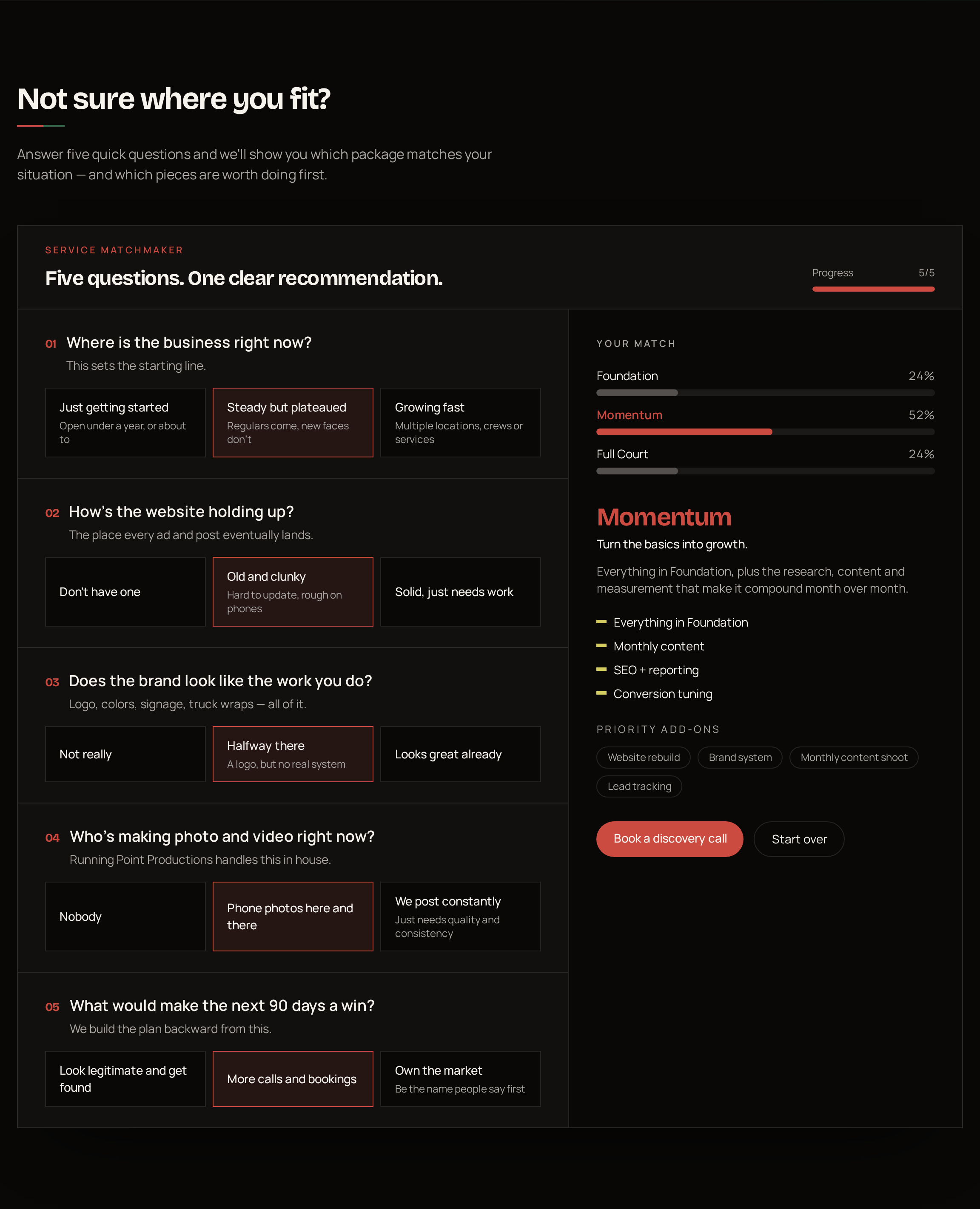
The research said people left the old site informed but unconvinced, and the biggest reason was that nobody could tell which service they actually needed or what shape their own problem was. A services list can't answer that. So instead of adding more copy, I designed two short interactive tools that let someone find their own answer in under a minute.
The Service Matchmaker sits on the Process page. Five plain-language questions — where the business is, how the website holds up, how the brand looks, who's making content, what a win looks like in 90 days — score against the three packages and land on one recommendation with the pieces worth doing first. It replaces the moment where a business owner has to guess at pricing tiers with a moment where the site tells them, and the answers double as qualifying information the agency now has before the first call.
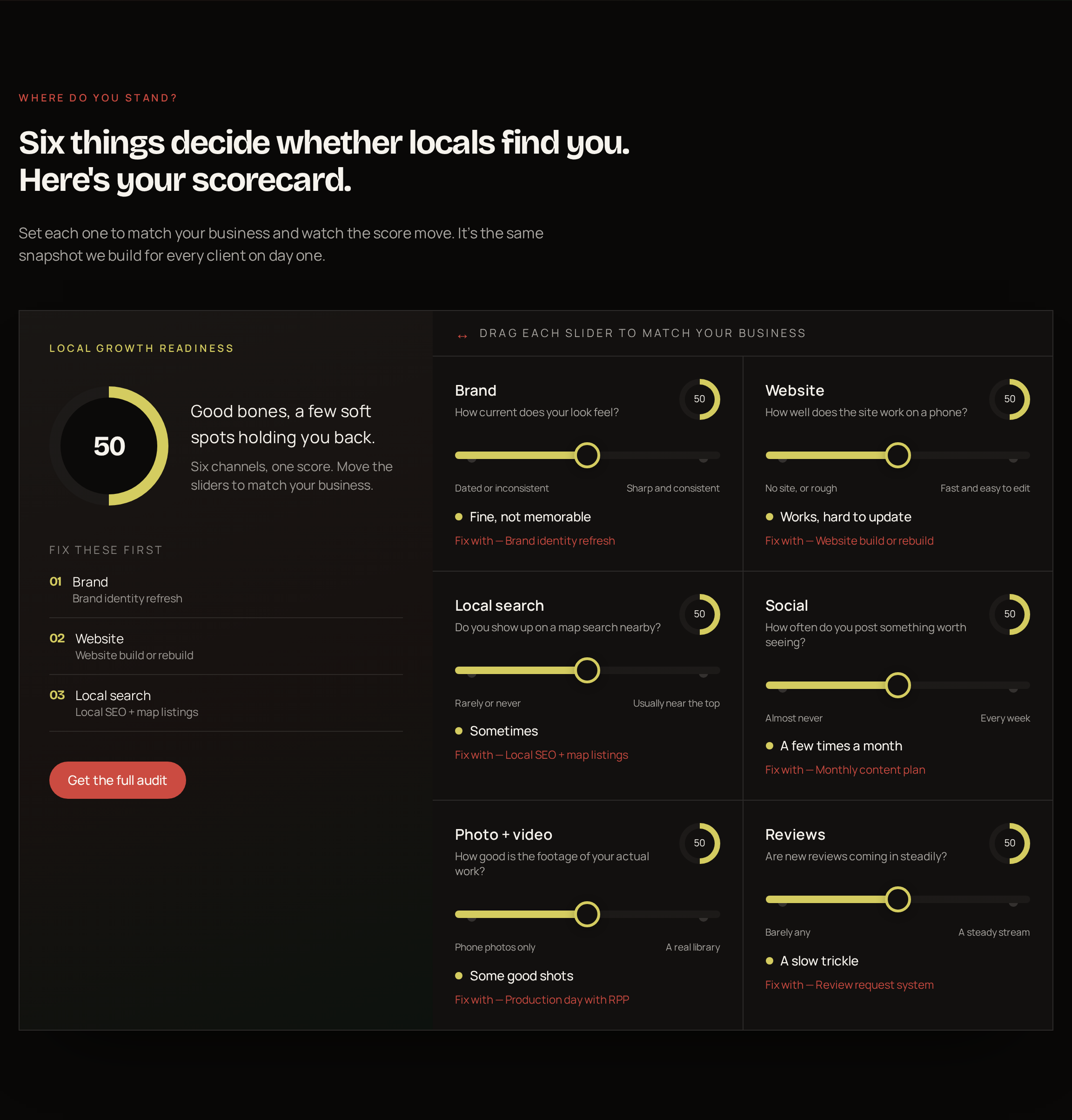
The Local Growth Readiness Scorecard sits on the About page. Six sliders — brand, website, local search, social, photo and video, reviews — move a single readiness score and surface a ranked "fix these first" list, each tied to a real service. It reframes the pitch: the site diagnoses the visitor's situation before it sells anything, which is the fastest trust-builder for an audience that assumes every agency will say they need everything.
- Why it worksBoth tools answer the question that stalled people on the old site — "which of this is for me?" — without a sales call.
- Lower commitmentA slider or a five-question quiz is a far easier first step than a contact form, so more people engage before they leave.
- Better first callsSomeone who arrives already matched to a package and a priority list makes the discovery call shorter and warmer.
- Built as real codeBoth are live components in the site, not mockups, so they were usability-tested in the browser on a phone.
Outcome
A site that leads somewhere
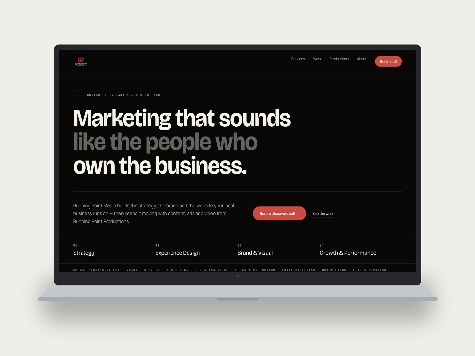
The new homepage opens with a type-led statement of who the agency works with, then breaks into four numbered practices, a services ticker, proof-driven case cards, and one obvious next step repeated down the page. The four problems from the research each have a section answering them.
Since launching, the site has driven a 106% increase in sessions, an 88% increase in direct traffic, and a 54% increase in unique visitors. It's live, and because it's code rather than a template, every future case study and service page drops into the same system without redesigning anything.
Visit the live site ↗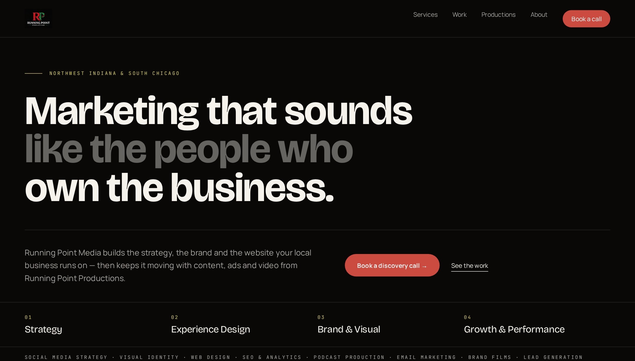
What I'd take forward
The next step is to run the study again on the new site. I'd repeat the same Maze tasks with a fresh set of local business owners so I get before-and-after numbers on the things the first study flagged: how quickly people find the case studies, how they rate ease of finding information, and whether they'd actually reach out. I'd add short follow-up interviews to hear how people describe the brand in their own words, and watch a few sessions on mobile since that's where most of this audience lands.