Framing
The research shipped. The solutions didn't.
I want to be clear about what happened here, because it matters for how the work reads: the study was real, it was delivered, and it was presented to Marketing leadership including the VP of Marketing. The design recommendations that came out of it were not built during my time at GoHealth.
So the numbers on this page are research findings — what people told me — not performance results. Nothing here claims a lift it didn't earn. What the study did produce was a shared, evidenced view of the customer that changed the conversation internally, and a concept that grew directly out of it.
The question
Why does a process this common still feel this hard?
Medicare sign-up is something almost everyone goes through once, at 65, with real money and real doctors on the line. Internally the assumption was that the friction was informational: people didn't know enough yet. I wanted to test whether that was actually the problem before anyone redesigned another page.
The study ran remotely: moderated interviews plus a survey with 40 Medicare-eligible and near-eligible adults, ages 45 to 65, in 10 to 15 minute sessions. I asked about their perception of Medicare marketing, how they navigated existing sites, how they made their enrollment decision, and what they actually understood about Open Enrollment.
- Goal 1Understand the emotional and informational barriers people hit during sign-up.
- Goal 2Find out how current Medicare marketing lands — tone, imagery, and timing.
- Goal 3Give internal teams evidence they could act on before the next Open Enrollment.
Alignment
Where the business and the customer actually wanted the same thing
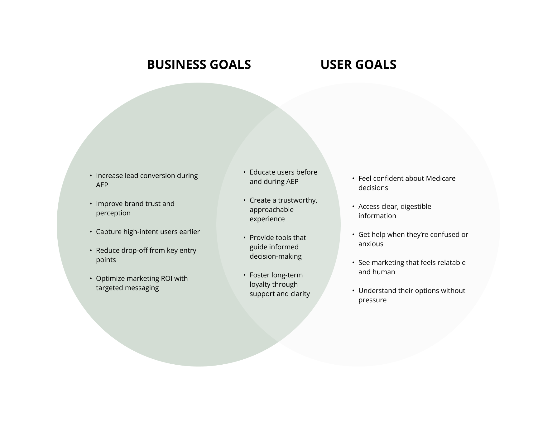
Before I recommended anything, I mapped business goals against user goals so the recommendations couldn't be dismissed as "nice for users, bad for conversion." The overlap was the argument: educating people earlier and building trust served lead conversion, not against it.
What people said
The barrier was emotional, not informational
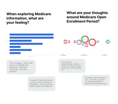
The survey data set the shape of the problem, and the interviews explained it. People weren't missing facts. They were afraid of being wrong, and the advertising they saw made them feel like the wrong kind of person for the product.
"I'm scared I'll choose the wrong plan." "I don't know who to trust." Nobody asked me for more information.
- 34 of 40found Medicare confusing or overwhelming.
- 30 of 40felt anxiety about making the wrong decision.
- 28 of 40found Open Enrollment marketing overwhelming.
- 26 of 40said the imagery made them feel old or unrepresented.
- 24 of 40felt Open Enrollment was rushed and wanted guidance earlier.
- 21 of 40found the websites cluttered or hard to navigate.
- 19 of 40preferred talking to a real person but weren't sure how to reach one.
- 16 of 40wanted clearer next steps after submitting a form.
Synthesis
Clustering 40 conversations into five real problems
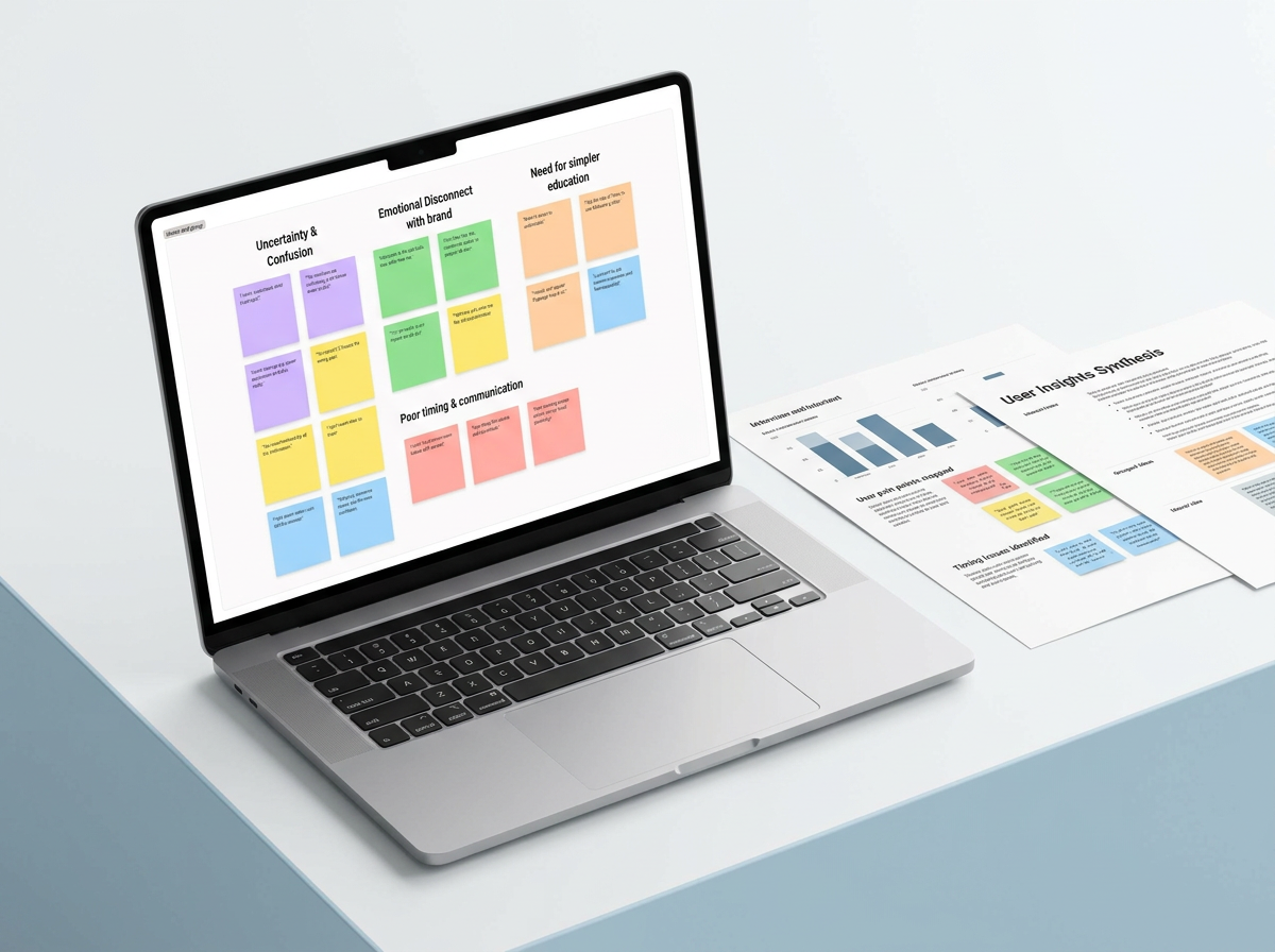
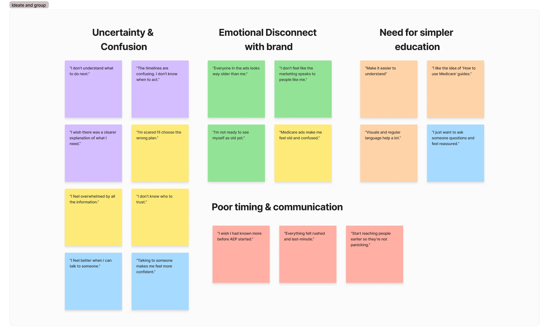
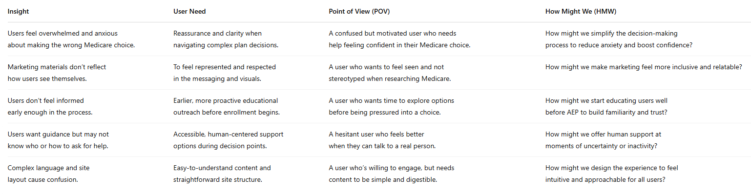
I pulled every quote onto a board and clustered it until the themes stopped moving. Four groups held: uncertainty and confusion, emotional disconnect from the brand, a need for simpler education, and poor timing and communication.
Then I turned each cluster into an insight, a user need, a point of view, and a How Might We — so the handoff to marketing and product was a set of design prompts, not a slide of complaints.
Personas
Two people the team could argue with
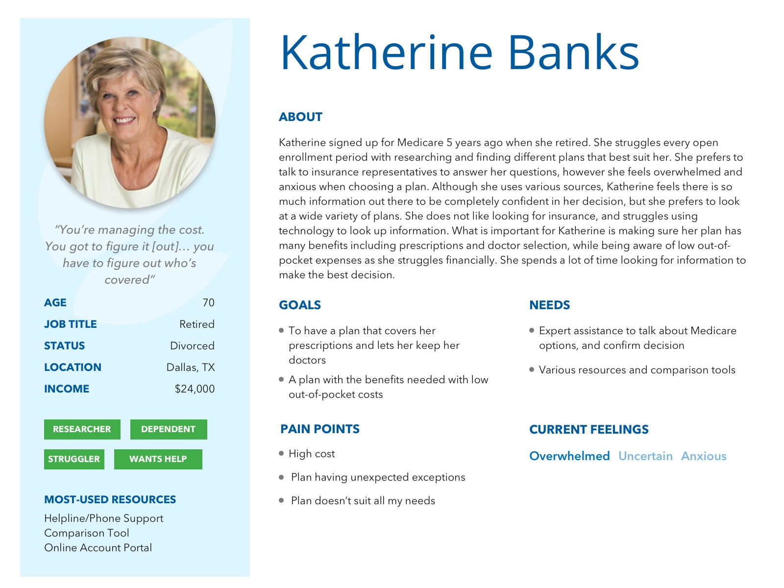
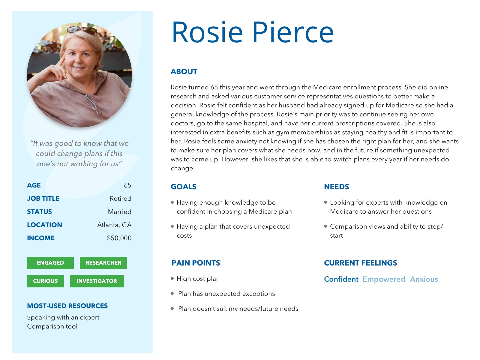
I built the personas from the interviews, the survey, and what enrollment agents told me callers open with. Katherine re-shops every year and dreads it. Rosie had just turned 65, researched online, and still wanted an expert to confirm her decision.
They stayed useful because they were specific: income, resources they actually use, and the exact feelings they arrive with. In review meetings, "would Katherine understand this?" ended more debates than any deck slide.
Recommendations
What I asked the team to change
The recommendations followed the clusters one to one, and I designed the ones that needed to be seen to be understood.
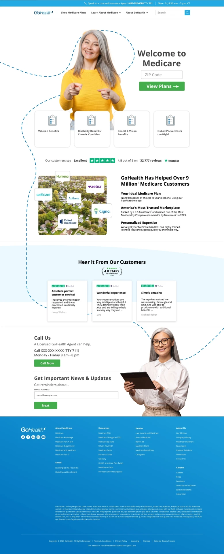
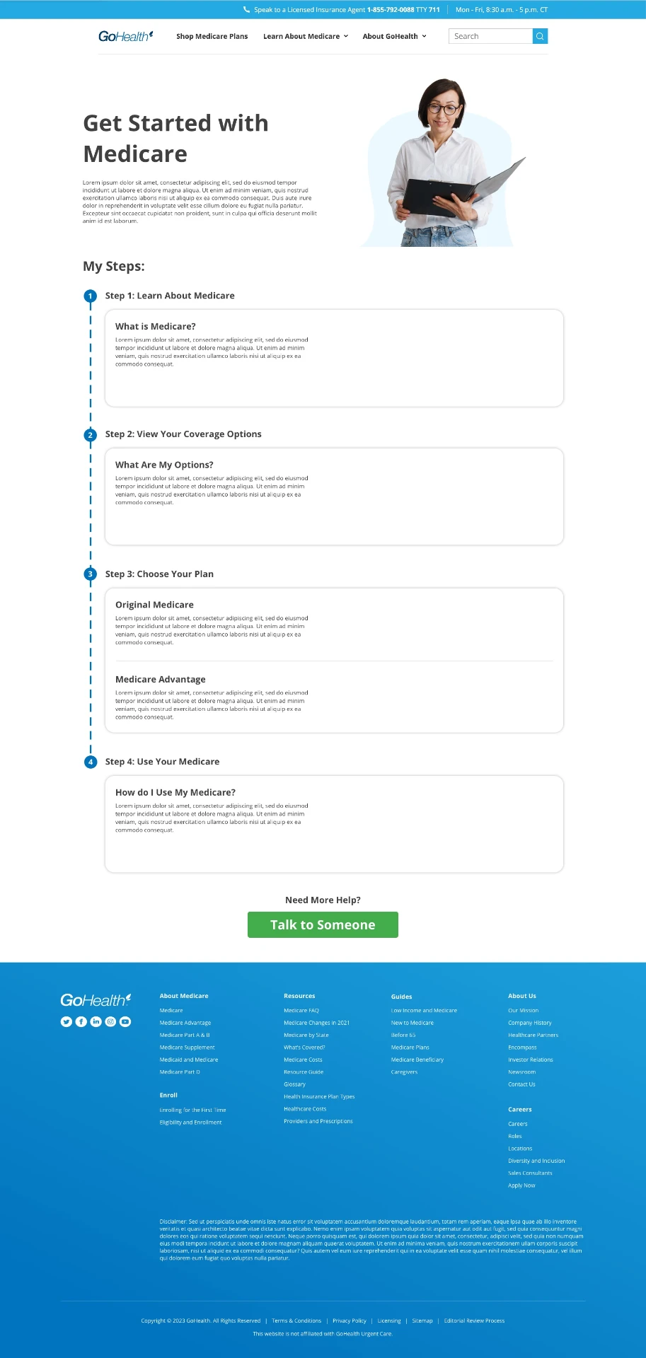
The entry page drops to a single question — your ZIP code — with reviews and a persistent Call Us option in view, because trust had to be established before anything was asked for. The education page breaks Medicare into four numbered steps in plain language with a Need more help? prompt at the end, because people wanted to learn before they were sold to.
- Guide, don't dumpStep-by-step flow, plain language, progress indicators, and visuals instead of dense copy.
- Offer help at hesitationA representative callout when someone goes inactive on a form, instead of waiting for them to leave.
- Show people themselvesAge-inclusive imagery and scenarios that don't read as clinical or condescending.
- Start before AEPEducational outreach ahead of Open Enrollment, so decisions aren't made under time pressure.
- Say what happens nextTransparent post-submission steps, and downloadable guides for people who want to read first.
The handoff
Presented to Marketing leadership
I presented the findings, personas, and recommendations to Marketing leadership and the VP of Marketing ahead of Open Enrollment. The goal wasn't approval for a redesign — it was to replace "seniors are confused" with a specific, quotable picture of who we were talking to and what scared them.
The most direct outcome was the plan comparison concept. People said, repeatedly, that they wanted to see and compare options themselves before talking to anyone. Nothing on the site let them do that, so I designed it.
See the Plan Finder concept ↗What I'd take forward
I'd change two things. First, sessions were 10 to 15 minutes, which was enough to surface feelings but too short to watch anyone actually complete a task — next time I'd run a shorter survey to a larger group and a smaller set of 45-minute moderated sessions on real screens. Second, I'd close the loop: build the recommendations as a coded prototype and re-test them with the same participants, so the study ends in evidence that the fix worked instead of a set of recommendations waiting on roadmap space.