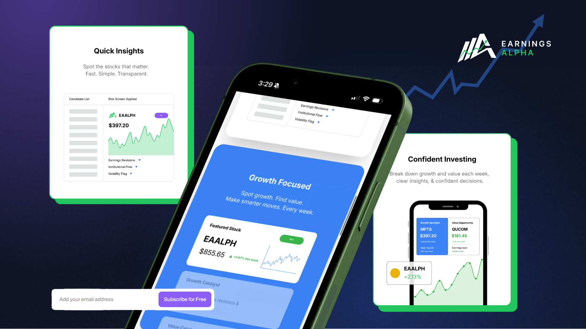
The problem
Good analysis, packaging that read as a scam
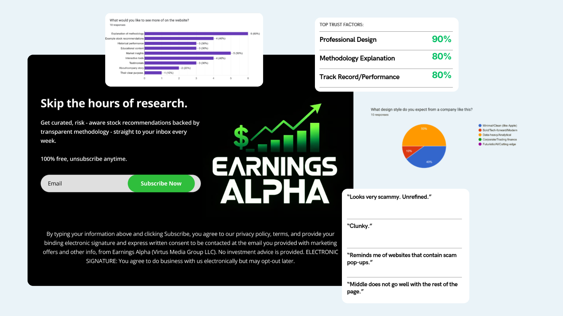
The analysis was genuinely good. The landing page wasn't — neon green on black, a headline that promised a lot, and nothing that showed how any of it worked. People used words like "scammy," "clunky," and "reminds me of websites with scam pop-ups."
Nobody hands over an email to a finance product they can't judge. Traffic came in, read for a few seconds, and left.
Research
Understanding why people didn't trust the product
Before designing anything, I wanted to know what investors needed to see before they'd trust a financial product enough to subscribe. People were actively looking for three things: a clear methodology (60%), actionable market insights (50%), and proof of value through examples and past performance (40%).
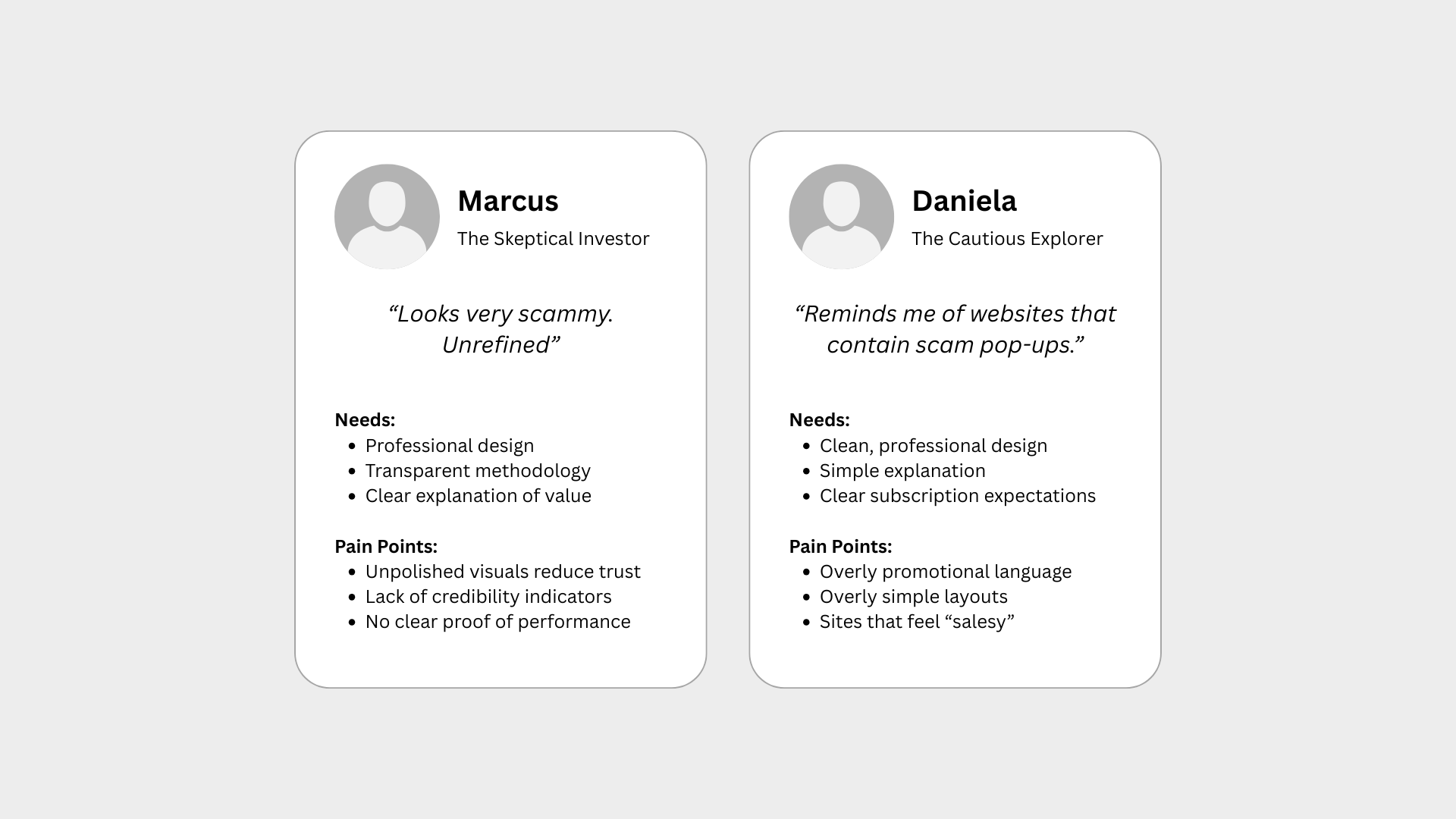
Without those, there was no way to justify subscribing — which explained the bounce rate and the flat conversion. Two profiles kept showing up: the skeptical investor who needs proof, and the cautious explorer who needs a plain explanation before committing.
Competitive analysis
Easy to read, or worth trusting — rarely both
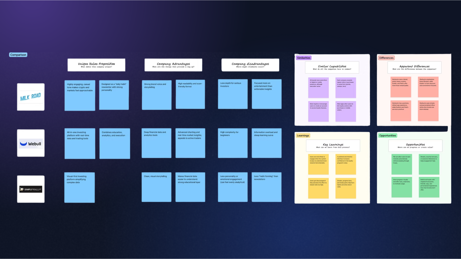
I looked across financial content platforms, investing tools, and market research products to find where Earnings Alpha could sit.
Financial content platforms were easy to understand, engaging, and welcoming to newer investors — but thin on depth, light on credibility signals, and generic in their recommendations. Advanced trading platforms had the opposite problem: real analysis and professional authority behind overwhelming interfaces and steep learning curves that shut out casual investors.
The open space was the middle: real analysis, explained like a person wrote it.
Strategy
From research insights to design decisions
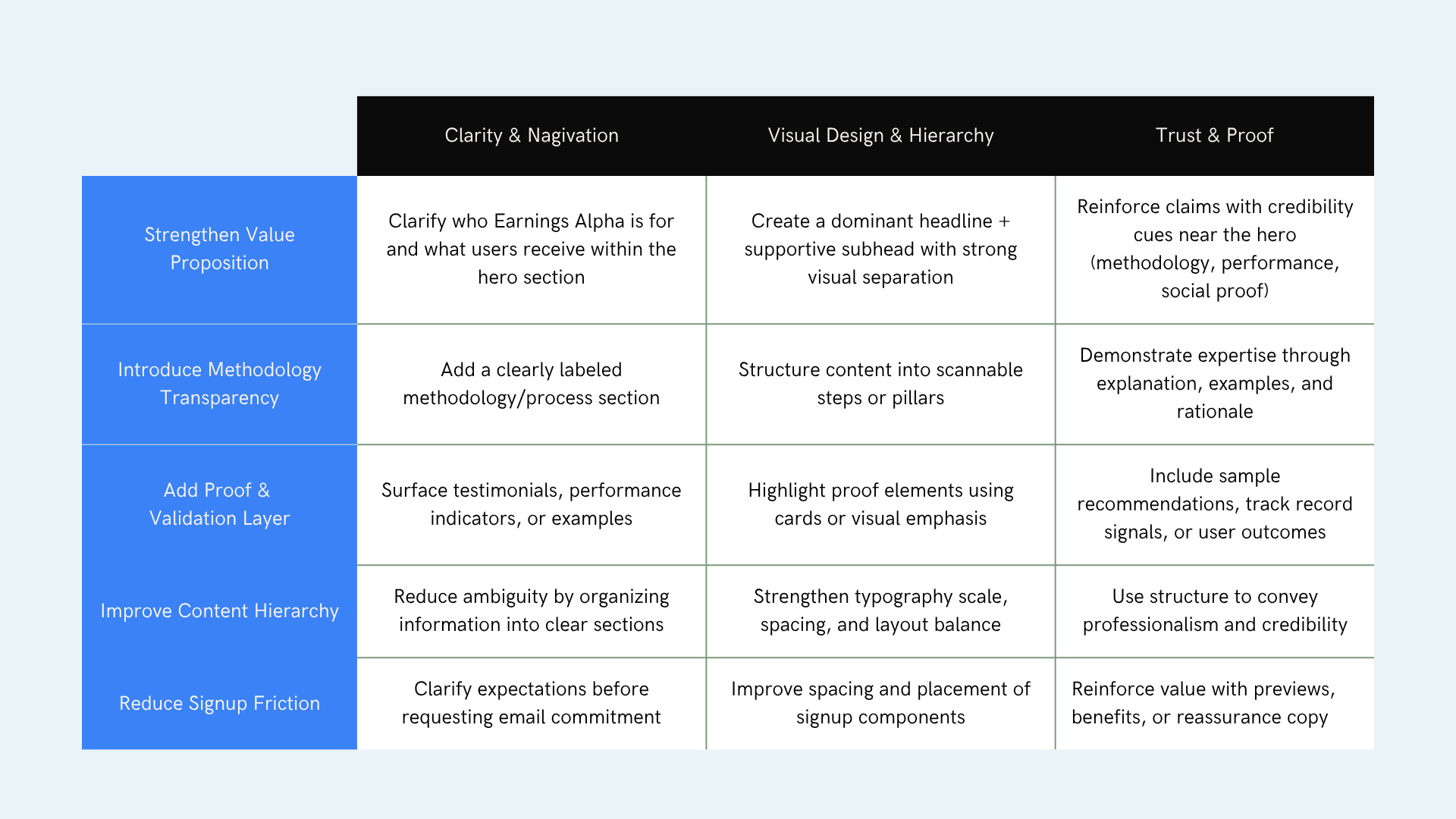
The findings made it clear this wasn't a visual design problem. People needed immediate clarity, proof of expertise, methodology transparency, less signup friction, and stronger credibility signals.
Those five needs became the checklist every design decision had to answer to.
- ClaritySay who it's for and what you get, in the hero.
- MethodologyA labeled section explaining how picks are made.
- ProofSample recommendations and performance signals, up front.
- HierarchyScannable sections instead of one long pitch.
- FrictionSet expectations before asking for an email.
The design
Structure first, then style
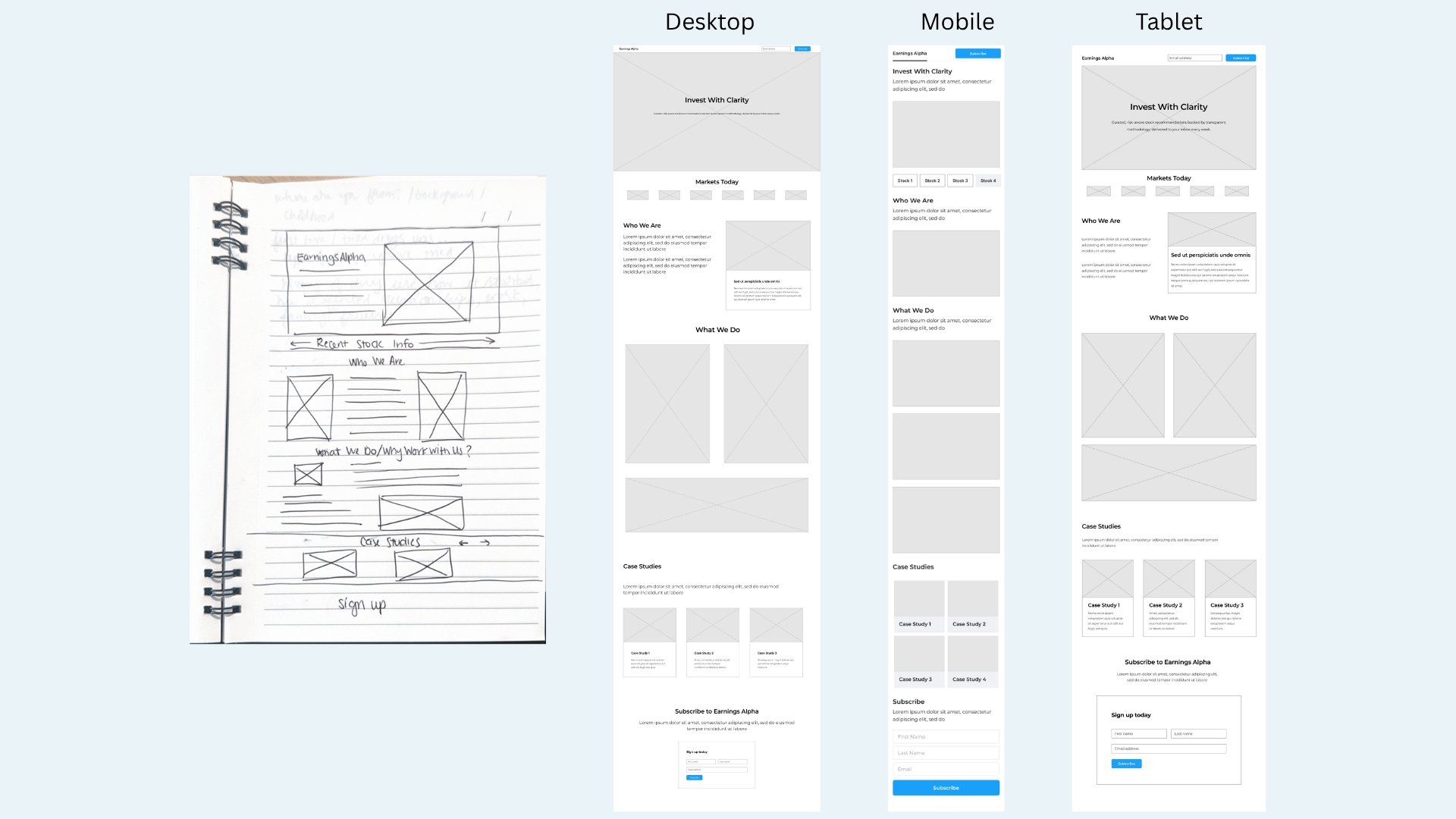
I wireframed desktop, tablet, and mobile from a paper sketch, sequencing the page so the argument builds: what this is, what the market looks like now, who's behind it, how it works, proof, then signup.
Only then did I build the visual system — a black and Alpha green identity with a stylized "A" made of upward bars, a documented type scale, and data components legible on a phone.
Design system
A system for making financial evidence clear and credible
I translated the identity into a reusable library for the landing page and weekly newsletter: foundations, action states, navigation, signup fields, methodology modules, performance cards, research labels, and responsive rules.
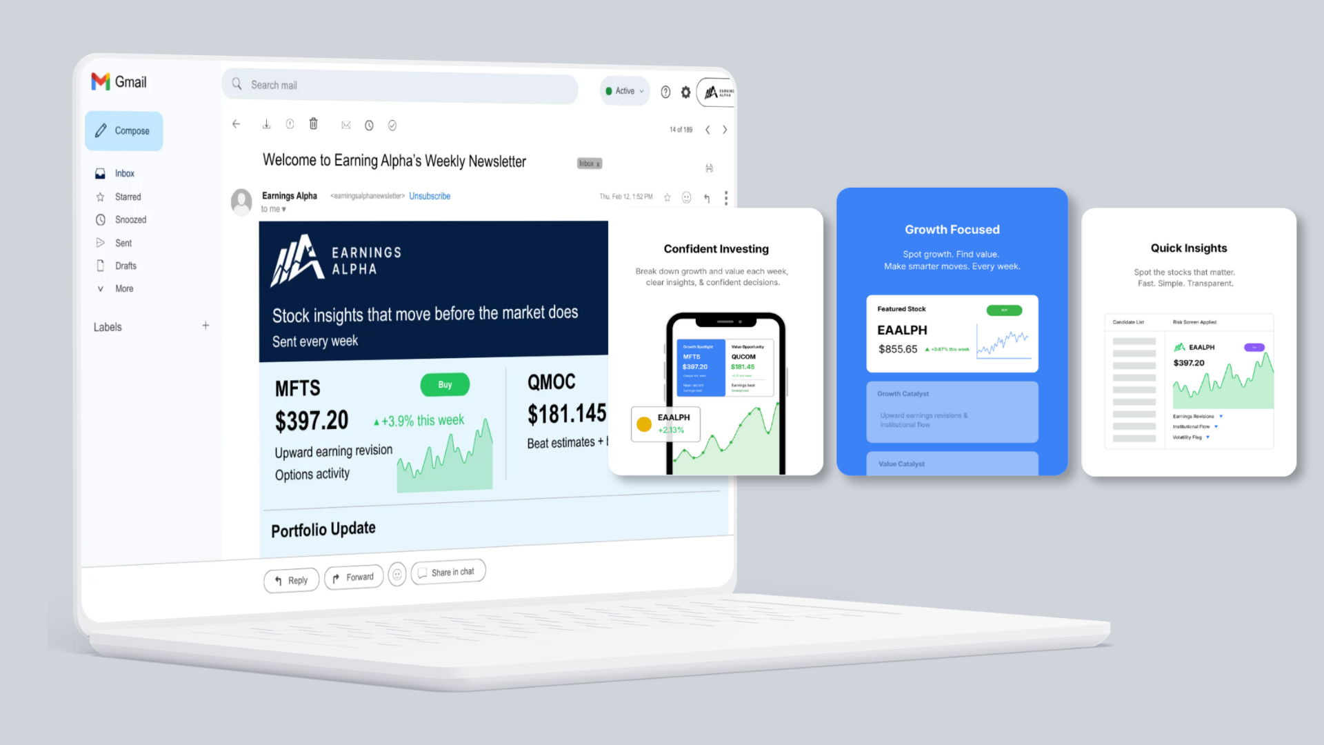
The system separates evidence from promotion. Alpha green signals positive performance and primary action, data colors support charts, and neutral surfaces keep dense analysis readable. The same hierarchy carries from the website into the product people receive after subscribing.
- Data foundationsA controlled palette, type scale, number formatting, spacing, dividers, and chart-label rules keep financial content comparable.
- Trust patternsMethodology explanations, analyst attribution, source notes, samples, and performance modules make proof visible before signup.
- ComponentsButtons, email fields, insight cards, ticker rows, article summaries, chart legends, notices, and newsletter sections share one anatomy.
- StatesPositive, negative, neutral, loading, empty, error, focus, success, and disabled states cover the moments data and signup flows can change.
- Across channelsWebsite and weekly email use the same hierarchy so the delivered product matches the promise that earned the subscription.
Design system library
Validation
Tested against the competition, not just itself
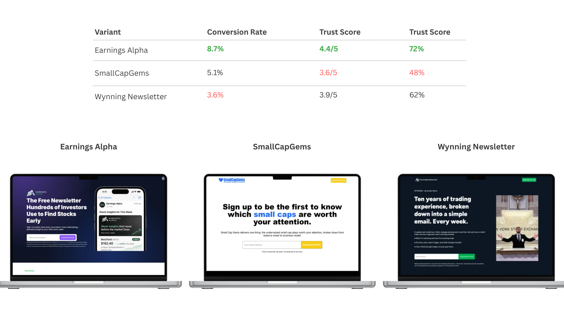
I put the redesign head-to-head with two competing newsletters. Earnings Alpha came out ahead on conversion, trust score, and how quickly people could say what the product actually did.
Impact
A page that argues its own value
Newsletter signups doubled. 64% of people preferred the new design over the alternatives, and 72% could state the value proposition without prompting.
The same system carried into the weekly email, so the thing people subscribed to looks like the thing that convinced them.
Visit the live site ↗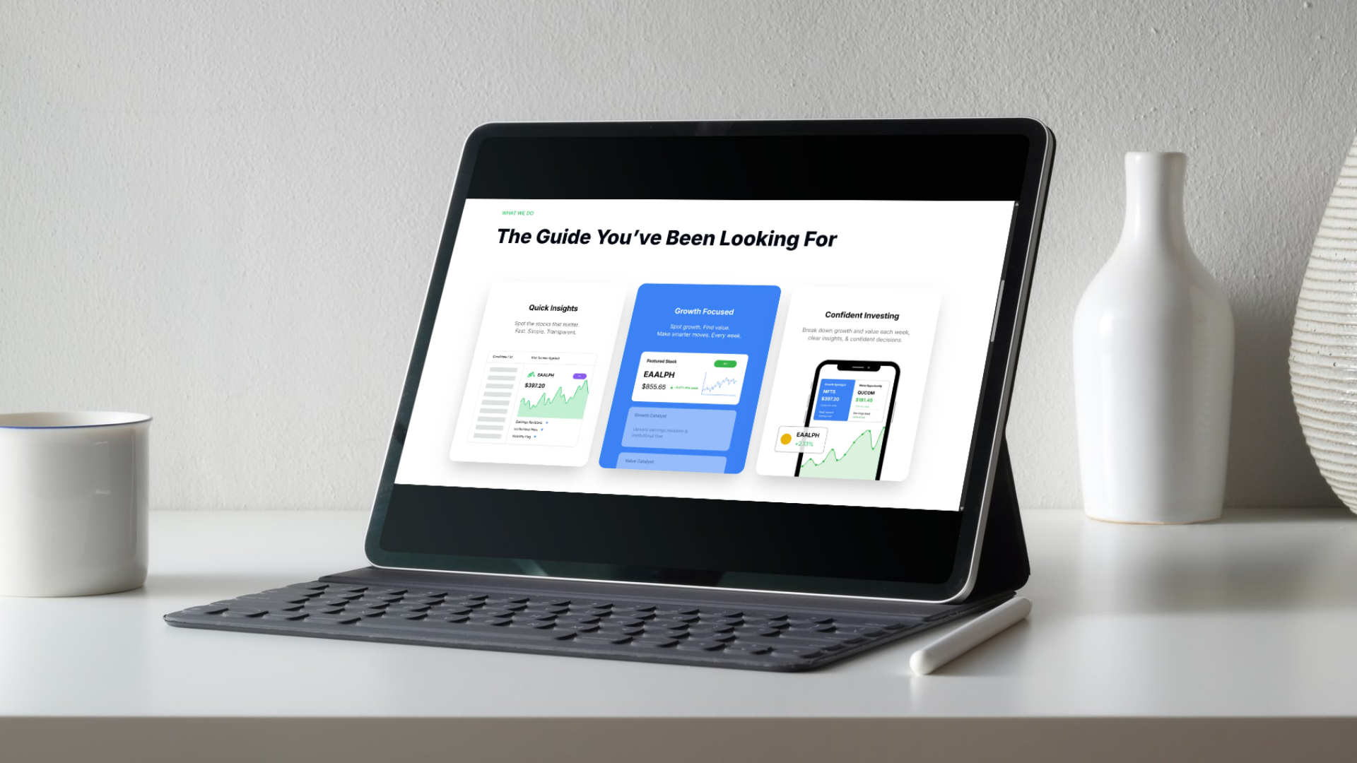
What I'd take forward
I'd run a test on the first scroll to check what people take away, and instrument the signup so I can see which proof element people last looked at before they convert. I'd also test which articles users are reading the most so that information can move up front.