The problem
People found out they didn't qualify after they'd already finished the form
The Spanish lead form was a straight translation of the English one. Nothing on the first screen mentioned that you needed Medicare Parts A and B, and nothing stopped you if you didn't have them. So people filled out the whole form, gave up their personal information, and got turned away at the end.
When I looked at the funnel data, 82% of completed forms came from people who didn't have Parts A or B. All of those turned into sales calls that were never going to go anywhere.
- For usersWasted time, a rejection with no explanation, and a reason to stop trusting us.
- For salesAgents spending their days calling people who were never eligible.
- For the businessMarketing spend going toward leads that couldn't convert.
Research
People weren't ignoring the rules. They didn't know what they were.
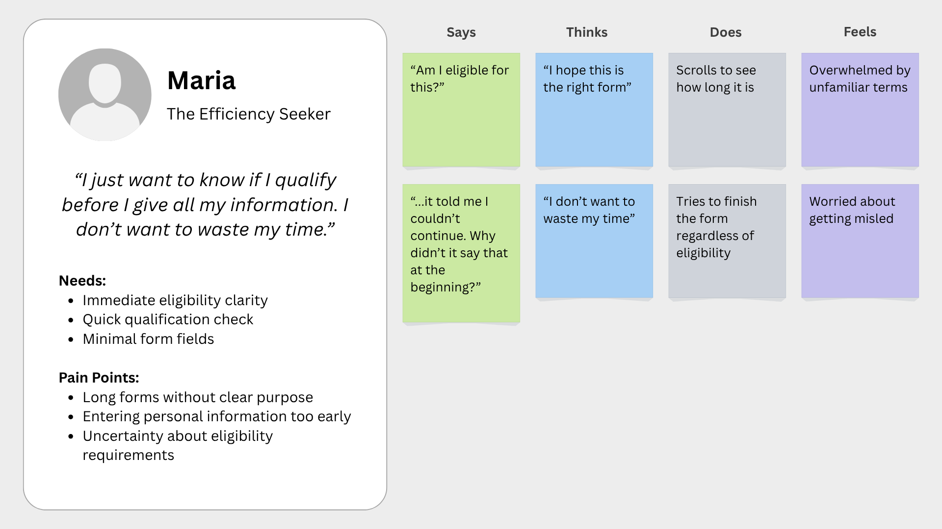
I worked with the data and sales teams so I had both sides of the story. On the numbers side, funnel and eligibility data. On the human side, feedback from our Spanish-speaking call center agents and interviews with Spanish-speaking users over 65. I pulled it together in an empathy map and affinity mapping to see what was actually going on.
What I found changed how I framed the project. People assumed the form would tell them at the end whether they qualified, so continuing was the reasonable thing to do. The form had never given them anything else to go on.
"I thought it would tell me at the end if I qualified."
- The words"Medicare Parts A and B" didn't mean anything to people, and translating it didn't make it any clearer.
- The timingEligibility came up at the very end, after all the effort and all the personal details.
- The trustAsking for personal information without explaining why made people suspicious.
- The exitPeople who didn't qualify got dropped with no explanation and no reason to come back later.
Testing
What I learned from watching people use it
I prototyped the new flow and ran moderated remote sessions with five Spanish-speaking users in the Medicare age range. Task completion came in at 92% with a 96% error-free rate, but the more useful part was what people said and did.
All five weren't sure whether they were allowed to keep going. Four out of five said the wording felt vague or intimidating. Three out of five skipped right past the red warning text and didn't register it until the end. That told me the problem wasn't the wording, it was that people weren't seeing it at all.
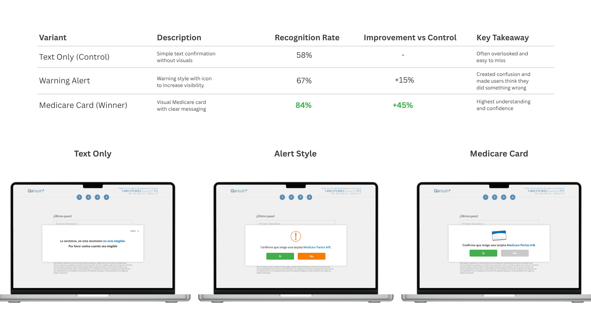
- What I triedText-only warnings, an alert-style banner, and an image of the Medicare card with plain-language copy.
- What happenedPeople skimmed past the text-only version, and the alert styling read like an error rather than a requirement.
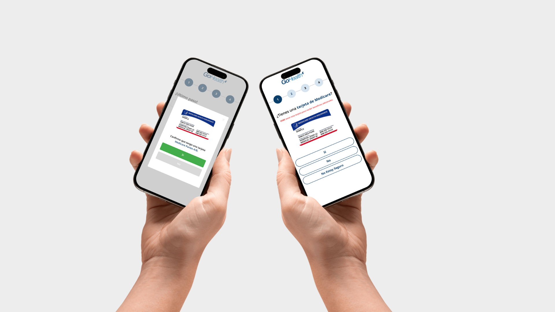
- What wonThe card image. People recognized the card they already had at home much faster than they read any sentence about it.
The design
Three changes, one for each thing I found
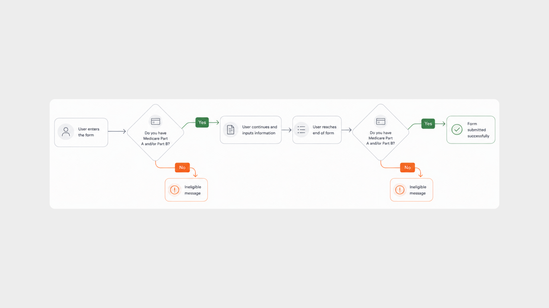
Instead of trying to convince more people to finish the form, I focused on helping them figure out for themselves whether they should. Show the requirement in a way people recognize, confirm it before asking for anything personal, and treat "not eligible yet" as someone worth staying in touch with.
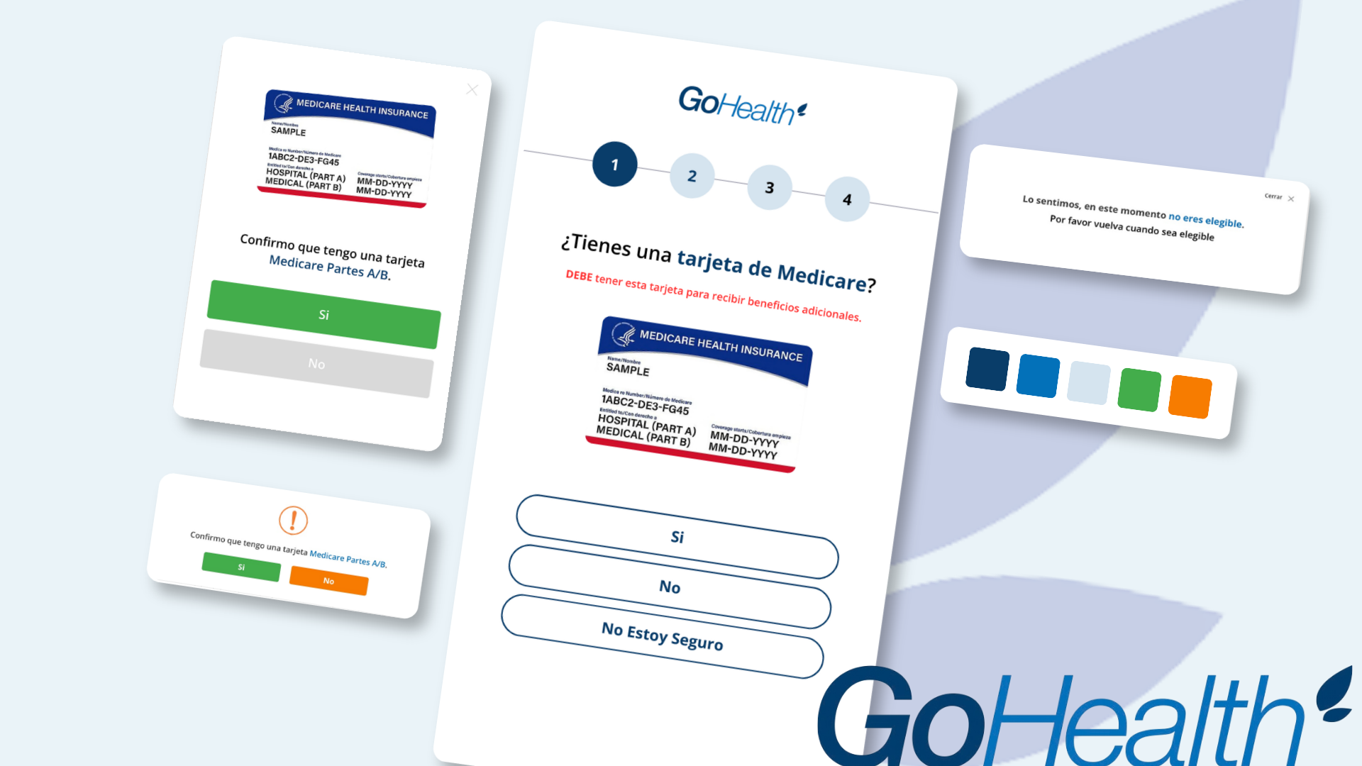
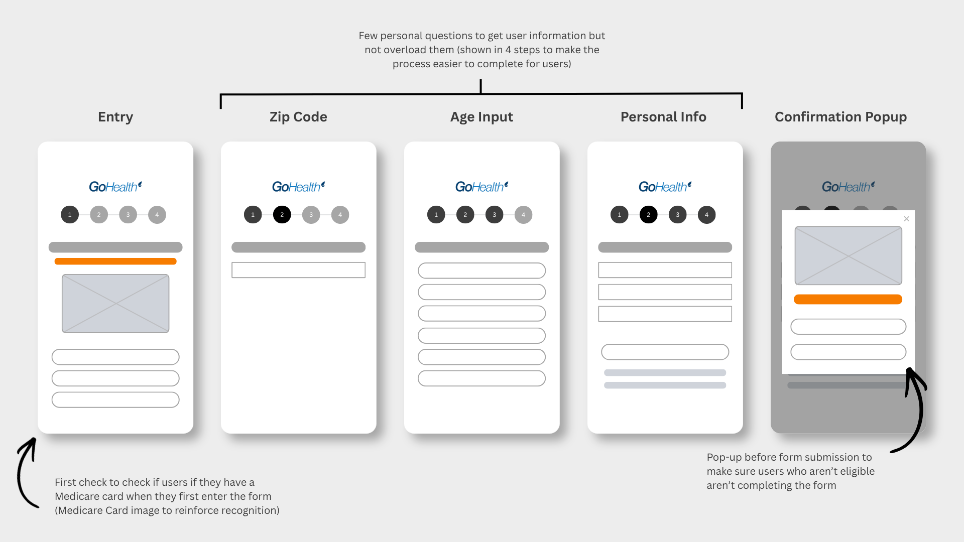
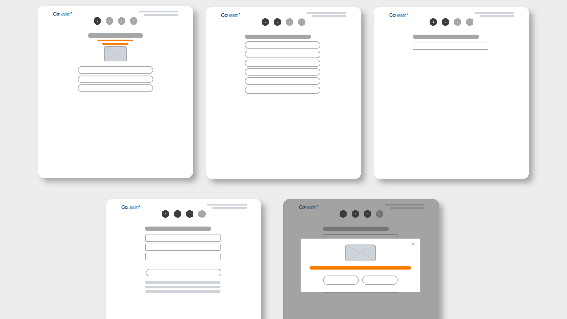
- Say it upfrontBold messaging with an image of the Medicare card at the top of the first screen, checked for contrast so it doesn't rely on color alone.
- Confirm before submittingA checkpoint that says "I have Medicare Parts A and B" instead of a generic "Confirm" button.
- A better way outPeople who don't qualify get a clear explanation and educational content for when they do.
Impact
Better leads, less time wasted, and a better experience either way
Ineligible submissions went down 30%, and sales spent noticeably less time on leads that couldn't convert, which freed up their day for people who could actually enroll.
It also got better for the people who didn't qualify. Four out of five testers said they felt respected by the message they got, and the educational content we pointed them to gave them somewhere useful to go. Brand recognition among Spanish-speaking users went up 22%. Altogether, the redesigned flow expanded access to Medicare enrollment for 8,000+ Spanish-speaking users during AEP.
- EfficiencyLess agent time spent on ineligible leads.
- Clarity80% less confusion about eligibility in testing.
- ReachExpanded access to Medicare enrollment for 8,000+ Spanish-speaking users during AEP.
- Trust22% lift in brand recognition among Spanish-speaking users.
What I'd take forward
The fix was showing people a picture of a card they already had in a drawer. Next time I'd get that image in front of people sooner — I could build a clickable prototype and test recognition with Spanish-speaking users in a couple of days instead of waiting on a full A/B cycle. I'd also look at where people drop off inside each step, not just whether they finished, so the next round of changes starts from evidence instead of a hunch.