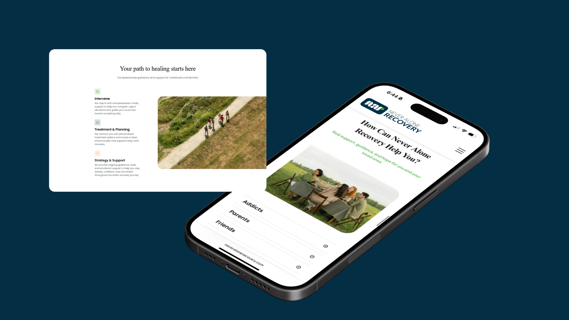
Challenge
Information was there. Direction wasn't.
The existing site lacked clear organization, so people couldn't quickly locate resources, understand what services existed, or take a meaningful next step.
My job was to redesign the experience to reduce cognitive load, improve accessibility, and create obvious pathways toward help.
- What I didUsability research, IA evaluation, navigation redesign, simplified content hierarchy, and a more supportive experience for finding resources, registering for events, and reaching someone.
Research
Understanding users in high-emotion situations
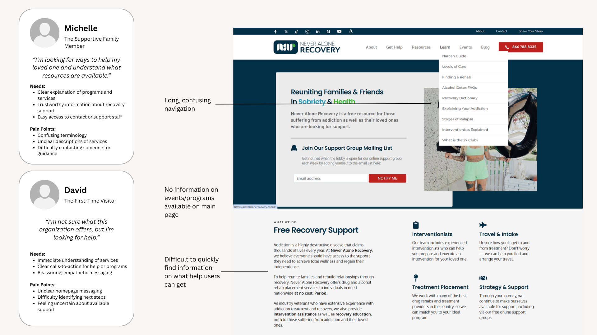
Unlike a typical website, most visitors arriving here were already navigating something difficult. Some were looking for support for themselves. Others were trying to help a family member or a loved one. Research showed that confusion in the experience amplified the uncertainty they already felt.
Participants struggled to determine where to begin, what resources were available, how to register for events, and how to contact the organization directly. The experience needed to do more than provide information — it needed to create confidence.
Friction points
Four places people got stuck
Each one looked small on its own. Together they were enough to make someone leave without asking for help.
- Resource discoverySupport programs and recovery resources were hard to locate.
- Event registrationRegistration opportunities were regularly overlooked.
- NavigationContent was spread across sections with no clear hierarchy.
- Contact visibilityCritical contact paths were buried when people needed immediate support.
Architecture
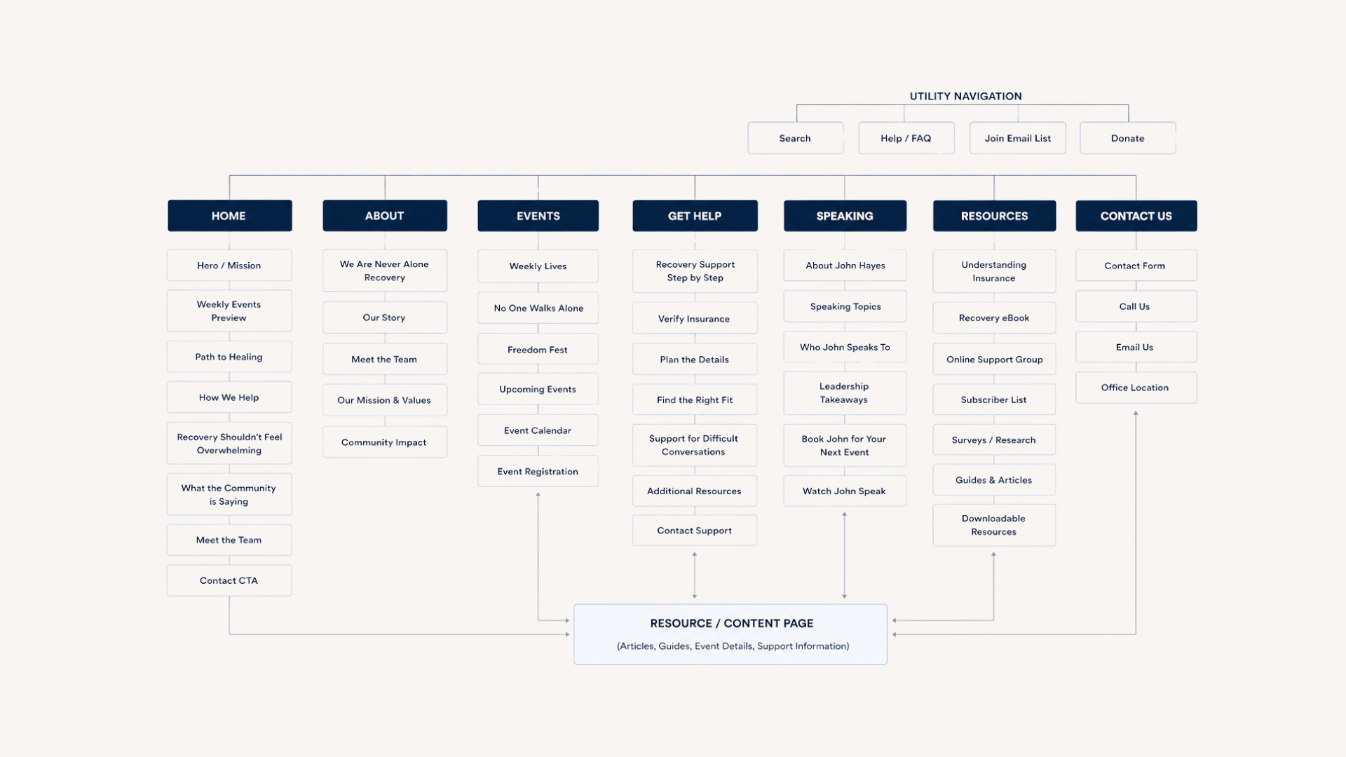
Reimagining the information architecture
Rather than introducing new features, I focused on simplifying. The redesign centered on helping people answer three questions as fast as possible.
- I need helpHow do I get support?
- I want to attendWhat programs and events are available?
- I want to learnWhat resources exist for me and my family?
Design
Designing for emotional clarity
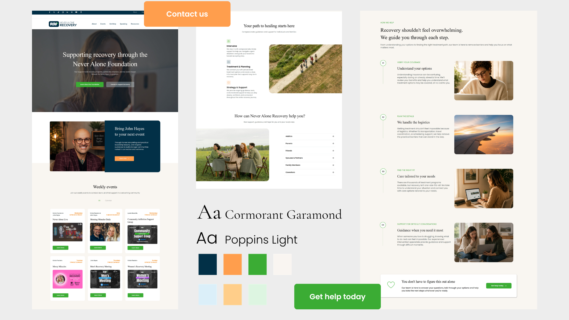
The goal wasn't only better usability — it was less anxiety. I rebuilt the experience around clear navigation, scannable layouts, a simplified hierarchy, consistent calls to action, and supportive, approachable messaging.
Every decision was measured against one question: does this help someone move forward with confidence?
Pathways
Creating clear paths to action
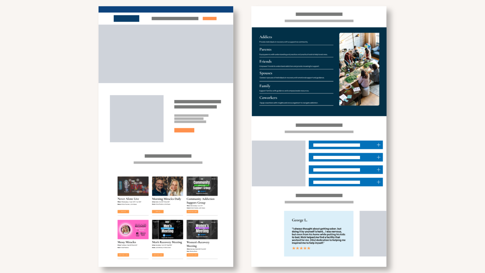
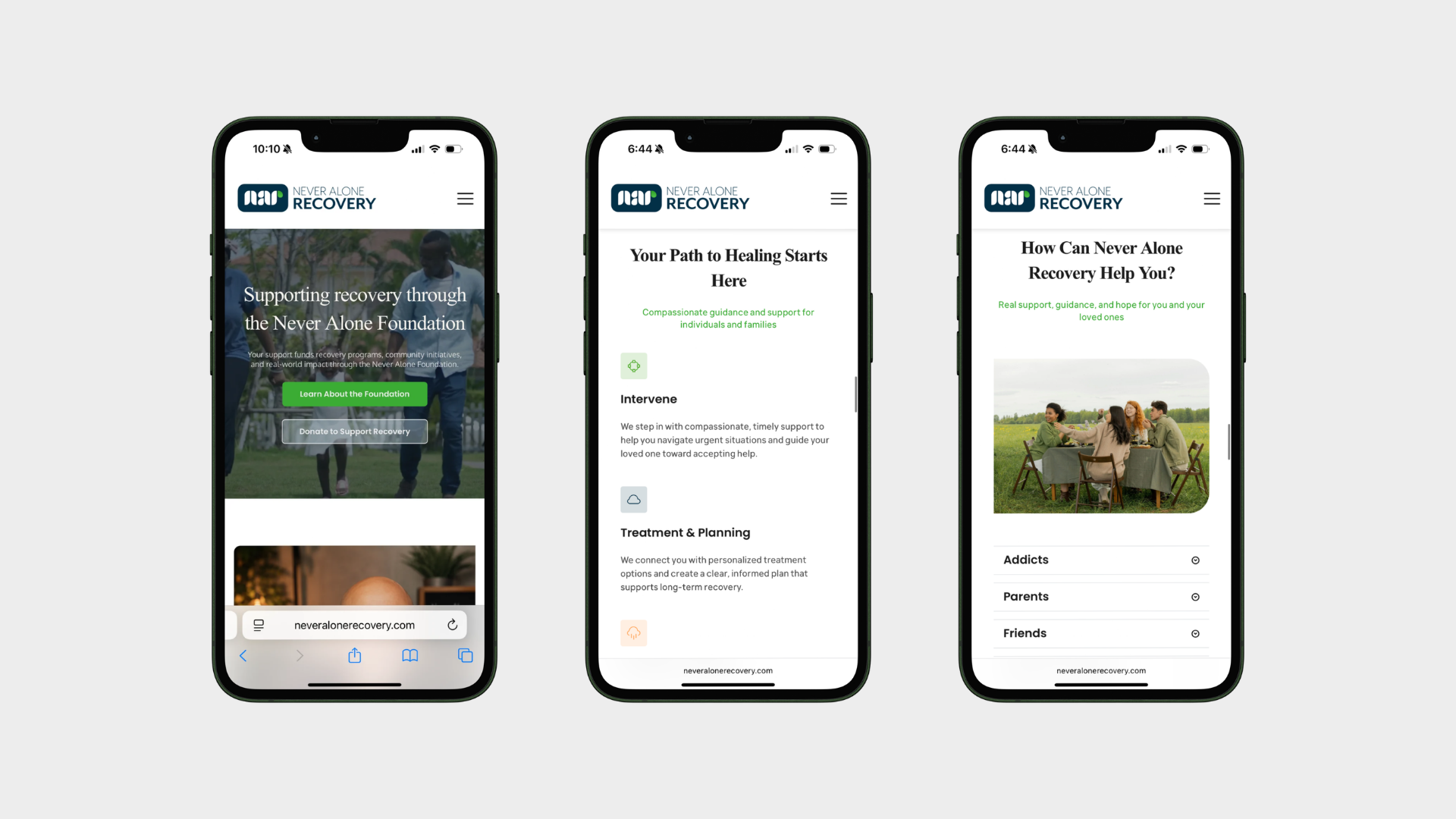
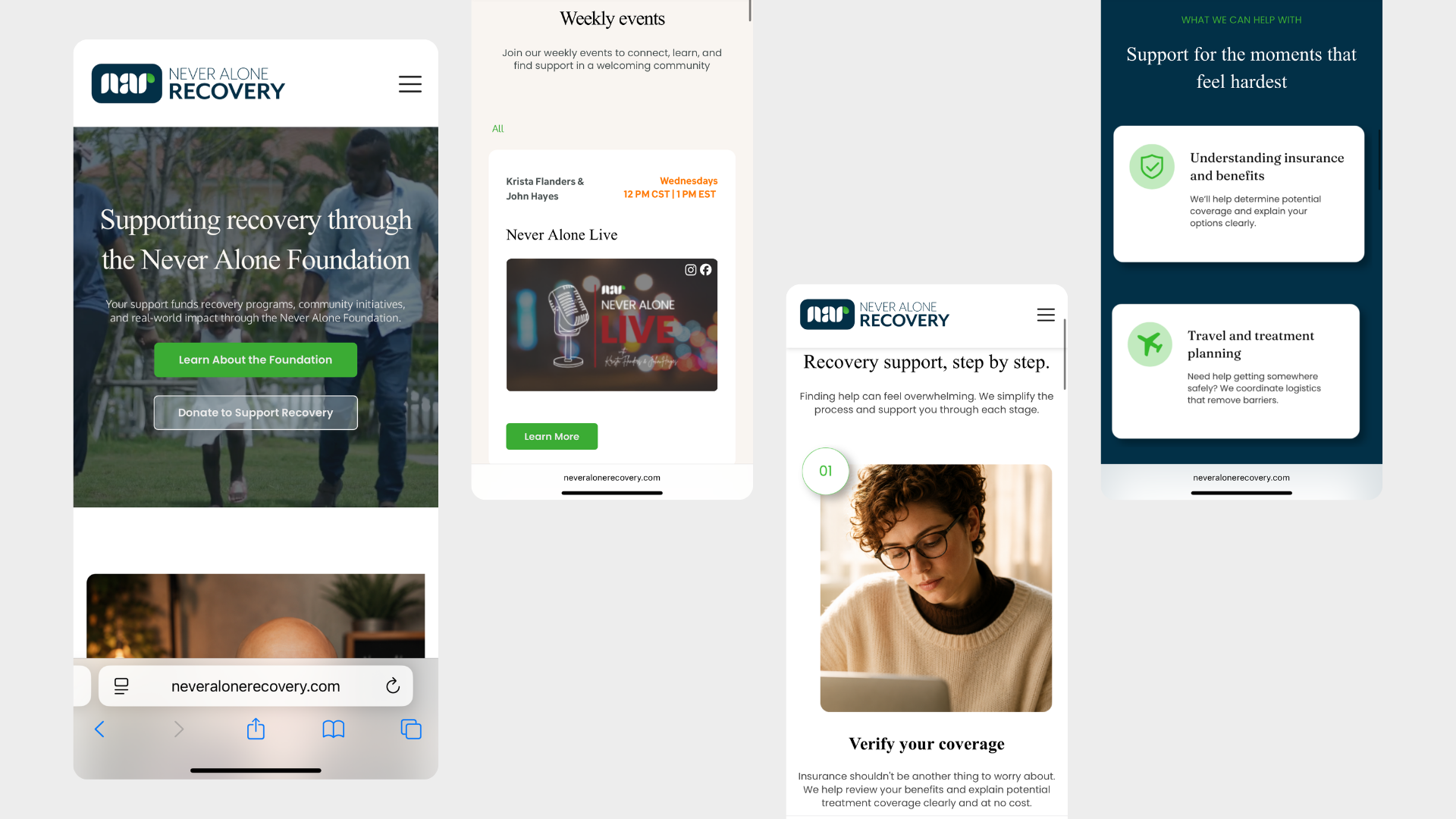
One of the main goals was helping people identify their next step immediately. The redesign introduced clearer pathways for event registration, program discovery, resource exploration, volunteering, and contacting the organization.
By reducing how much decision-making the site asked for, people engaged with less friction.
Trust
Building trust through community
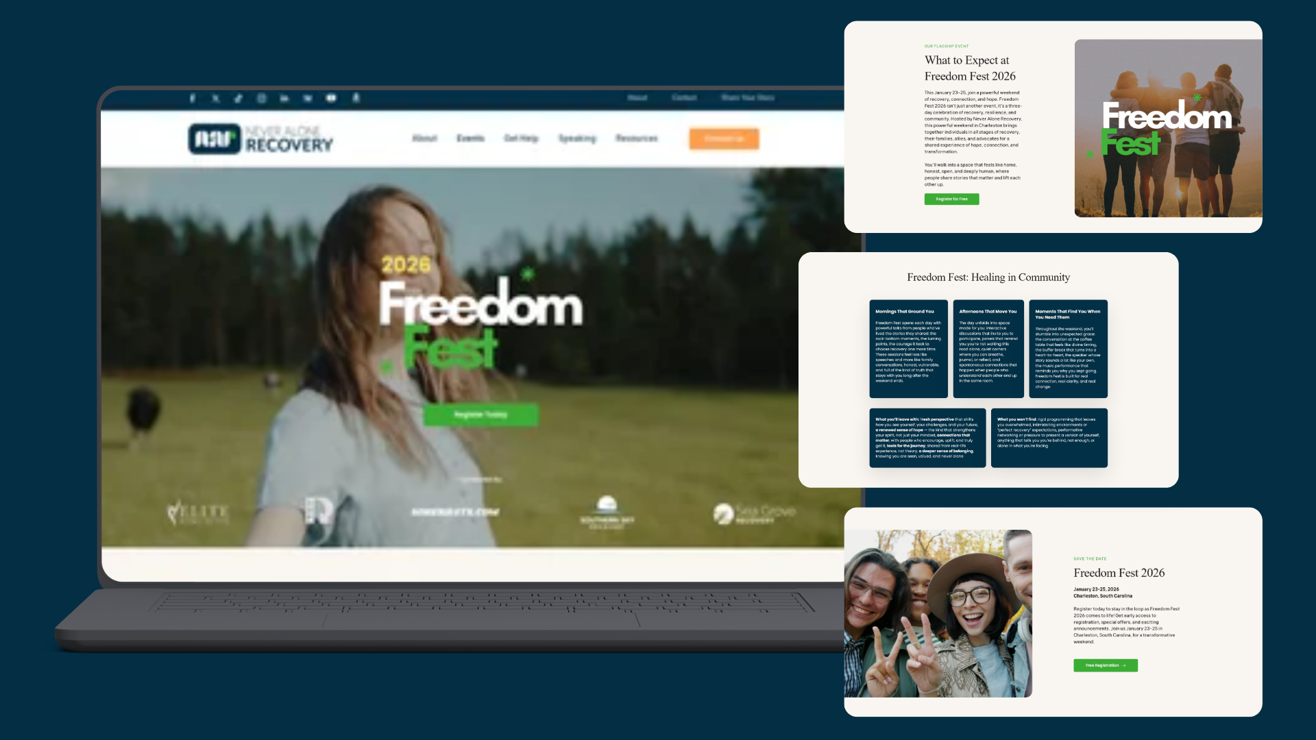
Recovery is deeply personal, and trust decides whether someone engages at all. The redesign put community involvement, upcoming events, real support opportunities, and transparent organizational information up front.
That reinforced credibility while making the whole experience feel more welcoming.
Impact
From a fragmented website to a guided support experience
Visit duration rose 34%, site views rose 10%, and bounce rate dropped 5%. By simplifying navigation, clarifying pathways, and prioritizing human connection, more people accessed resources, engaged with programs, and reached out for support.
Visit the live site ↗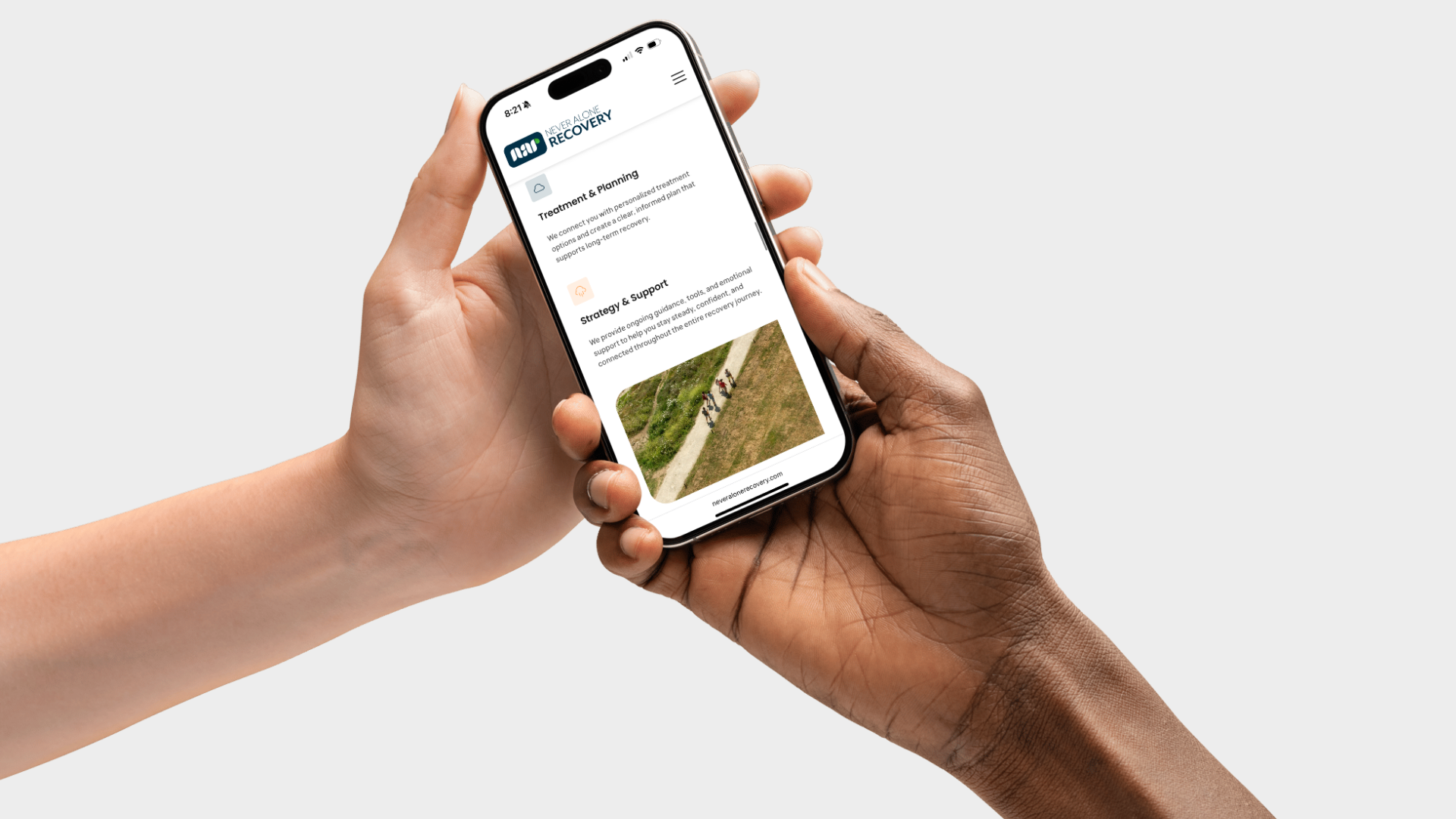
What I'd take forward
I'd prototype the get-help path as a working flow so it can be tested on a phone rather than reviewed in a static file. I'd also set up a simple way to track which entry point people actually use, so the navigation can keep adjusting to real behavior.