The problem
High traffic, zero pathway
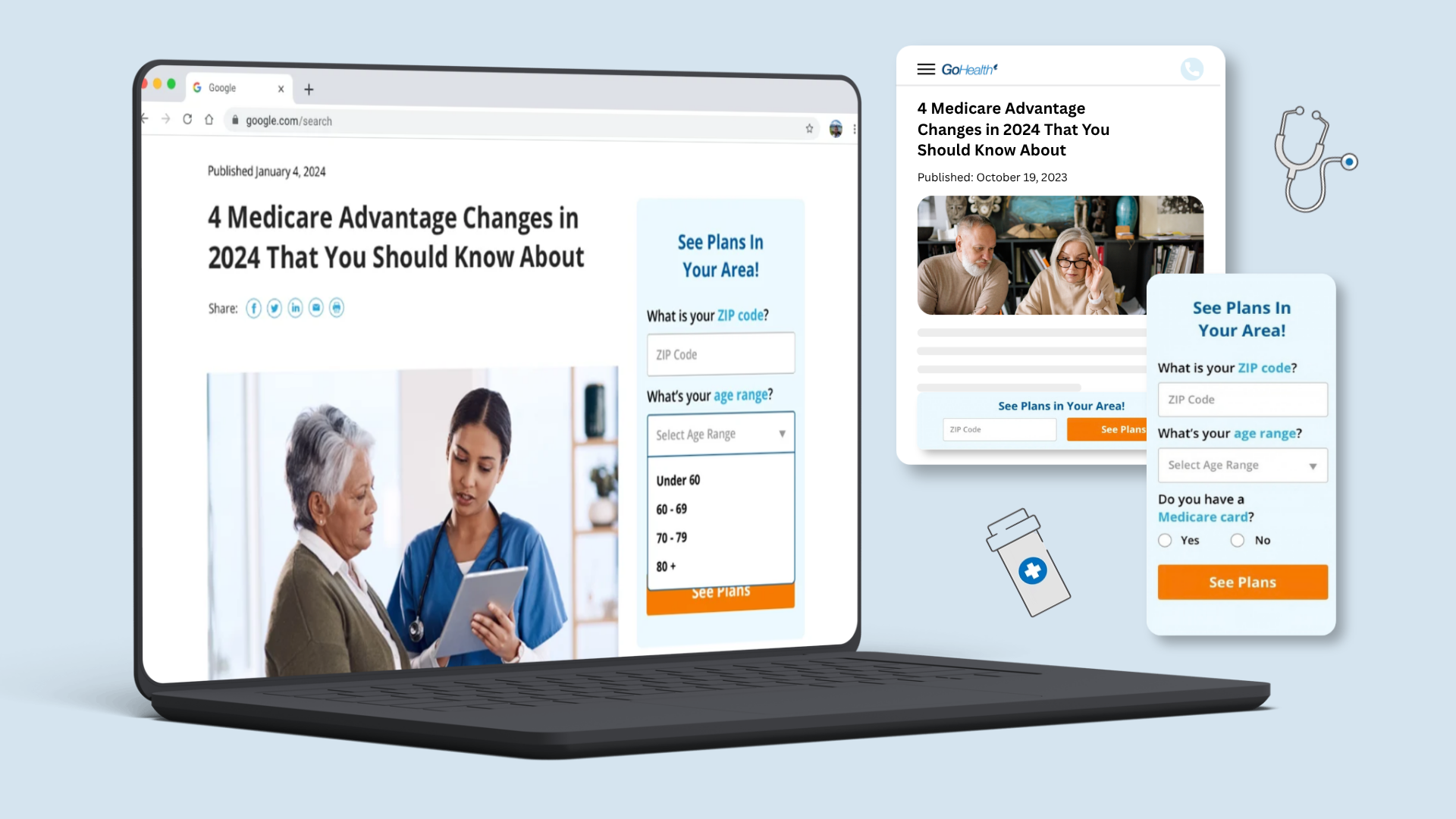
The blog was doing its job — ranking, informing, earning trust — and then dead-ending. The only way to act on what you just read was a footer CTA that asked you to leave the article and start over somewhere else.
Research
Two readers, two very different habits
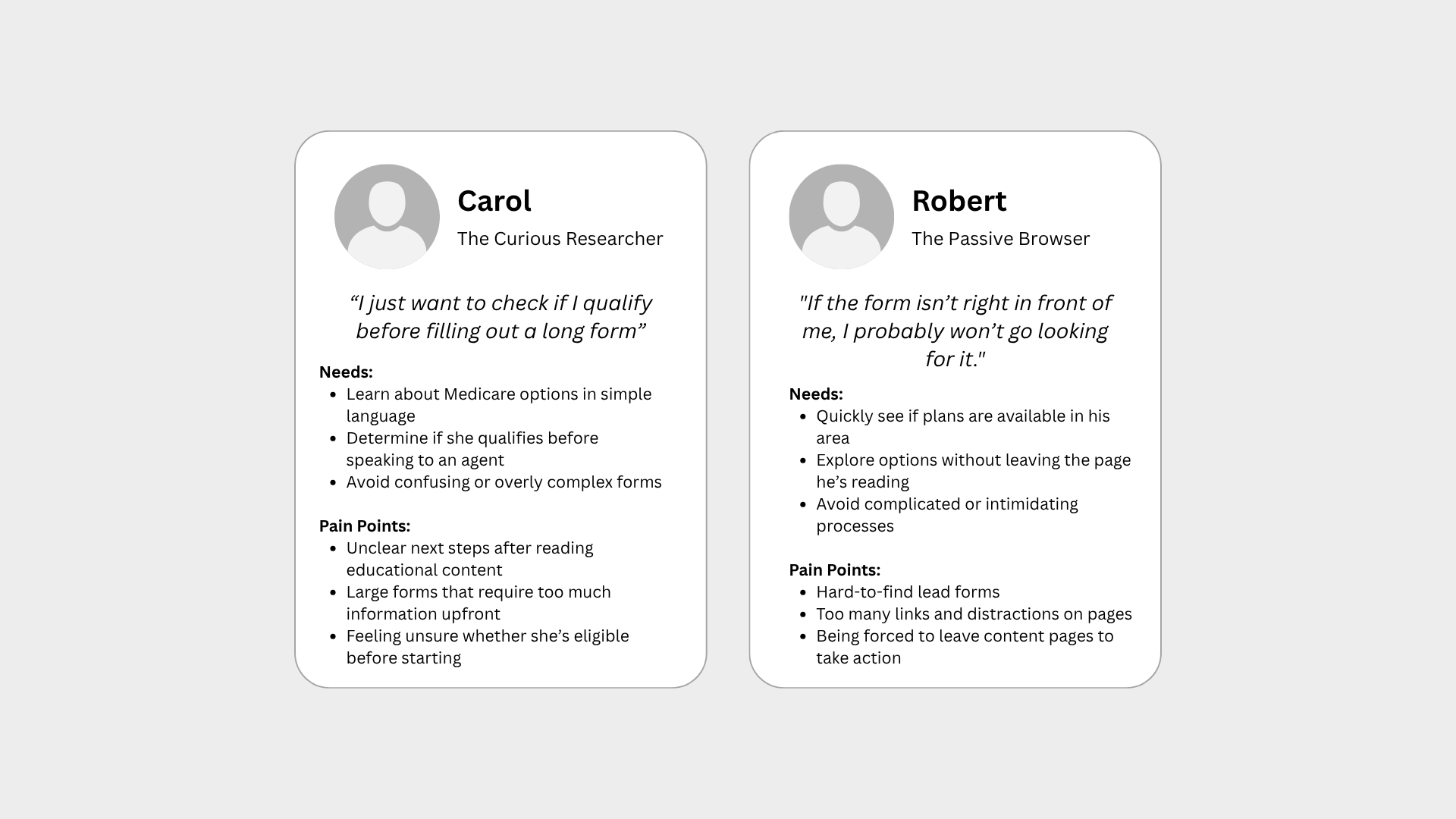
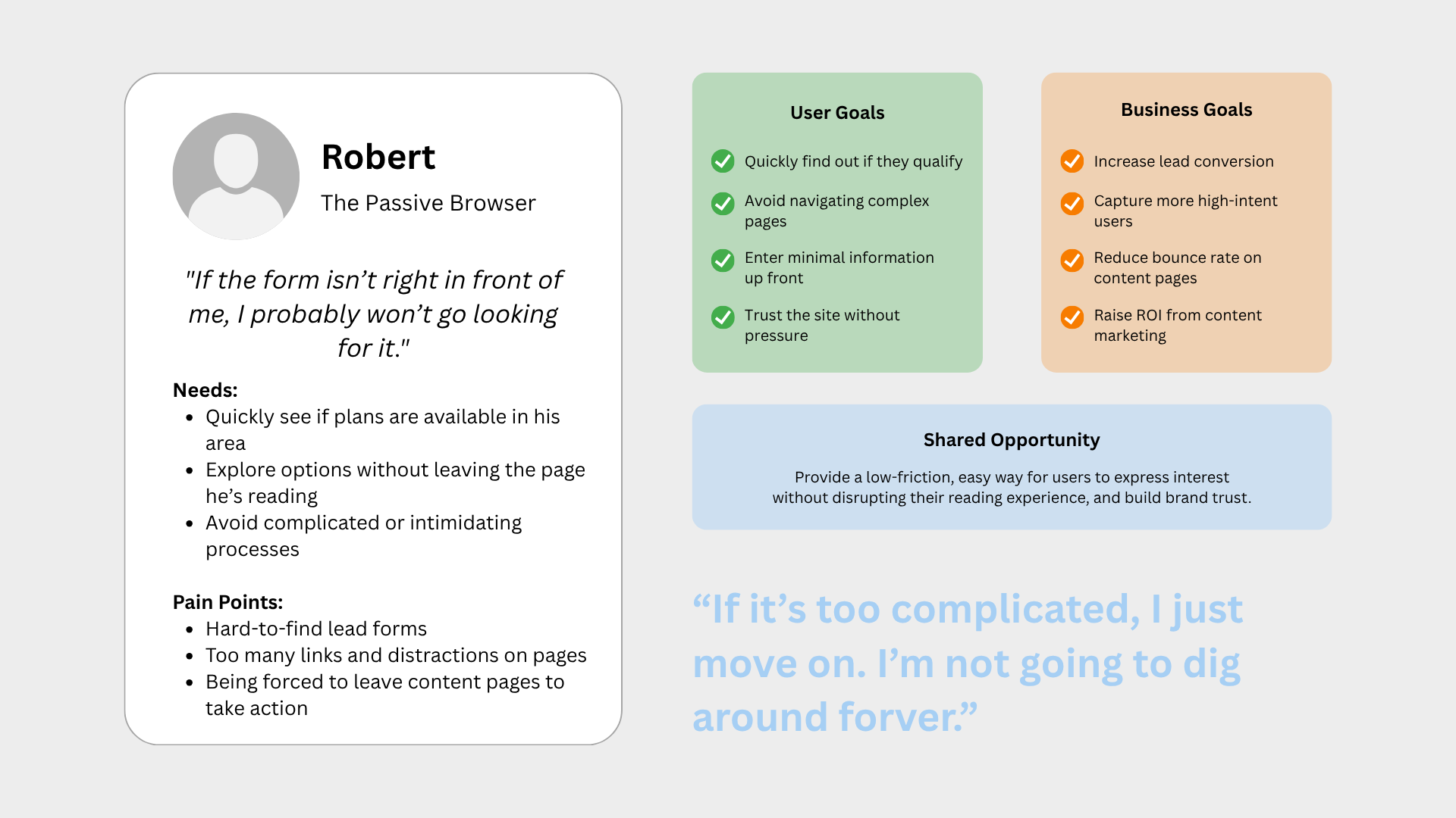
Talking to readers and reviewing behavior data, the same two types kept showing up. Carol reads carefully and wants to know if she qualifies before she commits to anything. Robert skims, and if the next step isn't in front of him, he's gone.
Both wanted the same thing: a quick answer without leaving the page they came for.
"If it's too complicated, I just move on. I'm not going to dig around forever."
The journey
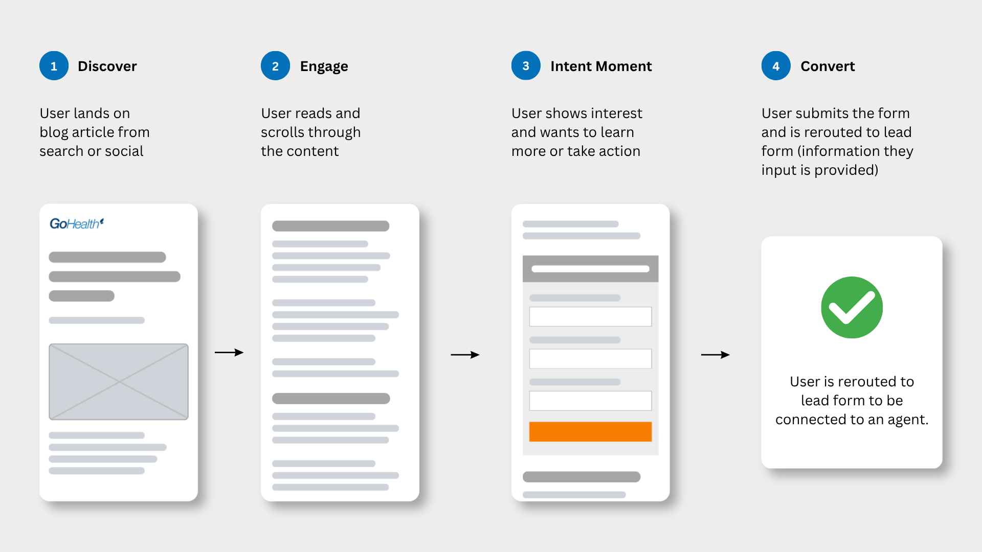
Intent spikes mid-article, not at the end
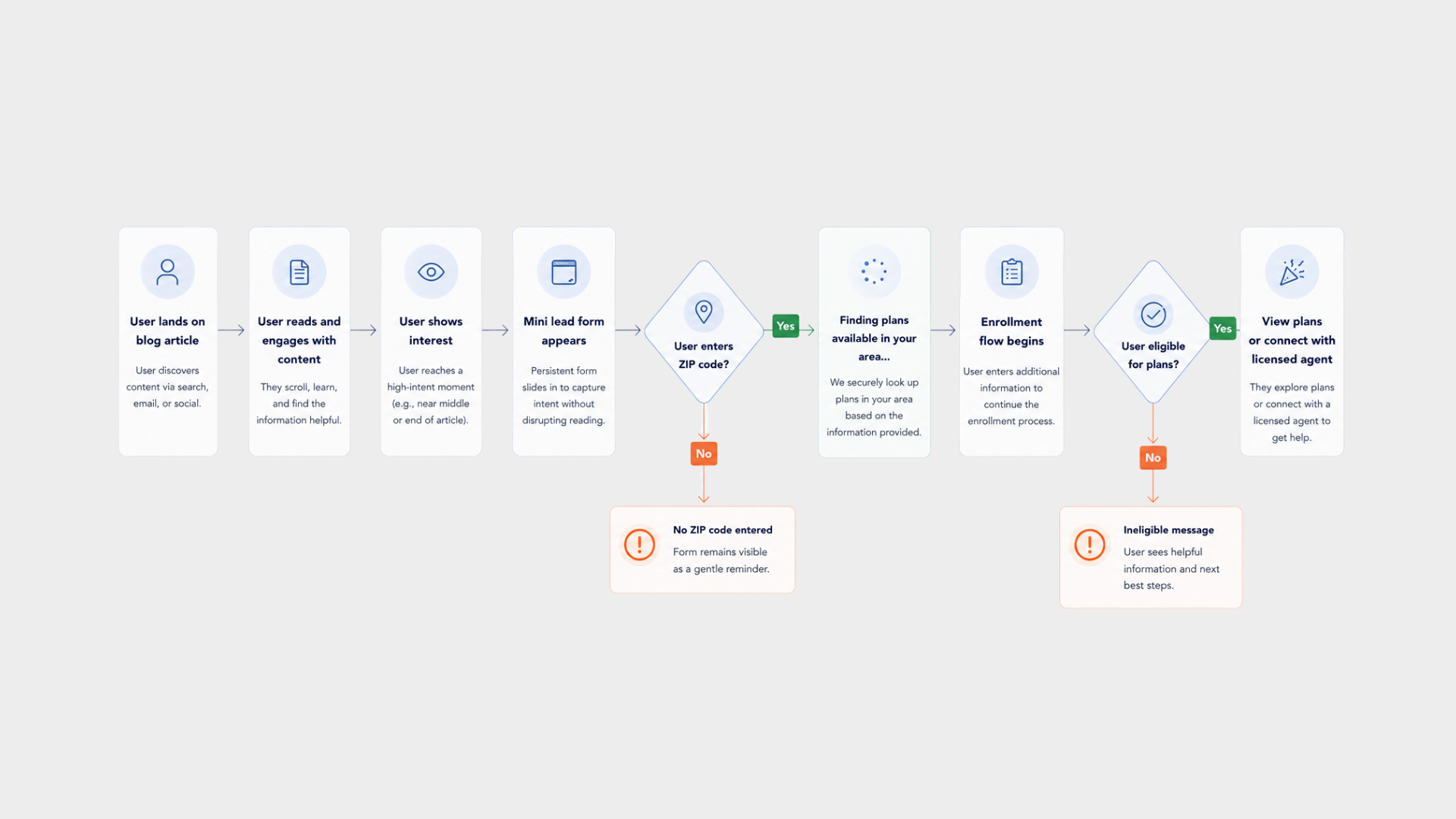
I mapped the path from landing on an article to talking to an agent. Attention peaks around the section that answers the reader's question — well before the footer. That's the moment the form had to be there.
Mapping the edge cases mattered just as much: no ZIP entered, not eligible, no plans in the area. Each one needed a helpful next step instead of a dead end.
Testing
Four placements, one honest test
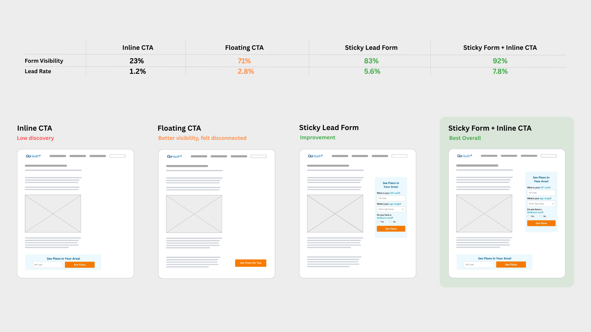
Instead of arguing placement in a meeting, I designed four real variants — inline CTA, floating CTA, sticky lead form, and sticky form plus inline CTA — with identical copy, so the test measured position and nothing else.
The hybrid won on both counts: 92% form visibility and a 7.8% lead rate, against 23% and 1.2% for the inline CTA we started with.
- Inline CTABarely discovered — 23% visibility, 1.2% lead rate.
- Floating CTAMore visible, but felt bolted on to the article.
- Sticky lead formA clear improvement at 83% visibility.
- Sticky + inlineBest overall: 92% visibility, 7.8% lead rate.
The design
One screen, three questions
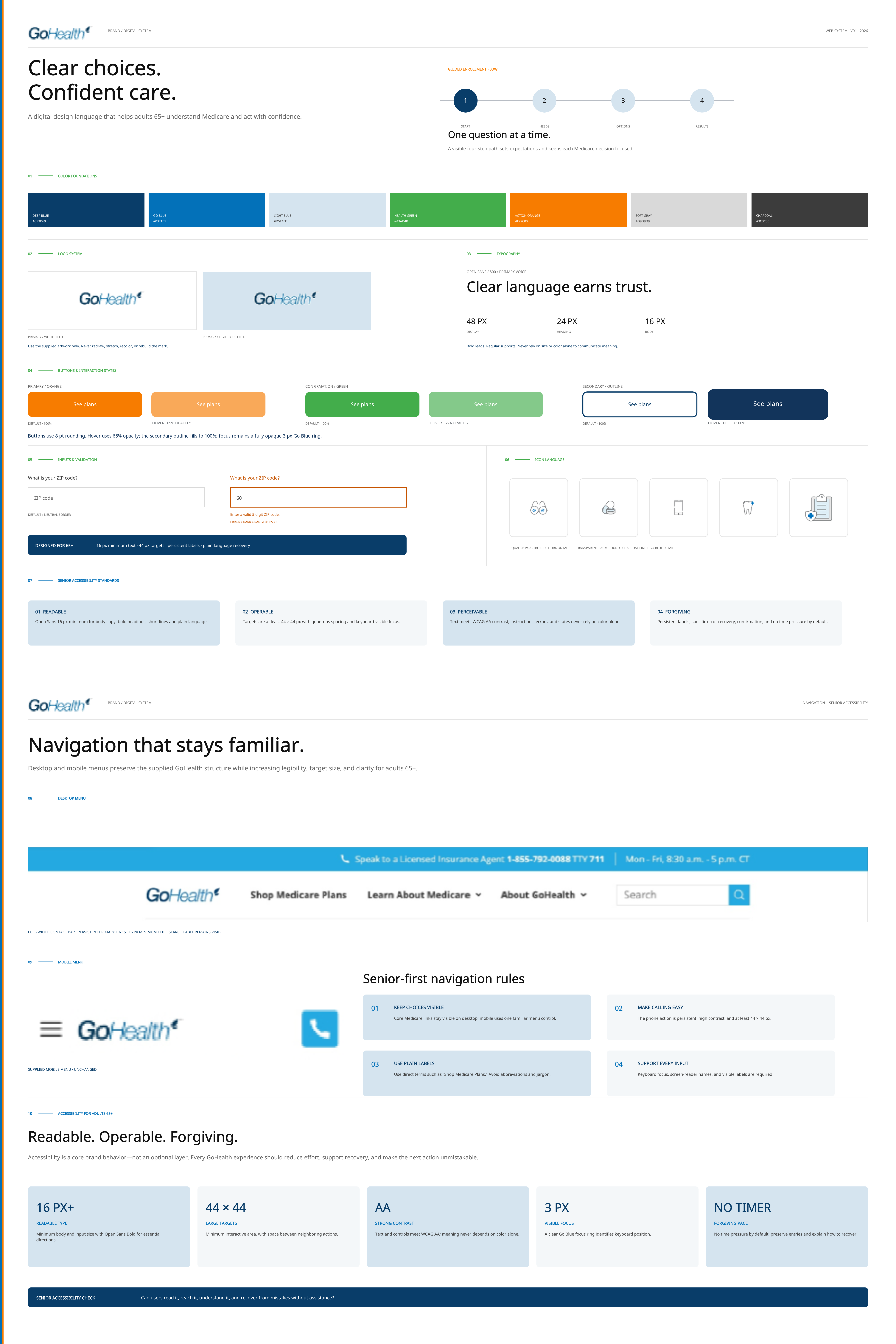
The winning pattern asks for ZIP, age range, and whether you already have a Medicare card — enough to qualify someone, short enough to finish on a phone in a few seconds.
Nothing resets the article. Submitting shows a plain confirmation and hands off to an agent with the answers already filled in, so no one repeats themselves.

Reusable system
One lead pattern, documented for a much larger content library
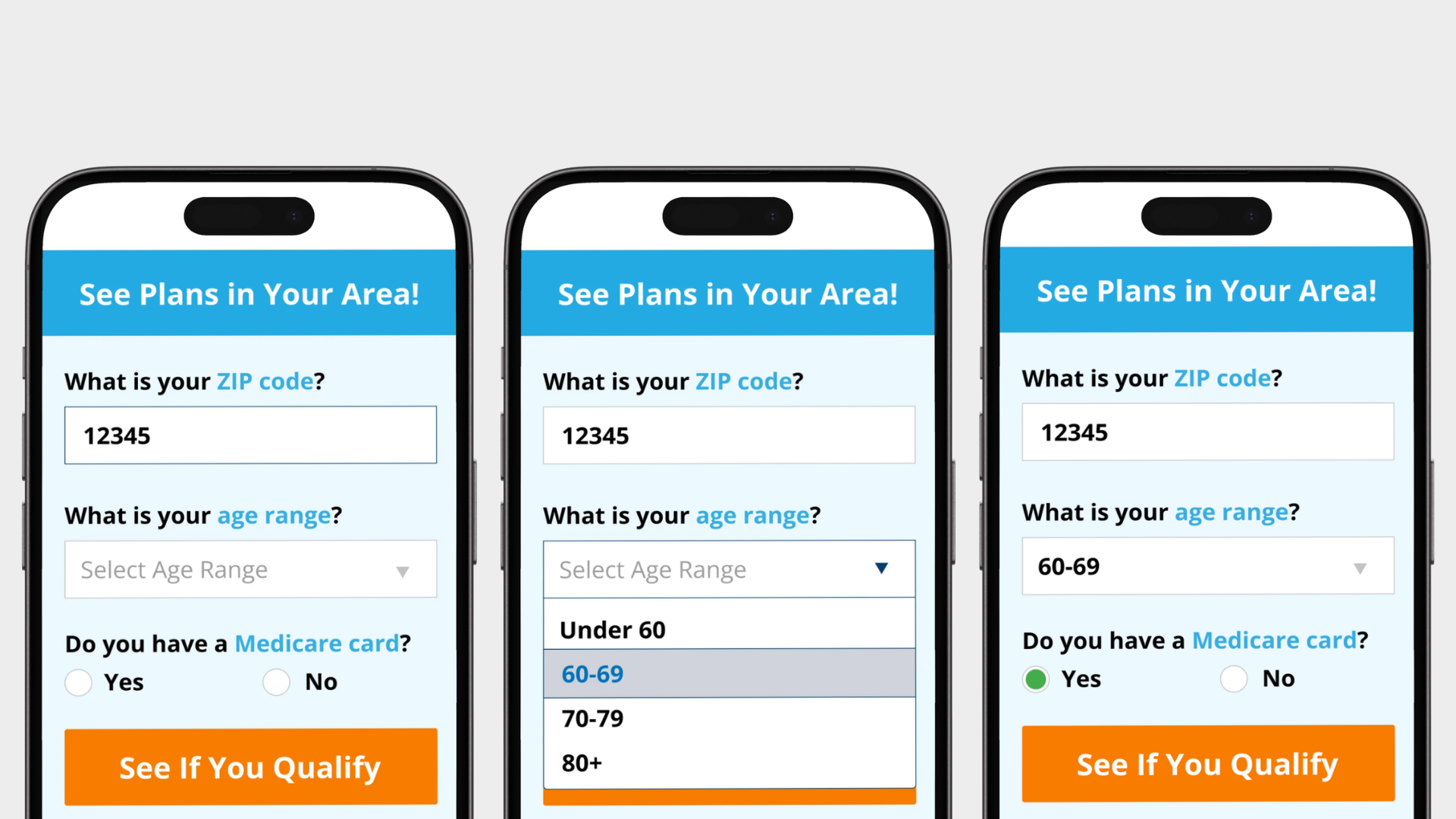
The winning form was not treated as a one-off screen. I documented it as a reusable acquisition pattern: where it belongs in an article, which three questions stay fixed, how the sticky and inline versions work together, and what happens when someone is ineligible or no plans are available.
I also worked within GoHealth's wider visual language instead of inventing a new mini-brand. Open Sans kept the content familiar and readable. The documented palette uses #12345B, #0878C9, #E8F6FB, #21A179, #F27935, and #6F7378. I created the icons and healthcare illustrations, then documented how they work with the exact logo variants, Medicare card, benefit cards, buttons, and form patterns across digital and campaign work.
- PlacementUse the sticky form for persistent access and the inline CTA at the point of highest article intent; never interrupt the reading flow with a takeover.
- Core fieldsZIP code, age range, and Medicare status remain consistent so qualification stays short and comparable across articles.
- Action hierarchyThe library preserves the supplied green rectangular lead action, blue filled plan action, and navy outlined Medicare-card choices.
- Brand assetsThe supplied blue, white, and leaf logo treatments, Open Sans hierarchy, and the icons and healthcare illustrations I created are documented as one visual language.
- Shared patternsButtons, benefit cards, Medicare-card recognition, form fields, confirmation panels, and educational modules repeat across English and Spanish touchpoints.
- Edge statesEligibility, no-plan, incomplete-field, confirmation, and agent handoff states are part of the component documentation, not left for development to infer.
- RolloutContent and growth teams could apply the pattern to more articles without waiting for a new layout each time.
Impact
A pattern the whole content library could use
Lead form visibility tripled across the blog, and qualified leads rose 15% now that readers had a direct path from an article to enrollment.
I documented the placement as a reusable component so content and growth could roll it out across articles without waiting on design.
View the Figma prototype ↗What I'd take forward
Position was worth more than any wording change we tried. Next time I'd test placement first with a coded prototype on a couple of live articles, before anyone writes copy or builds components. I'd also tie the form to article topic — someone reading about Part D needs a different first question than someone reading about enrollment dates — and measure which article types actually carry intent.