The problem
Expertise buried under a catalog
The old site listed equipment. Nobody wakes up wanting a filtration tank — they wake up because their water smells or their dishes come out spotted. Product-first navigation asked homeowners to diagnose themselves before the site would help them.
So most people did the only thing left: they called, and someone on the team spent twenty minutes explaining the basics.
Competitive audit
Everyone sells hardware; nobody explains
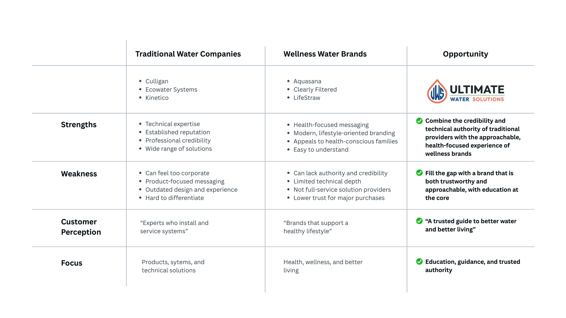
I mapped traditional water companies against the newer wellness brands. Traditional companies had credibility and dated, product-heavy experiences. Wellness brands were easy to understand but felt thin on expertise.
The gap was the whole strategy: be the brand that is both trustworthy and approachable, with education at the center.
Brand
A system that looks as capable as the team is
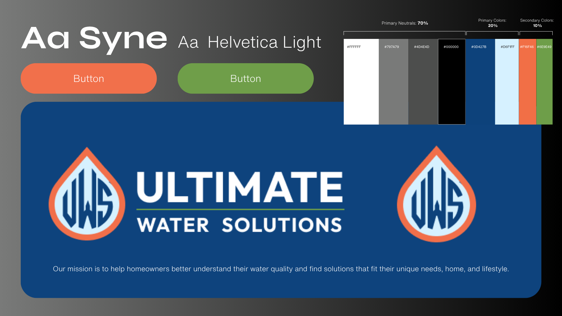
I refreshed the identity around a deep blue, a warm orange, and a clean sans — confident, local, and not clinical. Type scale, buttons, and color ratios were documented so the site could grow without drifting.
The work
Start with the concern, not the catalog
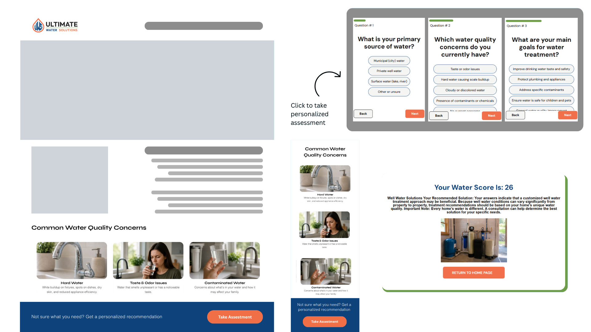
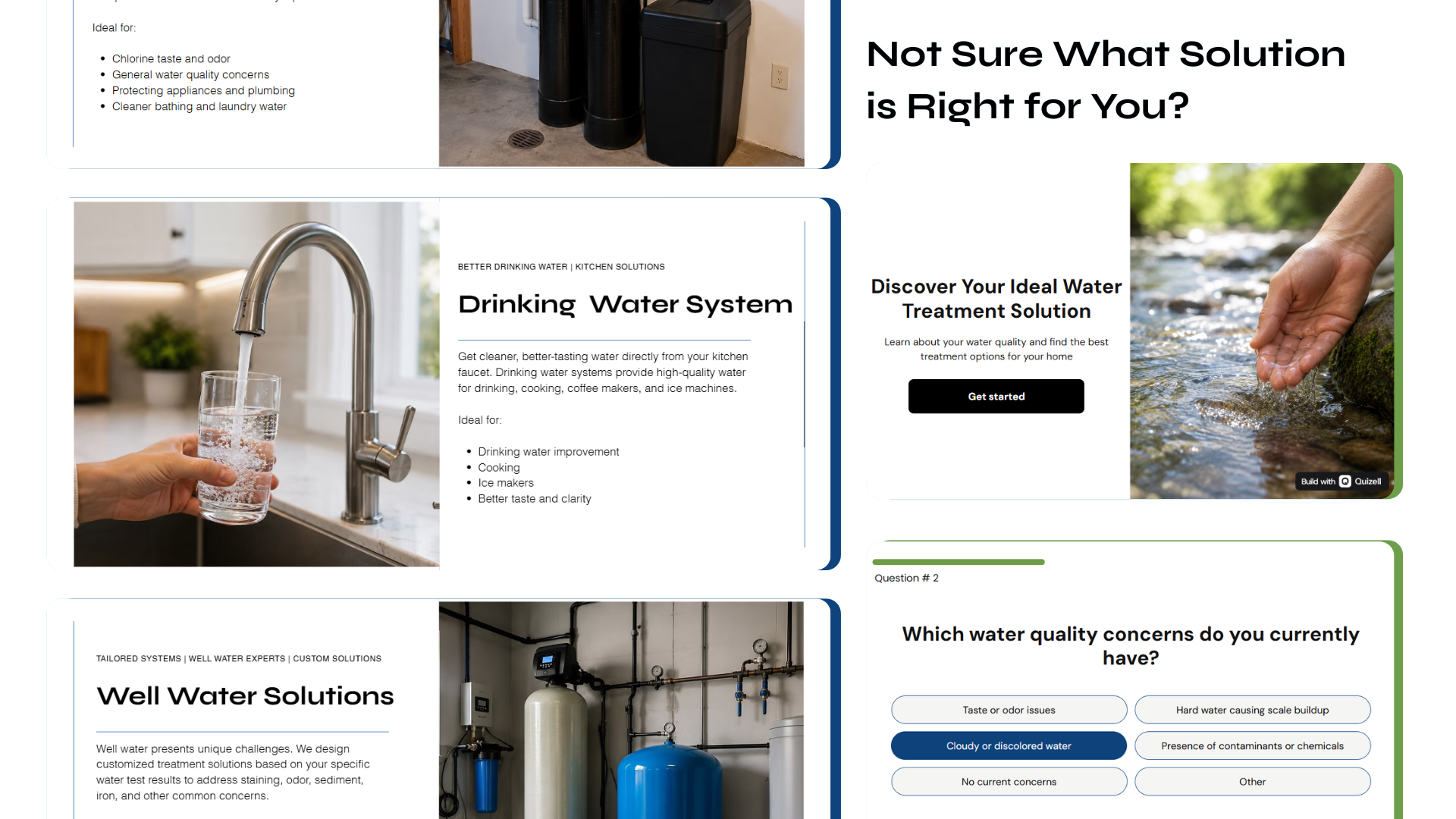
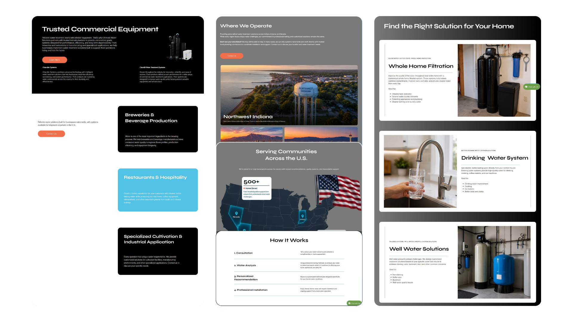
The homepage now opens with symptoms — hard water, taste and odor, contamination — and routes people toward a solution instead of a product grid. Each solution page explains what the system does and who it's for in plain language.
For anyone still unsure, a short assessment asks about water source, concerns, and goals, then returns a recommendation and a score. It takes under thirty seconds and hands the team a lead that already knows what it needs.
- DiagnoseSymptom-led entry: taste, smell, staining, hardness.
- ContextualizeWater source and household needs narrow the recommendation.
- RecommendOne primary solution with a plain-language why.
- ConvertBook an assessment with the answers already attached.
Smart chat
An assistant that teaches instead of deflects
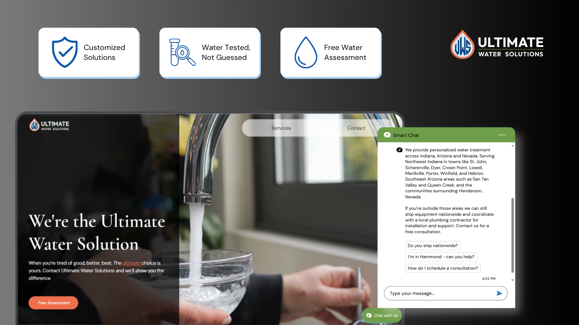
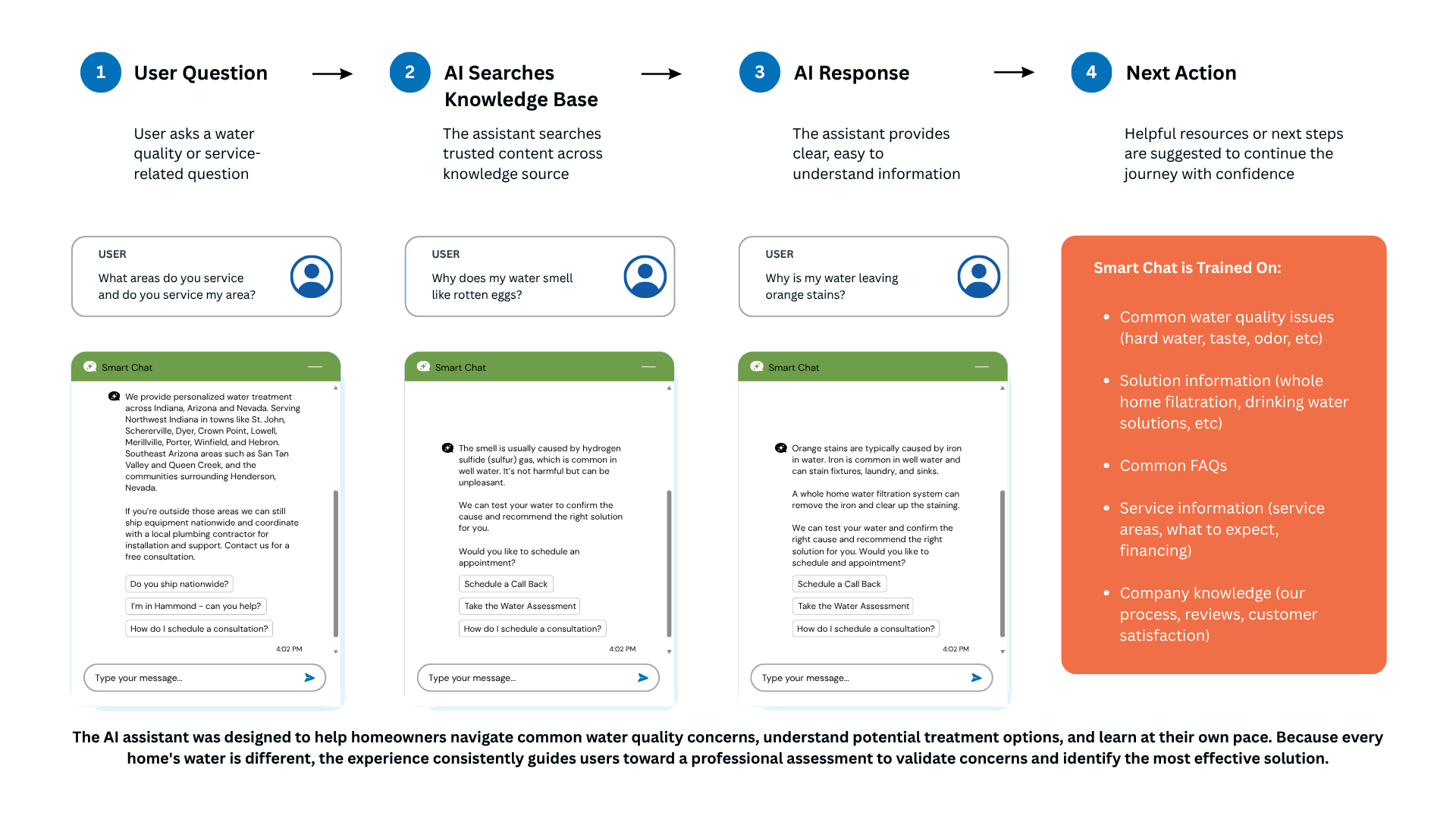
People ask the same questions at odd hours: why does my water smell like rotten eggs, why are there orange stains, do you service my town. I designed a chat assistant trained on the company's own service, product, and water-quality knowledge.
It answers in plain language, then offers a next step — take the assessment, schedule a call back — so learning always has somewhere to go.
Impact
A site that qualifies before it sells
Contact form submissions rose 25% — more people reaching out, and reaching out with context. The assessment became the main entry point, so calls started at "here's my recommendation" instead of "tell me about your water."
The mobile experience got the same treatment, since most homeowners find the company from a phone in their kitchen.
Visit the live site ↗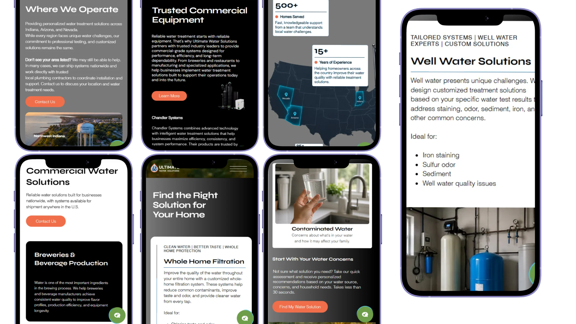
What I'd take forward
I'd run a new study on the live site and the chat assistant to see whether it actually answers the questions homeowners bring to it, using real questions pulled from calls and messages rather than the team's own. I'd also gather the data from the water quiz to see which concerns come up most often, then use those to shape marketing that speaks directly to what people are already worried about.