Trust is not a reassuring headline added at the end. It comes from what an experience asks, when it asks, what it explains, and whether someone can recover when they are uncertain.
Across Medicare and recovery work, I have designed for people making consequential decisions while already carrying anxiety. That changes my standard: the interface must be usable, but it must also be honest about eligibility, preserve control, and never make help harder to find.
“When the stakes are high, clarity is part of the care a product provides.”
01
Treat uncertainty as a design constraint
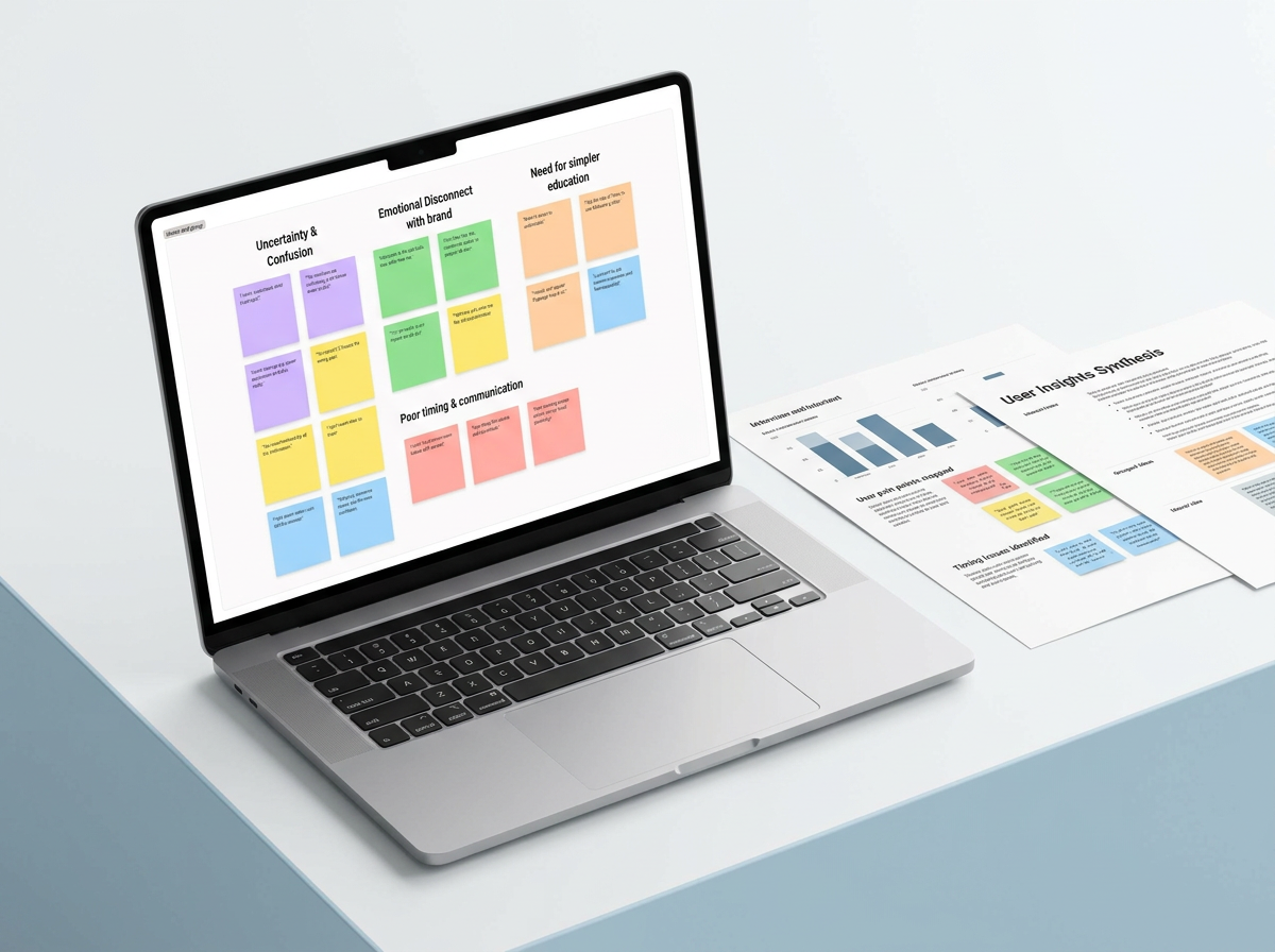
In my Medicare research, 34 of 40 participants described the system as confusing. Their interviews showed something deeper: people feared making a costly choice they could not undo. For Never Alone Recovery, visitors often arrived in an emotional moment and did not know where to begin.
I do not treat that uncertainty as a content problem alone. It shapes the hierarchy, the number of decisions on a screen, the language, and how visible human support needs to be.
The more consequential the choice, the easier it should be to understand what happens next.
Evidence · Medicare User Research
- What I found
- Fear, timing, and loss of control mattered as much as the amount of Medicare information available.
- What I changed
- I translated those patterns into opportunities for earlier education, self-service comparison, and visible human guidance.
Evidence · Never Alone Recovery
- What I found
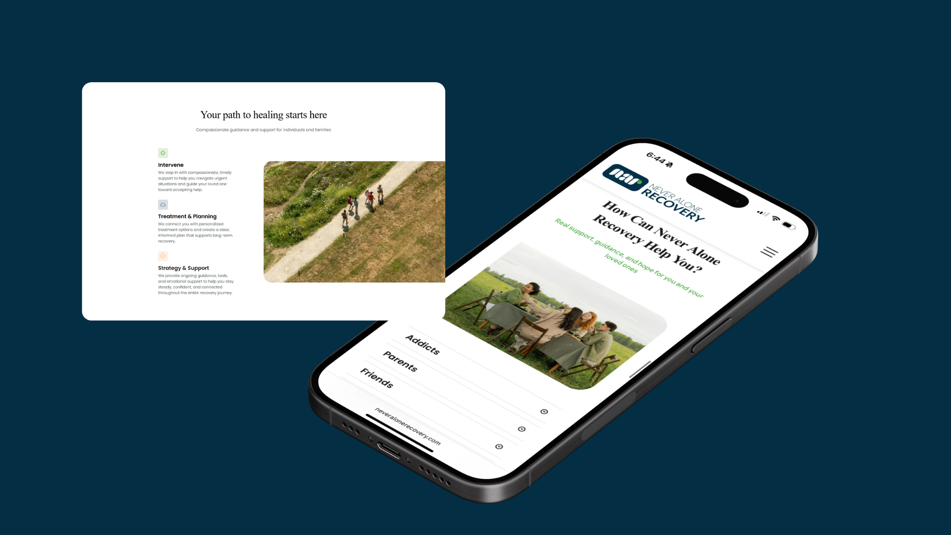
- People looking for support could not quickly tell where to begin, find resources, or contact the organization.
- What I changed
- I rebuilt the structure around three direct needs: get help, attend, and learn—then kept contact paths visible throughout.
- What happened
- Visit duration rose 34%, site views rose 10%, and bounce rate dropped 5%.
02
Earn personal information before asking for it
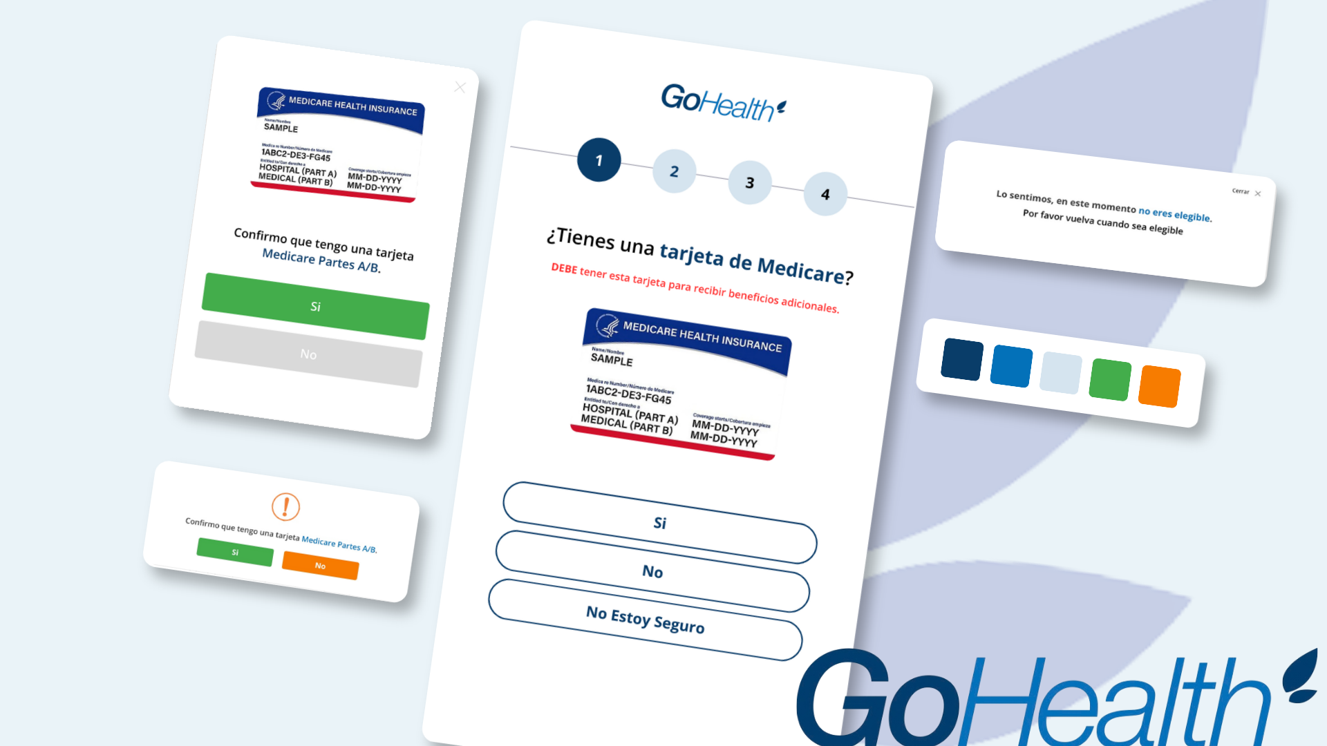
The Spanish Medicare form asked people to finish a personal-information flow before telling them whether they qualified. The issue was not that people ignored eligibility rules; the experience had never made those rules understandable.
I moved the requirement forward, used an image of the Medicare card people recognized, and added a plain-language confirmation before submission. People who were not eligible received an explanation and a useful next step instead of a dead end.
- 01
Explain the exchange
Make it clear why information is needed and what a person receives in return.
- 02
Use recognition, not jargon
The card image outperformed translated program terminology because it connected the requirement to something familiar.
- 03
Design the ineligible path
A respectful exit is part of the experience, not an exception state to handle later.
03
Balance self-service with human help
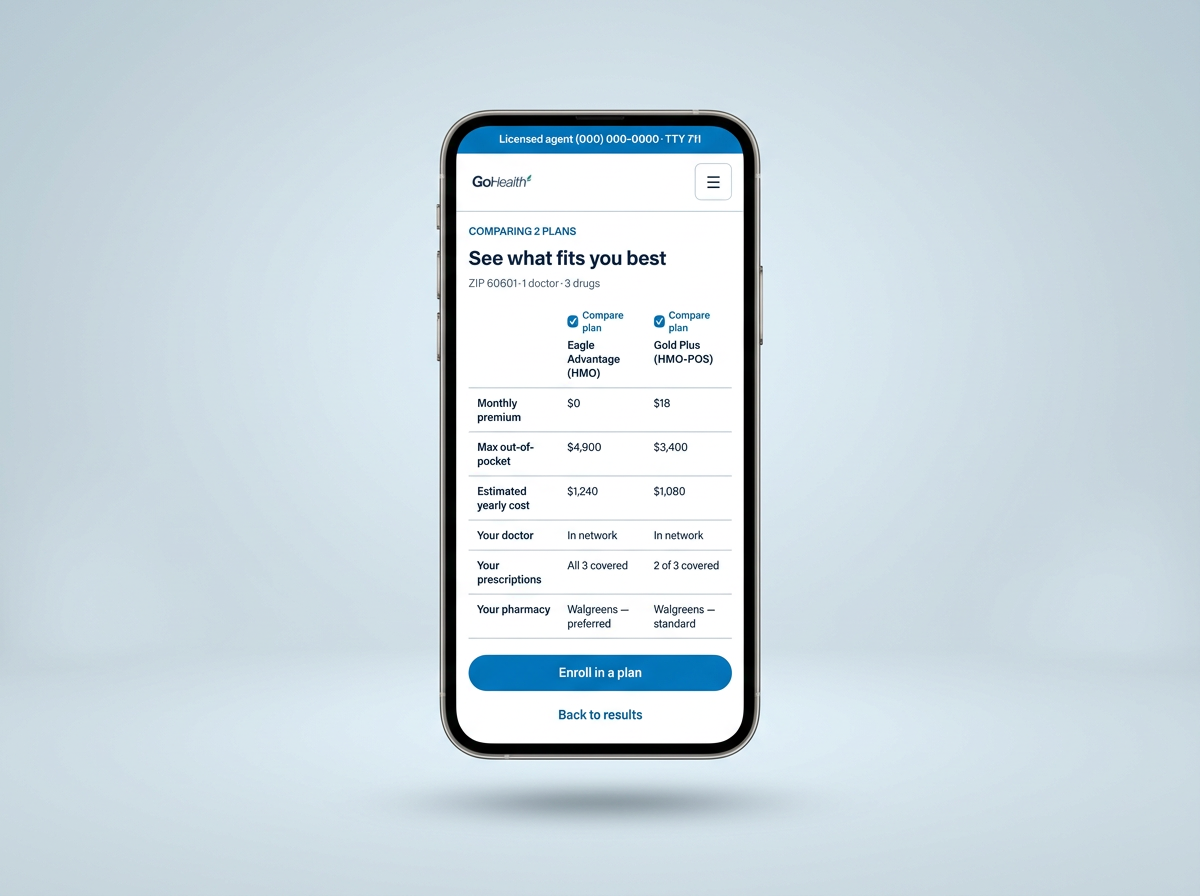
Self-service and human support are not opposing strategies. People often want enough control to learn and compare privately, then a knowledgeable person when the decision becomes specific.
That is why the Plan Finder concept begins with ZIP code rather than contact details, lets people compare around doctors, prescriptions, and yearly cost, and keeps licensed-agent help available without forcing it. The direction came from research; the concept itself did not ship, so I present it as a hypothesis that still needs usability testing.
The takeaway
Trust grows when the experience respects the decision
I cannot remove the stakes from healthcare or recovery. I can make the product honest about them: ask only what is necessary, explain what will happen, design every exit with dignity, and leave people with a clear next step.